Introduction
The newest version of CSS, CSS3, has added several features (such as the WebFonts that we have already discussed), which make CSS more powerful. In these notes, we will show examples of other beautiful effects you can achieve with CSS3, such as creating sophisticated text shadows, composing background scenes with multiple background images, using images as borders for elements, and applying rounded corners and box shadows. CSS3 has more features that we are not able to cover in detail, but you should be aware of them and try them out to see whether they might be useful to you in the future, especially when you design the pages of your project.
Important Note
Many of the CSS3 new features are still browser-specific. Thus, we often will need to add a browser-specific prefix for some of the new CSS3 properties to display properly. For Chrome and Safari the prefix is-webkit- (Webkit is the name of
the rendering engine that these browsers use). For Firefox the prefix
is -moz-, for Internet Explorer is -ms-,
and for Opera is -o-.
Text Effects
Text properties have been from the beginning part of CSS: color, text-align, text-decoration, text-indent, text-transform, letter-spacing, line-height, vertical-align, word-spacing, etc.
CSS3 expanded the Text Module
to specify several new text effects, which unfortunately, haven't been
adopted yet by the browsers. The ones that are working are: text-shadow,
word-break,
and
word-wrap.
You can look up the latter two properties on your own (very simple to understand), and
we will explain here the text-shadow property.
CSS uses the Cartesian coordinate system, depicted below.
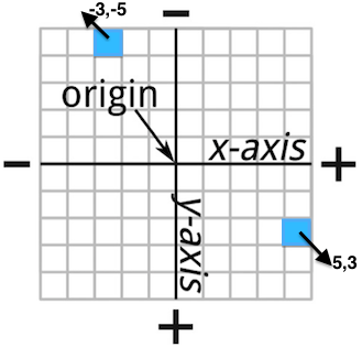
In Figure 1, we see the x-axis and y-axis overlaid in a grid. Imagine that each square corresponds to a single pixel. The distance from the origin can be measured either positively or negatively. Then, the coordinates of a pixel are a pair of values (one for each axis), which indicate the distance from the origin. In CSS, the default origin is the top-left corner of an element.
Now that we know how to express distances in pixels, we can explain the
text-shadow property. Let's start with an example:
WELLESLEY
As you can notice, the shadow drops rights below. This can be explained by positive values for both x and y coordinates, where the new shadowed text will be placed with the respect to 0,0 ( the origin, which is the top-left corner of the original text). This is the rule we wrote:
#shadow1 {
    font-family: Verdana, sans-serif;
    color: red;
    text-shadow: 3px 3px #FF7373;
}
The syntax for assigning values to the text-shadow property looks like this:
selector { text-shadow: x y blur-radius color; }
x is the horizontal distance from the text (x-offset), y is the vertical distance from the text (y-offset), blur-radius sets the extent of the blur effect on the shadow (the higher the value the wider the blur), color can be whatever value you like (we'll talk about color representation very soon). If you don't specify a value for the blur-radius, the default value is 0.
Here is an example of using the blur-radius:WELLESLEY
which was created with this CSS rule:
#shadow2 {
        color: white;
        font-size: 50pt;
        font-family: Times;
        text-shadow: 0 -4px 10px blue;
      }
Finally, it is possible to apply several shadows to text, to create more interesting effects:
WELLESLEY
This is the CSS rule for this effect:
#shadow3 {
        text-shadow: 0 -2px 3px #FFF, /* white */
                     0 -4px 3px #AAA, /* light gray */
                     0 -6px 6px #666, /* dark gray */
                     0 -8px 9px #000; /* black */
        font-size: 50pt;
      }
Background Images
You have already seen the property background-image in a few
examples. CSS3 makes possible to have multiple images
on the background, which can be used to create interesting effects.
Single background image
Here is the example of a page with one background image, which was generated with this CSS rule:
header {
  height: 640px;
  background: url('images/blue-sky.jpg') no-repeat;
}
The no-repeat value is especially useful when an image is small and
the browser automatically repeats it to fill the whole background space. Without
that value, the background will look like in
this example.
Additionally,
because the header element doesn't have a box size (no content), we
will need to specify the height property for it, otherwise, nothing
will be displayed.
Multiple background images
To make things more interesting we can add other images on top of an existing background image, again, only using CSS3.Here is a new page created by adding the bird on the blue sky from the previous two examples.
This is the CSS rule we used:
header {
  height: 640px;
  background: url('images/bird.png') no-repeat,
              url('images/blue-sky.jpg') no-repeat;
}
Notice that we use a , to list all images that we want to appear
in the background. The order in which the images appear in this list is
very important. The image that needs to be behind everything else should be
last in this list as well.
However, in order for the effect to look nice, the foreground images need to have transparent background themselves. Here is how our bird image looks like if you open it with a image processing tool:

The background property has multipe subproperties that
are useful to create more interesting effects. For example, using
background-position we can place our bird in any
location over the blue skye. Here is the
center bottom example.
We needed to add one line to our CSS rule:
header {
  height: 640px;
  background: url('images/bird.png') no-repeat,
              url('images/blue-sky.jpg') no-repeat;
  background-position: center bottom, 0% 0%;
}
Because there are two images, we specify the position for both of them. This property takes several values and you can play with them in this interactive example from the W3Schools.
Additionally, by using another property, background-size, we
can compose scenes with multiple images, as shown in this
example with many
flying birds.
header {
  height: 640px;
  background: url('images/bird.png') no-repeat 5% 105%,
              url('images/bird.png') no-repeat 20% 60%,
              url('images/bird.png') no-repeat 40% 80%,
              url('images/bird.png') no-repeat 60% 40%,
              url('images/bird.png') no-repeat 70% 45%,
              url('images/bird.png') no-repeat 60% 50%,
              url('images/blue-sky.jpg') no-repeat 50% 50%;
  background-size: auto, 10%, 10%, 5%, 5%, 5%,  auto;
}
The background-size property can also
take values of different kinds. The values in % shown in our
example, refer to the size of the parent element of the background, in this case
<header>. Since its size is 960x650 pixels, a 10% image will show as
96x65 pixels. Finally, notice that in this example, we have added the
background-position values to each image (after no-repeat).
Each of the pairs shows the left and top coordinate for where the image
is placed.
Borders and Box Effects
While the ability to style a border was in CSS from the very beginning, designers always wanted to do more than manipulate the color, size, or style (dotted, dashed, solid, etc.) for their elements.
CSS3 adds several features that designers where trying to achieve with lots of
hacks
involving extra markup in the HTML page, namely: rounded corners,
images for borders, and box shadows. We look into each of these properties in
the following.
Rounded Corners
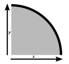
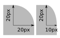
CSS3 introduces a way to round the corners of your elements using CSS alone. Each corner is treated as a quarter ellipse, which is defined by a curve that is drawn between a point on the x-axis and a point on the y-axis, as shown in the left graph below. A quarter ellipse can be regular, which means the length along both axes is the same, or irregular, which means the length along each axis is different (see graph on the right).
CSS3 introduced the border-radius property to implement the rounded
corners. Similar to the border property that can be specified by
-top, -right, -bottom, and -left,
we can specifiy the x and y values for each corner separately. Below is a concrete
example:
div {
    border-top-left-radius: 20px;
    border-top-right-radius: 20px;
    border-bottom-right-radius: 20px;
    border-bottom-left-radius: 20px;
}
If only one value has been specified, that means that both x and y are using
the same radius. Otherwise, we will specify two values in every line.
Clearly, if the radius is the same for all corners, we can simply
write the rule as: {border-radius: 20px; }. Additionally,
we can use the shorthand syntax to specify different values for x and y
using this syntax: border-radius: { horizontal-radius / vertical-radius; },
where each side of the slash can contain between one and four values, as with the
shorthand for regular curves.
We have grouped different uses of this rule in one single page of rounded corner examples. Use the "View Source" on the browser (or Inspect Element) to look at the syntax for every rule and what it achieves on the page.
Border Images
Similarly to how we specified images for the background of an element, we can specify an image to serve as the basis for decorative borders.
Visit this simple example page to see how such borders look like. The basis image for all of them is shown here:

The syntax for the border-image is shown below:
selector { border-image: source slice repeat; }
Example:
#frame1 { border-image: url("images/smallstar.png") 25 25 stretch; }
In addition to providing the border-image, it's important
to specify a border-width as well (see the frames in the example
above). Here is an explanation for the different values used in the rule:
- The value source is the URL to the location of the image.
- The value slice is a length or percentage value (or series of values,
specified in the order: top, right, bottom, left)
that sets a distance from each edge of the image marking the area that will be
used to
frame
the element. - The repeat value takes either one or two keywords, which set the way the image is repeated along the top and bottom (first keyword) and left and right (second keyword) of the element. The possible values are stretch, which stretches the image to fill the border length; repeat, which tiles the image across the length; round, which tiles the image across the length using a whole number of tiles (the element will be resized to accommodate this); and space, which also tiles the image across the length using a whole number of tiles, but using spaces if the image doesn’t fit the element.
The most difficult value to understant is slice. First, there are two kinds of values
it takes: pixels (but without using the "px" prefix) and percentages (using the % symbol).
Then, the numbers are used to slice from the image portions of it from the top, right,
bottom and left. When only one value is specified, the same portion is sliced from all
sides. If two values are specified, the first is used for top and bottom and the other
for right and left, and so on. Below is an example of how the value 25 25
generates four slices from our original image.


Then, each of these slices will be used in the corresponding border side, to generate the frame, according to the repeat rule. Refer again to the CSS rules used in our example page to see the effect of stretch, round, and repeat.
For more information and examples, you can always visit the W3School pages.
Box Shadow
Box shadow is very similar to text shadow that we discussed previously in these notes. Its role is to add shadows to box elements. This is the syntax for this property:
selector { box-shadow: inset x y blur spread color; }
The first value, inset is an optional keyword that sets whether the shadow sits inside or outside of the element. If inset is not specified, the shadow will sit outside. The next three values (x, y, blur) are the same as for the text-shadow. spread sets the distance the shadow spreads. A positive length makes the shadow larger than its element, and viceversa.
Here is a small div with a box shadow:
The effect was created with this CSS rule:
#shadowBox {
        background-color: #8942D6;
        width: 100px;
        height: 100px;
        box-shadow: 10px 10px 20px 10px #5A0DAC;
      }
W3Schools has a very good interactive example for exploring different combinations of values for this property.
Even more CSS3 features
There is more to CSS3 that we are able to cover in these notes. We will discuss the gradient property when we talk about colors. Here are some other features that you are encouraged to explore on your own.
- Multi-columns This property replaces to some extent float
for creating multi-columns when you have large amount of text. It is especially
useful for newspapers and magazines. There are several features related to this concept:
column-count,column-width,column-gap,column-rule. - 2D Transformations Such transformation allow the designer to
rotate, resize, and skew elements. All these transformations are realized
through one feature:
transform, which has this syntax:
selector { transform: function(value); }
Different functions will then apply the desired effect. Here is
a list of some of the functions:
- rotate(value) The vaue represent the angle of rotation, e.g. 25deg, -90deg, etc.
It is possible to use the property
transform-originto change the origin of the point that serves as center of the rotation. The default origin for rotation is the center of the element. - translate(x,y), translateX(value), translateY(value) These functions move an element either along both axes (the first one), or along one specified axis.
-webkit- browsers have implemented this feature.float. Every browser has its own
implementation that needs to be accessed through a prefix.