|
|
CS 112
Assignment 1
|
|
Due: Friday, February 13
You can turn in your assignment up until 5:00pm on 2/13/14. You should hand in both a hardcopy and electronic copy of your solutions. Your hardcopy submission should include printouts of four code files:golden.m, conds.m,
olympics.m and stars.m. To save paper, you can cut and
paste your four code files into one script, but your electronic submission should contain
the separate files.
Your electronic submission is described in
the section Uploading your saved work.
Assignment work is expected to be done in pairs, and according to the Pair Programming principles.
Reading
The following material from the text (fourth or fifth edition) is especially useful to review for this assignment: pages 5-23, 35-38, 46, 95-102, 133-138, 141-148, 175-186. You should also review notes and examples from Lectures #2, #3 and #4, and Labs #1 and #2.Getting Started: Download assign1_exercises from cs112d
Use Fetch or WinSCP to connect to the CS server using the cs112d account and download a copy of the assign1_exercises folder from the cs112d directory
onto your Desktop. The assign1_exercises folder contains a
code file named golden.m that will be a starting point for Exercise 1 below on
the Golden Ratio. In MATLAB, set your Current Directory to the assign1_exercises
folder to get started on this exercise. For Exercise 2, you will create a code file from
scratch and store it in the assign1_exercises folder. For the two problems in
this assignment, you will also create new code files from scratch, and will store them in a
folder named assign1_problems that you can create on your Desktop.
Uploading your saved work
Use Fetch or WinSCP again to upload your saved work, but this time you should connect to the
CS server using your personal user account name and password. (If you
are working with a partner, upload your work to both personal accounts.) After connecting
to your account, navigate to your cs112 folder and drag your
assign1_exercises or assign1_problems folder from your Desktop to
your cs112 folder. If you are working on a public computer, when done uploading,
be sure to delete your assign1_exercises or
assign1_problems folder from the
Desktop by dragging it to the trash can, and
then empty the trash (Finder--> Empty Trash). Be sure to Exit out of MATLAB when you are done.
When you have completed all of the work for this assignment, your assign1_exercises
folder should contain two code files named golden.m and conds.m, and
your assign1_problems folder should contain two code files
named olympics.m and stars.m. Use Fetch or WinSCP to connect to your
personal account on the server and navigate to your cs112/drop/assign1 folder.
Drag your assign1_exercises and assign1_problems folders to this drop
folder. More details about this process can be found on the webpage on
Managing Assignment Work.
Exercise 1: The Golden Ratio
|
The Golden Ratio, also known as the Golden Number Phi |
|

The file golden.m inside the assign1_exercises folder contains
two assignment statements that create two
vectors that each store 10 measurements obtained from the arms of 10 very accommodating
friends. The variable hands stores measurements of their hand length (in
inches), in increasing order. The variable forearms stores the
corresponding forearm lengths. These statements
have a semi-colon at the end, so the values are not printed in the MATLAB Command Window
when the code is
executed. In this exercise, you will expand the golden.m code file in
multiple steps. After completing each step, save the modified file and execute the new
code by entering the command golden in the Command Window. To begin,
open the golden.m file in the editor, and add comments to the top of the
file with the names of you and your partner.
(a) Plot the data
Add a call to the plot function to display a graph of forearm length vs. hand
length (i.e., plot hand length on the x axis and forearm length on the y axis). If the
ratio of these two lengths is roughly the Golden Number Phi, how should your
graph appear?
(Optional) If you add the following command after your call to the plot
function, the values on the x and y axes will be plotted on the same scale, which means
that the physical distance on the screen that is spanned by one unit on the x axis is the
same physical distance spanned by one unit on the y axis:
axis equal
(b) Create a vector of forearm:hand ratios
Add a single assignment statement that creates a new vector of 10 ratios, obtained by
dividing each forearm length stored in forearms by its corresponding hand
length stored in hands.
(c) Plot the ratios
Use the plot function to display a graph of the ratios generated in
Part (b). The ratios can be plotted on the y axis. Draw this graph in a new figure
window
by placing the figure command before the second call to the
plot function.
When you now execute your code, two figure windows will be drawn on top of one
another and can be dragged apart with the mouse.
Important note: After executing your new code and viewing the results, close the figure windows before executing your code again! Having an excessive number of open windows can sometimes cause code to execute improperly. You can close each window by clicking on the close box in the upper right corner of the window. You can close all of the figure windows at once by executing the following command in the Command Window:
>> close all
(d) Calculate the mean ratio
Calculate the mean, or average value of the ratios computed in Part (b) and assign a
variable to this mean value. Do not use the built-in mean function
(although it's OK to use mean to check your answer). What are we hoping
this mean value to be?
(e) Add the mean ratio to the graph
Using plot again, add a horizontal line to the graph that you created in
Part (c), whose height is the mean ratio. Set the color of this line to be different from
the default blue color of the graph of ratios. To add a second plot to an existing graph, place
the following command before the next call to plot:
hold on
To create the coordinates of points to draw the horizontal line, keep in mind that the
plot function only needs two points to draw a line! Also note that the names of
variables can be placed inside an assignment statement that creates a vector of
values, as illustrated in the following code:
  num = 3

  moreNums = [num 2*num 3*num]
(f) Measure your forearm and hand lengths and add your ratio to the graph
With a ruler, measure the length of your own forearm and hand (to see how these distances
are determined, see the picture on
The Human Hand & Foot page). Add two assignment
statements to your code that each use the input function to ask the user to enter their
forearm length and hand length, and assign each of the user's inputs to variables.
Compute the ratio of the user's forearm to hand length, and assign this ratio to a new variable.
Finally, draw a horizontal line on
the graph with a new color, whose height is the ratio computed for the user's (your) arm.
After adding this final line, add the following statement to your code so that future graphs are not drawn on the same figure:
hold off
(g) Add labels to your graphs
Use the functions xlabel, ylabel and title to add labels to the
two graphs that you created.
(h) Add a text label to your ratio line
Use the MATLAB function text to add a text label (e.g. 'My ratio') to
the line that shows your ratio. text works like this:
text(xpos, ypos,'your text here');
places 'your text here' at position (xpos, ypos) in your plot.
(i) Add comments to your code
You'll notice that there are some comments at the beginning of the code file that provide
the file name, initial creator and date of creation, and a brief description of what the program
does. Add a comment near the beginning that includes your name and the last date on which you
modified the code. If you worked with a partner, include the name of your partner as well.
Then add a few additional brief comments throughout the code that summarize
groups of statements that implement each major task. For
example, you might add a comment like "compute and display the mean ratio" prior to the
sequence of statements that you added for Parts (d) and (e). Comments like this are helpful
unto other people who read your code and also help you to remember what you did if you
need to modify the code sometime in the (distant) future. Comments that appear at the
beginning of a script file are printed by the help function:
help golden
Congratulations! You have now completed your first substantial MATLAB program!
Exercise 2: Practice with conditional expressions
Create a new file in MATLAB called conds.m (that you will turn in).
Make sure your Current Directory is set to the assign1_exercises folder when you
save this code file.
In conds.m, first use MATLAB's
input function to prompt the user for three pieces of information:
1) a numerical month (between 1 and 12), 2) a day (between
1 and 31) and 3) the user's name. Store each of these values in a variable
(e.g. month is 7
(for July), day is 28 and name is 'Rosa'). To prompt
the user for a string, provide a second input 's' when calling
the input function:
name = input('Enter your name: ', 's'); % name is a string
Then write MATLAB expressions that correspond to the following:
-
Create a variable
valentinethat is true on February 14 and false otherwise.
-
Create a variable
cs112midtermthat is true on March 2 and April 23, and false otherwise.
-
Create a variable
springBreakthat is true between March 19 and March 29 (inclusive).
- If
monthanddayare your birthday, then print out a personalized birthday greeting such as "Happy Birthday to Stella!", otherwise print "Not Stella's birthday". Thedispfunction can be used to print text that combines literal strings with variables whose value is a string:>> place = 'SCI 257'; >> disp(['class will be held in ' place ' today']); class will be held in SCI 257 today
-
If
monthis December, January or February, then print the lyrics of the first stanza of the song, "Frosty the Snowman" (on four separate lines), otherwise print a message of your choosing (this can be a single line).
Frosty the Snowman was a jolly happy soul,
With a corncob pipe and a button nose and two eyes made out of coal.
Frosty the Snowman is a fairy tale they say,
He was made of snow but the children know how he came to life one day.
month and
day and then seeing if your variables contain the correct values.
Add comments containing the names of you and your partner, and the date, to your conds.m
file and upload it with your other MATLAB files in your assign1_exercises folder,
when turning in Assignment 1.
Problem 1: The 2014 Winter Olympics are Finally Here!
|
The 2014 Winter Olympic Games in Sochi are now behind
us and the 2018 2018
PyeongChang Games may seem far away, but we can still try to
get into the spirit by creating our own olympic symbol! Using
the |
|

The code for making this picture should be placed in a file named
olympics.m that you create from scratch and store in a folder named
assign1_problems that you also create. The easiest way to start a new code file
is to type the edit command in the Command Window, followed by the first name of the
file that you want to create:
>> edit olympics
A pop-up box will appear that tells you that the file olympics.m does not exist and
asks if you want to create it. Click on the Yes button and an empty window for entering
your code will appear in the Editor. Type a couple
comments at the beginning of the file with the name of the file, your name, and the name of your
partner if you are working in a pair, and you'll be ready to start working on creating your picture.
Similar to what you did to complete the Golden Ratio exercise 1, it will help to proceed in stages.
(1) Draw a single circle
To draw a circle, you can use the plot function to draw a curve that connects a
set of equally spaced points around the circumference of the circle. The x and
y coordinates of each point can be defined in polar coordinates as
illustrated in the figure
below. r is the radius of the circle and a is the
angle between the x axis and the line connecting the origin to a point on the circle
(shown in green). The coordinates of the point on the circle are given by the following
expressions:
x = r * cos(a)
      y = r * sin(a)
The sin and cos functions require the
input angle to be given in radians. Click here
for a quick review of trigonometry and generating points around a circle.
There is a special constant pi whose
value is π (3.14159...) that is helpful for generating angles in radians. The input
to the sin and cos functions can either be a single angle or
a vector of angles. When a vector of angles is given, these functions generate a vector of
sine and cosine values for all of the angles in the input vector.
With this background in mind, generate the x and y coordinates for points on
the circle by first creating a vector of equally spaced angles from 0 to 2π,
and then using the expressions above to
compute the x and y coordinates from the vector of angles. The olympic symbol shown above
was created using 50 equally spaced angles around the circle, but you can vary this
number. You also need to specify a value for the radius of the circle. Draw the
circle with the plot function and observe your results - it may look more like
an oval than a circle! To make the curve appear as a true circle, add the axis equal
command.
(2) Draw four more circles
The circle shown above is centered at the origin, (0,0). To draw the remaining circles, shift
the coordinates to a new center location when plotting.
Be sure to add the hold on command before plotting the second
circle, and the hold off command at the end of your code. Add color, linestyles and
markers to each call to the plot function so that each circle is displayed
with a different color, linestyle and marker. Set the range of values that are displayed on
the axes so that there is white space all around the picture. This can be done by
calling the axis function with an input that is a vector of four values corresponding
to the minimum and maximum x values to plot, and the minimum and maximum y values:
axis([xmin xmax ymin ymax])
You can also turn off the axes around the picture with the following command:
axis off
When the axis is turned off, the background color reverts to the default gray color. You can set the background color to white with the following command:
set(gcf, 'Color', 'w')
gcf refers to the current figure window.
(3) The finishing touches
Use the title command to add a title to the figure, and
add some comments to the code that include the name of the file, the names of you and your
partner, and the date at
the beginning of the file, and describing what is done by the major parts of the code.
Note: For your final submission, you do not need to hand in a hardcopy of your picture,
only a copy of your olympics.m code file.
Problem 2: Star Light, Star Bright
|
Ever wonder why some stars appear brighter than others? Astronomists have observed that the brightness of a star depends on both its size and temperature. This dependence is captured in a Hertzsprung-Russell (H-R) diagram such as the one shown below. The ratio between the luminosity of a star and the luminosity of the sun is plotted on the vertical axis and the temperature of the star in degrees Kelvin is plotted on the horizontal axis, with temperature decreasing from left to right. Each dot in the diagram represents a single star. In general, hotter stars appear brighter and lie along the main sequence. The cooler giants and supergiants appear very bright due to their large size, while the hot white dwarfs appear faint because of their tiny size. |
|

Astronomists have modeled the relationship between luminosity, size and temperature using the following equation:
Lstar/Lsun = (Rstar/Rsun)2 (Tstar/Tsun)4
where Lstar/Lsun is the ratio between the luminosity of a particular star and the luminosity of the sun, and Rstar/Rsun and Tstar/Tsun are similar ratios for the size and temperature of the star relative to the sun. The following table provides data on the ratios Lstar/Lsun and Rstar/Rsun, and the temperature values for a set of stars. The aim of this problem is to determine how well the above model fits the observed data1.
| Sun | Barnard's Star |
Epsilon Indi |
Alioth | Regulus | Spica | Beta Crucis |
|
| Lstar/Lsun | 1 | 0.0004 | 0.15 | 108 | 150 | 13400 | 34000 |
| Rstar/Rsun | 1 | 0.18 | 0.76 | 3.7 | 3.5 | 7.8 | 8 |
| Temp (K) | 5840 | 3130 | 4280 | 9400 | 13260 | 22400 | 28200 |
Write a MATLAB script named stars.m that creates an H-R diagram from the above
data and model, and quantifies the deviation between the two. Your stars.m code
file should be placed inside your assign1_problems folder. If your are working
with a partner, add comments to the top of the code file with the names of both partners.
In your script, create a
single figure that contains two line plots corresponding to the data and model predictions.
Display the two plots with a different color and marker. Use the same temperature values for
the two plots. In the case of the luminosity ratio, use values from the above table for one
plot, and values computed by the above model for the second plot. Your figure should resemble
the plots of the model and data for a cooling cup of coffee shown in the last slide from
lecture #3. Create vectors to store the data from
the table, the temperature ratios Tstar/Tsun and the predicted
values of Lstar/Lsun. Add axis labels, a title and legend to your figure,
and use the axis command to set the range of values on the axes so that there
is some space between the axes and plots. Remember that in an H-R plot, the temperature
values are displayed in decreasing order on the horizontal axis. This can be accomplished
in MATLAB by added the following statement:
set(gca, 'XDir', 'reverse')
The data and model predictions will appear to be very close, but let's quantify the fit. A common measure of deviation between a set of data values and the predictions of a model is the root mean square error (rms error) defined by the following expression:
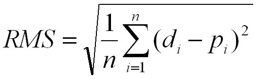
where di is the ith data value (e.g. the luminosity ratio
measured for the ith star), pi is the predicted
ith value (e.g. the luminosity ratio predicted from the model, for the
ith star), and n is the total number of data samples.
The rms error captures the
average difference between the measured and predicted values. Add code to your
stars.m script to calculate the rms error and print its value. Note that
all of the arithmetic operations needed to compute the rms error can be combined into
one MATLAB statement!
Be sure to add some comments throughout your code file.
Optional: You're welcome to enhance your figure using properties to change the colors, fonts and markers, but this is not essential!
Note: Again, for your final submission, you do not need to hand in a hardcopy of your
picture, only a copy of your stars.m code file.
1This problem was adapted from: Gilat, Amos, MATLAB: An Introduction with Applications, Third Edition, John Wiley & Sons, 2008 (p. 151).