|
|
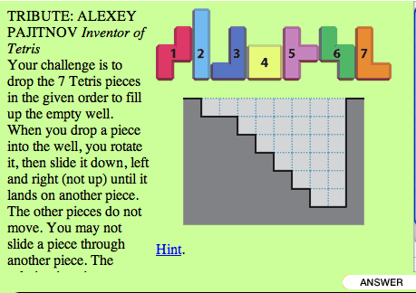
Designing Online User Interfaces for Puzzles Scott Kim is a master, not only designing new games, but also designing the appropriate interface for his games. Consider, for example, the following puzzle described on paper, on one of Scott Kim's Page-A-Day puzzle calendar: This is a paper-based puzzle. The way to play them is that you read the description, and then you try to solve it with paper and pencil. If you need help, you read the hint on the back of the page. To check whether you solved it correctly, you turn the page to the "solutions" section. So, using paper and pencil has its advantages and limitations. How would you play this puzzle on the computer? To do so you need to design and describe the user interface that manages the puzzle on the computer screen. In particular:
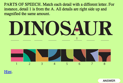
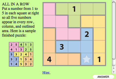
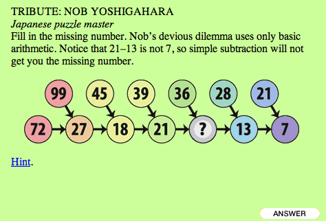
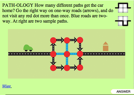
Spend some time thinking about your answers. Then, take a look at Scott Kim's Just my type puzzle to see how he has designed the interface to play it on a computer. Do you agree with his choices? Every puzzle may require a fresh look. What was appropriate interface for one does not make it appropriate for another. Look, for example, at the following snapshots of other paper-based puzzles.
How would you design these? Again, you need to describe how a user will be able to use the mouse and the keyboard as her User Interface to manipulate your computer-based puzzle screen. How the user with little or no insructions will be able to solve each puzzle? Remember, the best UI is the transparent UI. And if you need more inspiration, look at some more of Scott Kim's games: Color-me RGB, Convergence, Get connected,Mondo Jigsaw, Random Jargon, and Tangled tale. |
|||||
|
Maintained By: Takis Metaxas
|
||||||
