P3 - Paper prototype implementation + testing
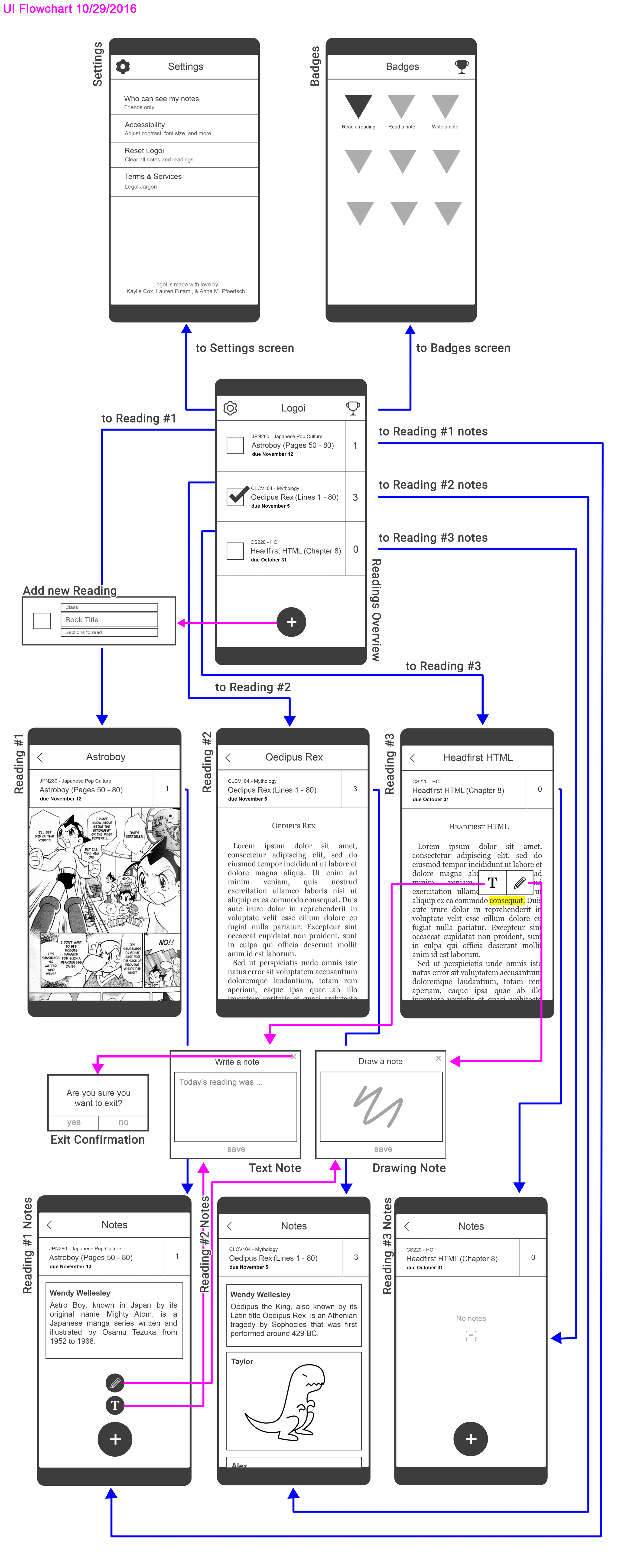
Paper Protoype Flowchart
Briefing
Logoi is an app designed for students to access class readings on-the-go and annotate them. Users will be able to create and read notes that other users have already created. It is meant to motivate the user to finish readings with a greater comprehension of the material.
Scenarios
- Use Logoi to complete a reading for CS220.
- Use Logoi to add a note to Oedipus Rex.
- Use Logoi to view someone else’s note.
Observations
- Users had a hard time realizing they could add a note by highlighting a word.
- Some users thought the “T” stood for font size rather than a text note, and therefore wouldn’t click on it when writing a note.
- Users wanted confirmation buttons that specified whether they were going back/deleting a note or adding it, as without them they were unsure of which action they were taking
- The number next to the reading is right below the badges icon, so some users thought it represented the number of badges for that reading and didn’t initially click on it to go straight to notes (which would have sped up Scenario 3)
- Readings aren’t ordered in any particular way, which makes staying on top of readings problematic/inconvenient
- Users noted that it would be nice to keep past readings in an archive so that they might review them later. They also wanted unread readings to turn red and remain at the top of the reading list so that it becomes more urgent to read them
- One user would have liked the comments to have an upvote system and have the notes section display the notes that received more upvotes at the top
- One user did not like the fact that their name would be shown on their written comments because they like to write comments that are not necessarily informational but more conversational
Prototype Iteration
After testing our pilot users, we decided to add a few more features to our paper prototype like:
- Done/Cancel Button on Top of Note - This appears at the top of the note that the user has written or drawn. Our pilot testers were confused as to how to add their note once they finished writing it. They would press outside of their created note, but were hesitant when a dialog box appeared asking them whether or not they wanted to continue with their action. They were afraid that they might be deleting their newly created note instead of submitting it for others to read.
- Keyboard - We wanted our users to simulate typing out a message on a mobile phone in order to provide a more accurate experience of our app.
- General errors - Some prototype pieces had features already “activated”, so we made sure those were in their initial states for the prototype the real users used.
- Consistent buttons - We updated the layout and buttons (such as the back buttons) to provide a more consistent environment throughout the app, so that the user felt comfortable exploring the app without making a big mistake
Resolutions
- During the first time using the app, have a pop-up box explain how to add a note (i.e. give a simple tour), as this would take care of both explaining how to highlight and what the two note types are.
- Create multiple confirmation boxes with specific wording for whatever action they’re taking
- Potentially add a note icon next to numbers to signal the number’s function
- Add a back button to badges page rather than have users click on the badge button again
- Organize readings with the ones due soonest at top