Page layout involves placing page elements (such as text and graphics) where you choose on a page. In the past, page layout was done with special HTML tags, including tables. The modern approach is to separate the page layout from the page contents by using CSS. This has the advantage that you can have different layouts for different media (screens, printouts, cellphones) as well as keeping the HTML clean and uncluttered for those users who don't use the CSS, such as a blind person who uses screen reading software.
Boxes
To understand page layout, you first have to understand that, to a web browser, a web page is a series of boxes. The boxes have a width and height, and they get assembled (laid out) on the page, much the way Ben Franklin might have laid out the text and pictures in his newpaper.
Boxes come in two kinds: blocks and inline.
A block is something big like a paragraph or
a <div>. Blocks are preceded and followed by line
breaks, so Ben Franklin or the layout engine stacks them vertically on the
page. (Normally, a block doesn't have anything to the left or right,
though we will see some exceptions later.)
An inline element (box) is something like a word, where Ben
Franklin or the layout engine fills up a line with as many as it can, then
goes on to the next line, and so forth. You may be surprised to learn
that <img> elements are inline, so that a line is
filled with as many images as will fit before starting the next line.
(That's why centering an image is tricky; we'll look at that a bit later.)
DIV and SPAN
The <div> element is the generic block element. A
DIV can contain any other element, including other DIVs. You can nest
DIVs as deep as you want. It has no semantics, but we can style it by
using CSS (often adding an ID or a class to the element, to distinguish
it from other DIVs). Because DIV is a generic container, we will often
use it to structure our pages. It will feature in many of the examples below.
The <span> element is the generic inline
element. As with DIV, span has no semantics, but we can style it using
CSS, and, of course, we can add ID and class if we want.
A span can contain other inline elements, including other spans, but no inline element can contain a block element. That means you can put EM inside a P, but not vice versa. The browser may let you get away with it, but the validator won't.
Margins, Borders and Padding
The contents of a box can optionally be surrounded by a border. For example, the following CSS
p {
    border: 2px dashed red;
}
will put a 2 pixel dashed red line around the contents of each paragraph.
Padding is the distance between the contents of the box and the border. By default, it's zero, but if you'd like a little more room between your text and the border, you can increase it. Even if you don't have a border, padding can be used to increase the distance between the contents of your box and the contents of any neighboring boxes.
Margins are the distance between the borders and the
next element. However, it's not quite as simple as that, because
the margins for vertical elements
sometimes collapse.
Margin collapse means that if a box A has a bottom margin of X and is
followed by box B with a top margin of Y, the two
are max(X,Y) apart, not X+Y. That sounds
weird, but it's usually what you want. If you specify that both have a
margin of Z, they will be Z apart rather
than 2*Z.
Example
Here's an example that does uses all these measures:
Now is the winter of our discontent, turned glorious summer by this sun of York.
Now is the time for all good men to come to the aid of their country.
Here's the CSS. Notice we use a descendant selector, so as not to modify every paragraph on the page.
.eg_box p {
   border: 1px solid orange;
   background-color: yellow;
   padding: 5px 2em;
   margin: 10px;
}
Again, we've used short-hand properties. With padding and margins, if you give one number, as we did with the margin, you get 10px on all four sides. If you give two numbers, as we did with the padding, the first one is the top and bottom, and the second is the left and right. If you give four numbers, you can specify all four sides, in the order top, right, bottom and left (clockwise from the top). So the following is equivalent:
.eg_box p {
   border: 1px solid orange;
   background-color: yellow;
   padding: 5px 2em 5px 2em;
   margin: 10px 10px 10px 10px;
}
Note that margin-collapse means that the two paragraphs are 10px apart, which is reasonable and easy to specify. So margin-collapse is usually a help rather than a hindrance.
Exercise 1
Look at this modifying boxes using Inspect Element. (Dummy text courtesy of lipsum.com.)
In the exercise, you'll notice that contents of the box, including the padding, acquire the background color, but the margins are always transparent. Thus, padding and margins, which seem to be interchangeable when there isn't a border, aren't the same if you have a background color.
You'll also notice some big differences between blocks and inline
elements. Not only are the inline elements put together on a line,
but a <span> can be broken up if it's too wide
(certain inline elements, such as images, can't be broken up).
Also, the width and height, and top and bottom margins of inline
elements are completely ignored.
You are probably wondering how to set all these distances. There are CSS properties to control the thickness of each side of the box (margin, border, and padding) as well as the style of the border if there is a border. There are also shorthand forms that let you define things more compactly. Consult a good reference on CSS properties
Lengths and Units
Now that you've seen some CSS properties whose values are lengths, you'll want to know what values they can have. For example, we indented this paragraph by half an inch. It's the only indented paragraph in the site. We did it using the following code:
<p style="text-indent: 0.5in">Now that you've seen some CSS properties ...
You might guess that in means inches.
To
specify lengths effectively, you need to know the units that
CSS uses. They come in several categories:
- Ruler measures. Inches (
in), centimeters (cm), and millimeters (mm). - Pixels. These measures are in pixels, so they're less
flexible if the web page will be printed out onto paper, but they're
useful on the web. This unit is specified using
px. - Printer units. You probably know that font sizes are
measured in points, as in a
12 point font.
One point is equal to 1/72 of an inch, and is specified by usingpt. - Font-relative units. These measures are proportional to
the size of the font, so they are bigger if the font is bigger,
and smaller if it's smaller. This is great because visually impaired people
may increase the font size to much greater than you'd ever expect, and
you'd like the web page lengths to scale appropriately. These are
appropriate measures for, say, the distance between lines (called the
leading, from strips of lead that were put between the rows of
type back in the olden days of actual lead type). The two font-relative
sizes are
emandex. Theemmeasure is named for the width of the letterM
in the current font, and in CSS is defined to be equal to the size of the font. Theexmeasure is named for the height of the letterx
in the current font, and in CSS is usually about half the size of the font. - Percentages. These are best for elements whose size you
want to specify relative to the size of the enclosing element or the window.
If you want a paragraph to be three-fourths the width of the enclosing
<div>, you can use code like the following:#content { width: 800px; margin-left: 100px; } #note { width: 75%; margin-left: 25%; } <div id="content"> <p>Here's the usual contents of the page ...</p> ... <p id="note">And here is a narrow note on the right side.</p> </div>Look at the percentage example in action.
Images are Inline Elements
Pictures (image elements, produced by the <img> tag)
are inline elements. This may seem odd, since images look so
much like big box-like things, and therefore ought to be block
elements, but they are (by default), inline elements. So, the browser
treats them like big words. Here's an example:
Bonnie and Chester were enjoying a picnic on the
 . Suddenly the sky filled with dark
 . Soon, it began to
 . When the
 began, they decided to
head for
began, they decided to
head for
 .
.
Centering Content
Before we get to more complex stuff, let's look at centering content, particularly images, since that's a common desire among CS110 students. Let's start, though, with centering lines of text within a block. Here's an eye chart:
F P
T O Z
L P E D
P E C F D
E F D C Z P
F E L O P Z D
All we had to do was to use the CSS property text-align:
center. (Note that we used an inline style sheet in the
example code, just for brevity. In practice, we would probably add a
class to this div and define it in an external style sheet).
Since images are just like big letters, the same trick will work with images:
Centering Text
You should almost never center lines of text in a paragraph (unless you're making lots of eye charts). You get ragged edges left and right, which looks ugly. Also, depending on the font, amount of text and the width of the region, the last line may be weirdly short (and centered). Here's a Tolkien quote:
You probably don't want that single word centered on the second line. But that can happen (and all-too-often does) when you center text and don't have complete control over browser-width, font-size, and the like.
Instead, what you probably want is to have normal, left-aligned text in a box that is itself centered. Let's see how to center boxes.
Centering a Block
To center a block, you have to give it a width that is smaller than
its parent (which might be the <body>), and setting its
left and right margins to be auto. Auto
means to take
the leftover space on the line and distribute it equally among the
auto
elements. If both margins are auto, the element
is centered. Thus:
Do not meddle in the affairs of wizards, for they are subtle and quick to anger.
Here's the code that accomplishes that:
#outer_box_example {  width: 80%; border: 3px solid blue; }
#inner_box_example {  width: 70%; border: 2px solid red; margin: 0 auto; }
This makes the browser calculate the necessary margin for centering, and works even when the widths are in percentages. When the width is a percentage, it is calculated as a percent of its parent, not the whole window. So in this case, the inner box is 70 percent of the outer box, and the outer box is 80 percent of the area where this paragraph is. You'll notice that the outer one is not centered, though.
Centering Images
An alternative technique for centering images is to use the same margin
trick that works for centering other block elements, such as the
paragraph above. The difference is that <p> is
already a block element, while
<img> is inline. However, we can change an
<img> element to be a block by using the
display: block style. That is, to make an image that
is centered, use a style sheet that makes the image display
as a block, and sets the margin-left
and margin-right
to auto.

Note that by making the <img> be block,
they stack vertically, even without the <br> tags. If
we had tried to use the text-align: center technique, the two
pictures would have appeared next to each other on the line. (Of course,
that may be what you want, in certain circumstances.)
You should consult this web reference on Centering Things in CSS.
Box Widths
Consider the following example of an overfull box. Look at the CSS for it. Why does the browser have a horizontal scroll bar? The box is 100% of the container, not 110%.
The solution to this mystery is that the width of a box is defined to
be the width of its contents, not the width of the box. (If you
think this is a stupid definition, you would find many who agree with you,
but we're stuck with this definition.) Thus, if you define a box to be
100%, it had better not have any margin, border, or padding, or it will
be overfull
.
One way to avoid the creation of overfull boxes is to nest two boxes, set the width of the outer one, and then use the inner one to set the margins, border and padding. By default, the dimensions of the inner box will be determined by the outer one, which is just what you want. Here is an example of a full, not overfull box created with this idea.
Background Images
You have already seen the
property background-image in a few examples. The
background-image property will cover the screen area corresponding to
that element. If the image is smaller than the element, the image will be
repeated horizontally and vertically (like tiles on a floor), unless you
say it shouldn't be repeated. This paragraph is put on a wooden
background image by using the following CSS:
#bgimage {
    background: url("wood-texture.jpeg");
}
The header for this section also uses a background image. We make the image not-repeat and slide the text over by using some padding (not margin), like this:
#background_images {
    background: url("cs110.png") no-repeat;
    padding-left: 35px;
}
You can learn more and try it out at this page: W3 Schools background image.
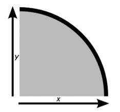
Rounded Corners
CSS3 introduces a way to round the corners of your elements using CSS alone. Each corner is treated as a quarter ellipse, which is defined by a curve that is drawn between a point on the x-axis and a point on the y-axis, as shown in the left graph below. A quarter ellipse can be regular, which means the length along both axes is the same, or irregular, which means the length along each axis is different (see graph on the right).
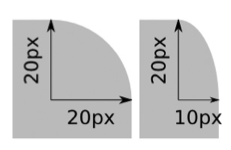
CSS3 introduced the border-radius property to implement
the rounded corners. Similar to the border property that
can be specified by
-top, -right, -bottom, and -left,
we can specifiy the x and y values for each corner separately. Below is a concrete
example:
div {
    border-top-left-radius: 20px;
    border-top-right-radius: 20px;
    border-bottom-right-radius: 20px;
    border-bottom-left-radius: 20px;
}
If only one value has been specified, that means that both x and y are
using the same radius. Otherwise, we will specify two values in every
line. Clearly, if the radius is the same for all corners, we can simply
write the rule as: {border-radius: 20px; }. Additionally,
we can use the shorthand syntax to specify different values for x and y
using this syntax: border-radius: { horizontal-radius /
vertical-radius; }, where each side of the slash can contain
between one and four values, as with the shorthand for regular curves.
We have grouped different uses of this rule in one single page of rounded corner examples. Use the "View Source" on the browser (or Inspect Element) to look at the syntax for every rule and what it achieves on the page.
Even more CSS
You can stop here; the following material is optional. There are some fun, eye-candy effects that you can do with CSS3, but none of it is necessary for a functional, nice-looking website.
Multiple Background Images
Here is the example of a page with one background image, which was generated with this CSS rule:
header {
  height: 640px;
  background: url('images/blue-sky.jpg') no-repeat;
}
To make things more interesting we can add other images on top of an existing background image, again, only using CSS3.
Here is a new page created by adding the bird on the blue sky from the previous example.
This is the CSS rule we used:
header {
  height: 640px;
  background: url('images/bird.png') no-repeat,
              url('images/blue-sky.jpg') no-repeat;
}
Notice that we use a , to list all images that we want to appear
in the background. The order in which the images appear in this list is
very important. The image that needs to be behind everything else should be
last in this list as well.
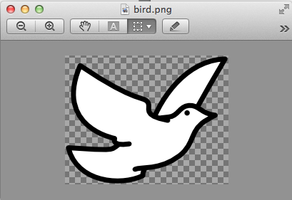
However, in order for the effect to look nice, the foreground images need to have transparent background themselves. Here is how our bird image looks like if you open it with a image processing tool:
The background property has multipe subproperties that
are useful to create more interesting effects. For example, using
background-position we can place our bird in any
location over the blue sky. Here is the
center bottom example.
We needed to add one line to our CSS rule:
header {
  height: 640px;
  background: url('images/bird.png') no-repeat,
              url('images/blue-sky.jpg') no-repeat;
  background-position: center bottom, 0% 0%;
}
Because there are two images, we specify the position for both of them. This property takes several values and you can play with them in this interactive example from the W3Schools.
Additionally, by using another property, background-size, we
can compose scenes with multiple images, as shown in this
example with many
flying birds.
header {
  height: 640px;
  background: url('images/bird.png') no-repeat 5% 105%,
              url('images/bird.png') no-repeat 20% 60%,
              url('images/bird.png') no-repeat 40% 80%,
              url('images/bird.png') no-repeat 60% 40%,
              url('images/bird.png') no-repeat 70% 45%,
              url('images/bird.png') no-repeat 60% 50%,
              url('images/blue-sky.jpg') no-repeat 50% 50%;
  background-size: auto, 10%, 10%, 5%, 5%, 5%,  auto;
}
The background-size property can also
take values of different kinds. The values in % shown in our
example, refer to the size of the parent element of the background, in this case
<header>. Since its size is 960x650 pixels, a 10% image will show as
96x65 pixels. Finally, notice that in this example, we have added the
background-position values to each image (after no-repeat).
Each of the pairs shows the left and top coordinate for where the image
is placed.