We strongly recommend that you read Chapter 11 of the Head First HTML and CSS book as a gentle explanation for this topic. The material in these notes comes from Chapters 11, 12, 13 of the book CSS The Missing Manual.
Introduction
As you have noticed so far, HTML displays content from top to bottom, with most elements stacked as blocks. Today, we will see how to use CSS to put elements everywhere in the page, in order to create more visually appealing pages.
Most web page designs on the web fall in one of the two types of layout: fixed-width or liquid.
Fixed-width design gives you more control over how your pages will look, but will cause inconvenience for users with small monitor devices (a lot of horizontal scrolling, which people dislike). Liquid designs, which grow or shink to fit a browser window, are better for users, but make things more difficult for you the designer.
- A perfect example of a fixed-width layout is the NY Times website. Resize your page. Once your screen has become less than 970px, you'll see that the scrollbars will show up and the page doesn't change. Most websites on the web have a fixed width, usually under 1000px (with a common value of 960px).
- A perfect example of a liquid layout is the new Google Maps website. Again, resize your browser to see how the page content shrinks or grows with your window size. This type of design makes the best use of available space, but you'll need to make sure that it looks well on all different device sizes. Our own website is also an example of fluid design. Resize the window to experience it.
How CSS layout works
Web page layout involves putting content into different regions of the
page. In order to do this, the content needs to be in container tags such
as: nav, header, section, footer, picture, aside,
and the ubiquitous div. Keep in mind though that you don't
need to use div if it's not called for. Elements that are
displayed as blocks, such as ul, ol,
and p can be also moved everywhere in the page.
Two Techniques for CSS Layout
There are two general techniques used for layout: floats and absolute positioning. Floats are by far the most used, as it allows the layout to be fluid. Also, with float layout, content never overlaps other content, so even if the layout isn't pretty, it's functional. With absolute positioning, you have the power and burden of complete control. We'll look at both in this reading.
To use float, you start with the normal layout of boxes stacked
vertically on the page, but you can allow certain elements to move to the
side and have other material flow around them. To do that, HTML elements
have a property float, which will make the element float to
either the left or the right side of the page (your choice). Of course,
other material can't flow around it unless it is narrow enough, so we
also have to consider the width of the element. We'll look at that, too.
Absolute positioning allows you to place an element anywhere on the
page with pixel-like accuracy. To do so, CSS has a position
property that you set to absolute, and then use additional
properties like left and top to specify the
location of the element. This technique doesn't go well with the fluid
design, but is good for positioning things like logos, etc. that need
always be in a certain place. Absolute positioning is sometimes used in
a limited way as part of an overall layout that mostly uses float.
Layout Strategies
Web page layout with CSS is more of an art than science; there is no formula for marking up your HTML page or creating the CSS. CSS layout is something that you will learn through experience, learning the different CSS propertis, following tutorials, and practicing a lot. What follows in this section is a set of guidelines that can be useful as you start learning about this topic.
- Start with your content. Design starts with your content (headlines, text, links, photographs, etc.), not with colors, fonts, or icons. It is the page message that should dictate the design. For example, if the goal of a student organization page is to get more students to join, you can put a large photo of the members doing something fun or interesting, together with quotes from them. Then you use style to make them compelling.
- Mock up your design. Don't start your design with code, start with a drawing. Using a drawing program (Paint, Photoshop, Illustrator, etc.) gives you freedom to explore different colors, fonts, images, and positioning, without having to write code. This way you can experiment faster with many choices. If your page needs user interface elements such as buttons, tabs, etc. you can use the free stencil kit from Yahoo, together with Photoshop.
- Identify the boxes. Once you are satisfied with your mockup, you can start thinking about the HTML structure. Basically you need to identify which elements look like individual boxes, because they will have to be in container tags in your HTML.
- Remember background images. Very often, you can
more easily place an image with the
background-imageproperty than the<img>tag. This is because you can put other information on top of this image. However, you should know that background images are not printed, thus, don't put important information (such as maps) as background. - Layering elements. Tools like Photoshop use the
notion of layers to float several things on top of each other. To do
the same on a web page, there are two options: use
the
background-imageproperty to put text on top of images, or use thepositionproperty to lay images or icons on top of text. You can't usefloatto make content overlap. - Don't forget margins and paddings. Often, you might not need to use sophisticated CSS for layout. A good use of the margin and padding properties can take you really far (especially when combined with the background image property).
Float-based Layouts
In this section, we will show with different examples how to build
float-based layouts. Such layouts make use of the float
property to position elements side by side and create columns. You can
also use float to create a wrapping effect. This is because the floated
element is removed from the flow of the document and what comes after it
moves up and wraps around the float. (Note: Your book
has a very detailed description of what the flow of a document is.)
Floating an image
As you know, an image is an inline element. To remind you of
that, look at this example and
resize the browser page to see what happens to the images. You also
can use Chrome's Inspect Element to notice
that <img> is nested within
the p.
Now, let us look at the same page after applying the following style rules:
- Made the body a fixed width by specifying the width in pixels.
- Made the body centered by specifying
margin: auto;for it. - Made the images float to the right by specifying
img { float:
      right; }
.
Notice how the images are now strictly on the right side of the document, and the text of the paragraphs wrap around them. The only step that is necessary for this is the last step, but the others are nice, too.
Floating a div (or semantic container)
Let us now see what happens when we float a container element, such
as a div, figure, footer, etc.
Here is the unstyled page,
where we put the img inside the figure
container. Notice how this time the images are not inline anymore.
If we apply now the floating property to the figure,
element, we get the same effect
as before, with the distinction that
figure already has some default values for the margin assigned
by the browser.
The float property takes only three
values: left, right, and none. The last value
is used when you want to prevent an element from floating. (There is
no float: center property; we discussed centering in the
reading on the box model.)
Now that we learned about the property float, let's see how it can be used to create a layout with columns.
Two-column layout
In order to have a two-column layout, we need to have two containers
which can meaningfully stand next to each other; for example,
a section and an aside. Let's add first
a aside element to our
Hunger Games example. The
content will be a header and a list with short lines:
<aside>
    <h3>Characters</h3>
    <ul>
        <li>Katniss Everdeen</li>
        <li>Peeta Mellark</li>
        <li>Gale Hawthorne</li>
        <li>Primrose Everdeen</li>
        <li>Haymitch Abernathy</li>
    </ul>
</aside>
Then, we apply some minimal style to this element, in order to float on the left side, as shown below, getting this new version.
aside {
    float: left;
    border: 1px black solid;
    padding: 5px;
}
Important Note: The width and height of every
floated container element depends on the amount of content
(text or images) inside the container. This is the shrink-to-fit
model. If the list above had had some very long items, so that the list
was as wide as the page, the float property would have no
effect.
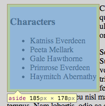
As you see from the screenshot below, the aside box size
can be calculated based on the values for margin, border, padding, and
content size (e.g. the width: 185px = 0 + 1px + 5px + 173px + 5px + 1px
+ 0). The 173px comes from the how wide the text in the header and list
are. Again, if you have a big paragraph of text in your floated element,
it's likely to be as wide as its container, and the floating will have
no effect.
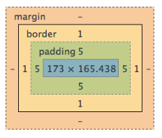
If you want the size of the column to be something you desire (e.g.,
instead of width of 185px, to be 200px), you can do the reverse
calculation to find what the width of the content should be, using a
simple equation. For example, 200px = 0 + 2*1px + 2*5px
+ Xpx. Solving this, we
get width=188px. This means that in our rule we should set
the width: 188px;, in order to get the real size of the
column to 200px on the browser page.
One could do the same for the height, but this is not very useful, because if the adjacent column gets more content, we'll need to recalculate.
Now, to achieve our two-column effect, we simply add a margin to the
non-floating element. Here, we add a margin to the section so that the
aside floats next to it. Depending on whether the floating column would
be on the left or the right side, we need to
set margin-left or margin-right to a value
slightly larger than the width of the floating column. Since the aside
is 185px wide, a margin of 210px should look nice. Therefore, we add the
following rule:
section {
    margin-left: 210px;
}
This is how the finished two-column layout looks: our two-column example.
Summary: The two-column layout
- Wrap each column in a container, for example,
asideandsection(or adivwith anidattribute). - Float one container (in our case,
aside) either left or right. - Set a desired width for the floated element.
- Add a margin (left or right, matching the floating side) to the fixed element.
Three-column layout
Going from a two-column layout to a three-column layout is a fairly straightforward extension. Can you think of the changes you will need to make to your HTML and CSS code? To challenge yourself, stop reading at this point and go and experiment with the code from the two-column layout (get the files from the links above). Then, check our solution. Here is a summary of the steps we performed:
- Added a new
asideelement (before thesection). - Added an ID attribute to each
asideelement. - Used these two new IDs as selectors in the CSS code (the rules are
identical, with the exception of
float. - Added
margin-right: 210px;to the section rule, in order to allow space for the new floating element.
Important Note: When using this technique (known as positive margins), the floating elements need to be placed before the main content in the HTML file, otherwise, you will not get the desired effect.
Float Problems
Working with floating elements can often cause unexpected problems. In the following, we will describe two of them together with the solutions.
--- Optional Reading Starts here ---
Clearing Floats
We saw that one of the things that happens with floats is that other
content wraps around them. Often that's what we want, but sometimes it
isn't. A problem that occurs often is with the footer
element of a page, when the main content is shorter than one of the
floating columns. To illustrate this problem, we modified the
Hunger Games example
to show what happens with the footer. Here is a screen shot:
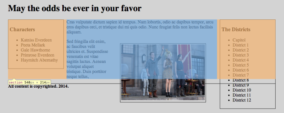
footer (copyright notice) has moved up,
higher than the floating figure and the aside on the right (the District
lists).
Fortunately, there is an easy fix for this problem. We add the property
clear in the rule of the element we want to stay away from
the floats, in our case, footer. What clear
means is to move the cleared element down, below any floating
elements. Like this:
footer {
  clear: both;
}
After making this change, the footer stays at the bottom of the page.
Containing Floats
Another problem occurs when a floating element contained within another
element is larger than its container. This becomes obvious when the
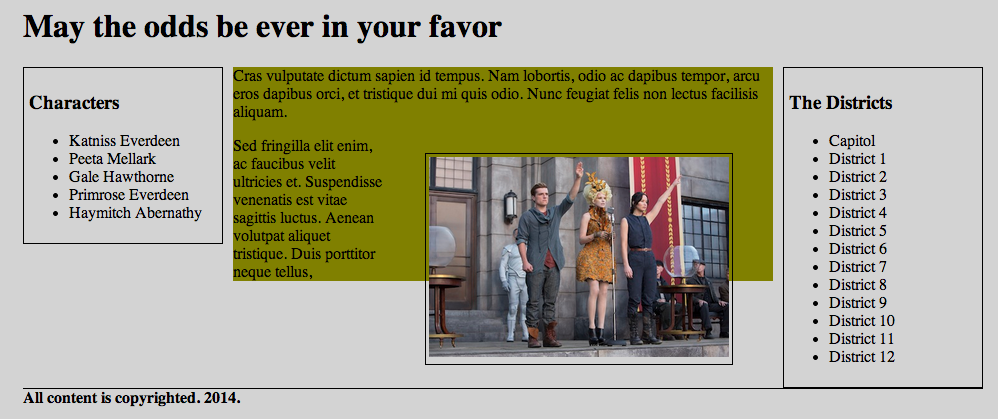
container has a background color or border. In our
ongoing Hunger
Games example, we changed the background color of
the section element to olive, so that now you can see, in
the screenshot below, that the floating element (the figure) had come out of
its container (the section). It had always been outside its container,
but we just hadn't noticed.
There are several solutions to this problem, but we will show the two simplest.
- Add an element at the bottom of the container, in order to use
clear. In
our solution
using clear, we added a
<br class="clear">element before the end of the section and a CSS rule for itbr.clear {clear: both;}. - Use a dedicated CSS property for the container
element,
overflow: hidden;. Here is again solution using overflow hidden. While this CSS property works very well, its name can be confusing, since the effect is not to hide the overflow (the floated element that sticks out), but instead it enlarges the containing element so that the floated element no longer sticks out.
Positioning Elements on Page
At the beginning of these notes we mentioned that floats are the most used technique for designing layouts. However, there is another technique, positioning, which has its good uses in particular situations.
We achieve positioning of elements through the
property position, which can take these values:
- absolute
- relative
- fixed
- static (this is the default value)
The values absolute and fixed are very similar in their syntax (though they create different effects) and more easy to understand. The value relative is a bit more tricky, because its meaning is not in par with how we use the word in everyday language. To explain these values, we will show in the following an example for each. You should look at the HTML and CSS files of each example to better understand what is going on.
position: absolute
We can use this style to set an element in a desired location in the
page, by additionally specifying a horizontal and vertical position
using the
properties left, right, top,
and bottom. These properties specify the distance (in
pixels or some other units) from the
(0,0) coordinates of some reference container. Usually, the reference
container is the viewport (top-left corner of the browser
viewing area).
To see this in action we have
a modified
version of our Hunger Games example, and we will try to position
the figure to some other location, as shown in
this styled
version of the example.
This effect was achieved with this CSS code:
figure {
  position: absolute;
  top: 350px;
  left: 500px;
  border: 1px black solid;
  padding: 3px;
}
Notice how the figure lays on top of the text. This is because by becoming absolute, the other elements are not aware of it anymore, so they cannot flow around it. Additionally, try to resize your browser window. The placement of the figure doesn't change.
position: relative
Suppose we want to put a caption on the figure, sitting on top of it, instead of below it. In this case, we will need to use the relative position. However to achieve this, we need to do two things:
- Declare which is the element relative to which this positioning is going to happen. This is the reference container that we mentioned in the previous section.
- Declare as absolute the element we want to position, and specify its coordinates relative to the reference container.
This new example, creates a caption over the figure with the following code:
figure {
  position: relative;
  border: 1px black solid;
  padding: 3px;
  width: 400px;
}
figcaption {
  position: absolute;
  bottom: 15px;
  left: 4px;
  right: 4px;
  color: yellow;
  background-color: black;
  opacity: 0.5;
  text-align: center;
  font-weight: 200%;
  padding: 5px;
}
So, the bottom and left lengths in
the figcaption are measured from the upper left of
the figure, not from the window.
position: fixed
This positioning is very similar to the absolute one, with
the difference that the element remains in its position all the time,
while the rest of the page scrolls up and down. You can think of it as
positioning relative to the screen. It is useful for fixing
navbars or sidebars in one position. See how the aside
element remains fixed
in our
example, with the code below:
aside {
  position: fixed;
  top: 80px;
  border: 1px black solid;
  padding: 5px;
  width: 188px; /* this value will make sure the sidebar box will occupy 200px */
}