AM4: Wellesley Course Browser
Overview
For AM4 (Achievement Milestone 4), students worked in teams to reimagine the Wellesley Course Browser website. The requirements were the following:
- The data would come from a Google Spreadsheet feed that was refreshed constantly (just like the Courses page is updated).
- The user interface needed at least three different ways to search for courses, with at least a combination of two fields.
- A user could select courses and then add them to their Google Calendar.
There were several challenges to master in order to complete the task successfully:
- How to clean and organize the data from the Google spreadsheet feed?
- How to design the user interface to make it easy to search?
- How to filter courses based on two or more search options?
- How to add events on the current week and in a separate, dedicated calendar.
Below are screenshots and links to the teams' solutions.
Team 1: Clara, Clare, Sophia
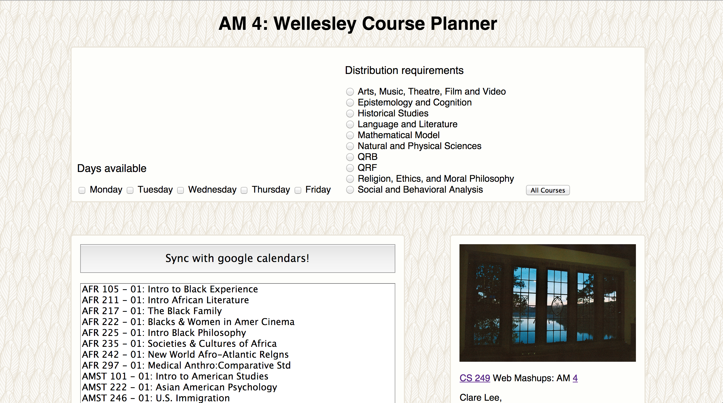
Some nice features:
- The interface is immediately responsive, you make a choice and can see the results updating.
- The button "All Courses" unselects all choices and goes back to displaying all courses.
- Aesthetically, the interface looks good with the background image, the images and layout.
Things to try to improve:
- Selecting two things (requirement and day) seems to add more courses as opposed to excluding them.
- When one clicks "Add course to calendar" without selecting a course, the code tries to do the operation and shows an error in the console.
- Trying to add a course shows a message that it was added,
but the calendar doesn't show it.The date is hard-coded, so one needs to go back to find the week.
Team 2: Meridian, Ella, Lee
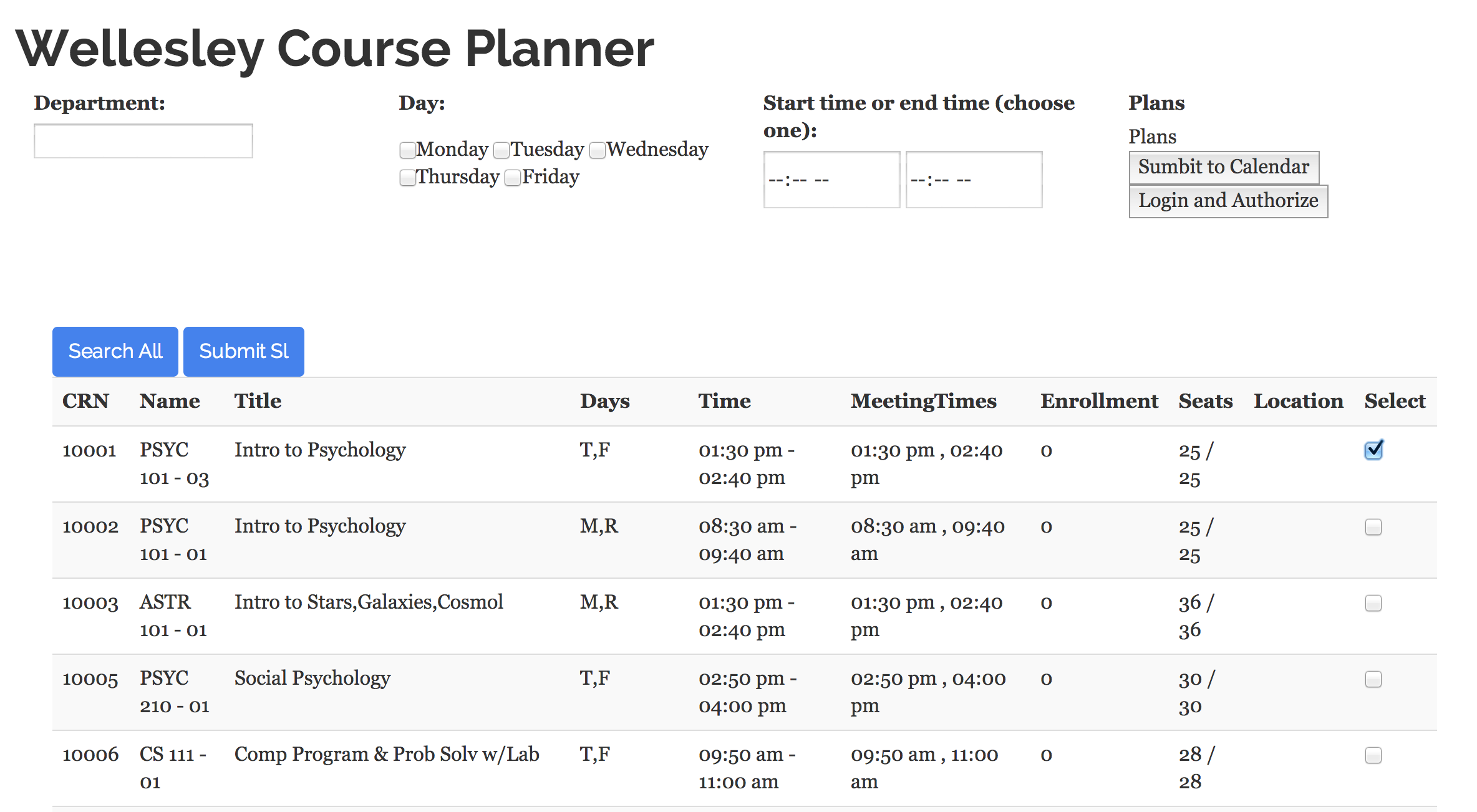
Some nice features:
- The course information is displayed in a table that contains most of the information about a course.
- The calendar code creates a new calendar if one doesn't exist.
- There is a button that can delete the calendar when the planning ends.
Things to try to improve:
- Filtering based on any of the three criterias seems to have no effect on the displayed courses.
- Adding events to the calendar doesn't display them on the calendar, despite refreshing (it looks like the button is doing nothing).
- The two buttons "Submit to Calendar" and "Add to Calendar" confuse which to use.
Team 3: Priscilla, Chimuanya, Jamie
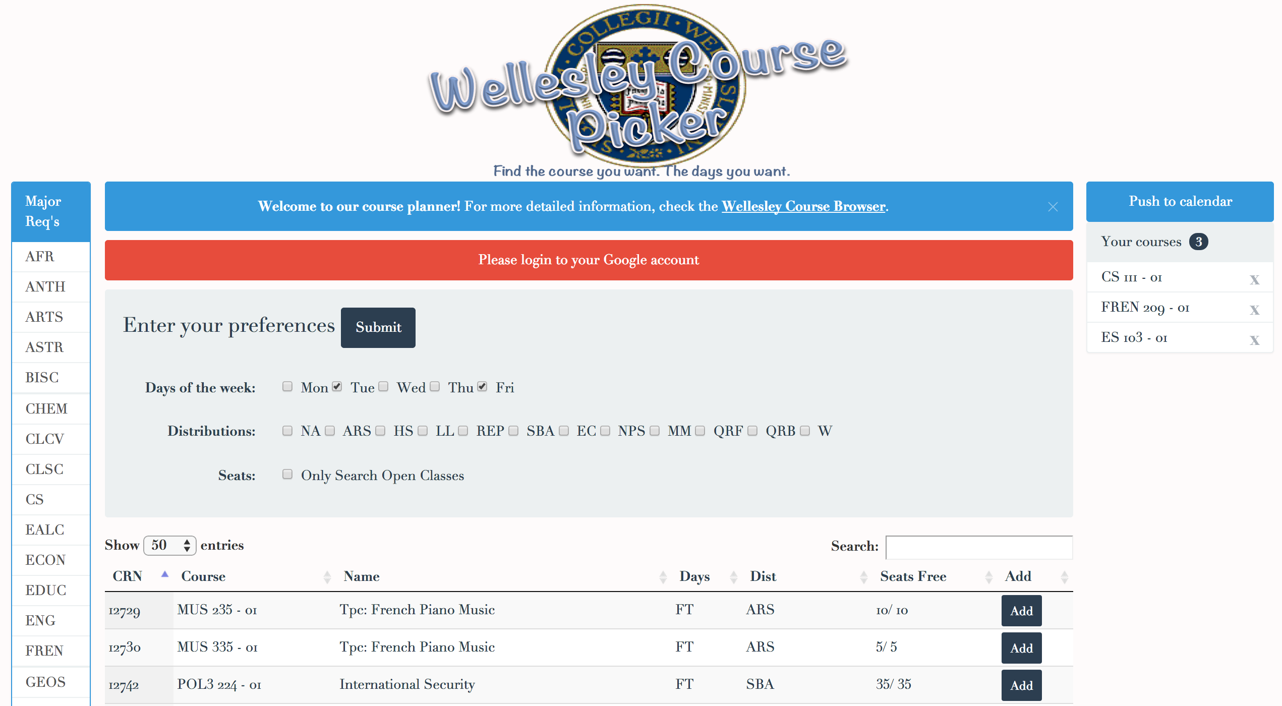
Some nice features:
- Courses are added to a separate calendar on the current week. The calendar window is opened when all courses are added.
- Uses a table plugin that shows the results paginated and has search capability.
- The interface: hiding the divs with instructions, links to departments, remove chosen courses, colorful buttons (red changes to green).
Things to try to improve:
- The "Submit" button is located above the search options, it's more natural to be below them.
- The information about the number of found courses is more useful at the top than at the bottom of the table.
- The acronyms for the distributions might be hard to understand (maybe have a tool-tip that display the full name).
Team 4: Lucy, Jessica B., MR
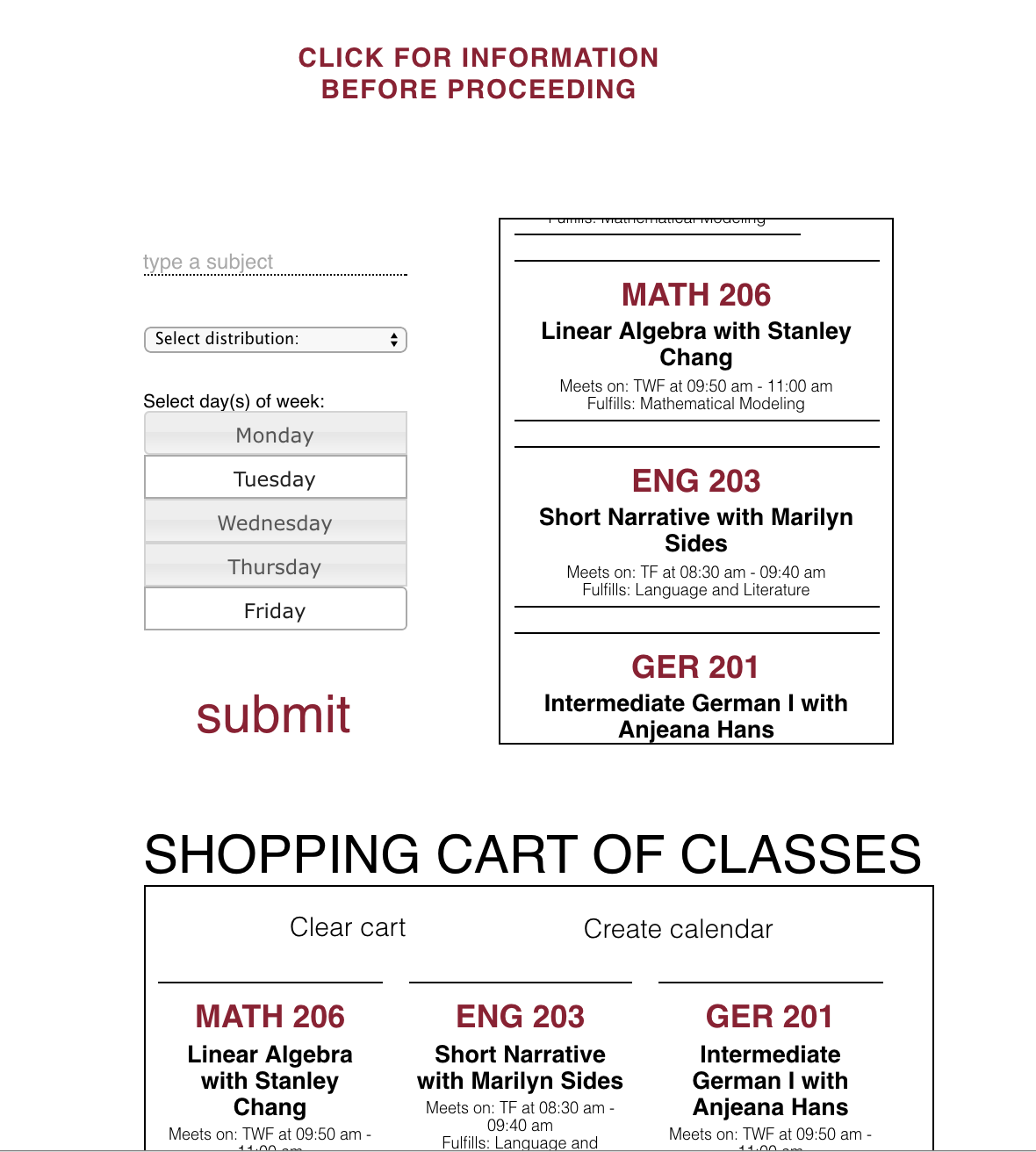
Some nice features:
- The filtering based on the different search criteria works great and it allows a combination of all three search criteria.
- Displaying all the course information for a course (though removing the section number is problematic).
- Being able to remove either all courses or single courses from the shopping cart.
Things to try to improve:
- The calendar functionality has not been combined yet with the app. Update: Calendar works: creates new calendar and adds events, but misses one of the meetings.
- White space is nice, but the shopping cart is not visible while adding courses, so rearranging the page to show its content without scrolling down would be useful.
- Show the number of found courses after submitting the search criteria.
Team 5: Susie, Diana, Audrey
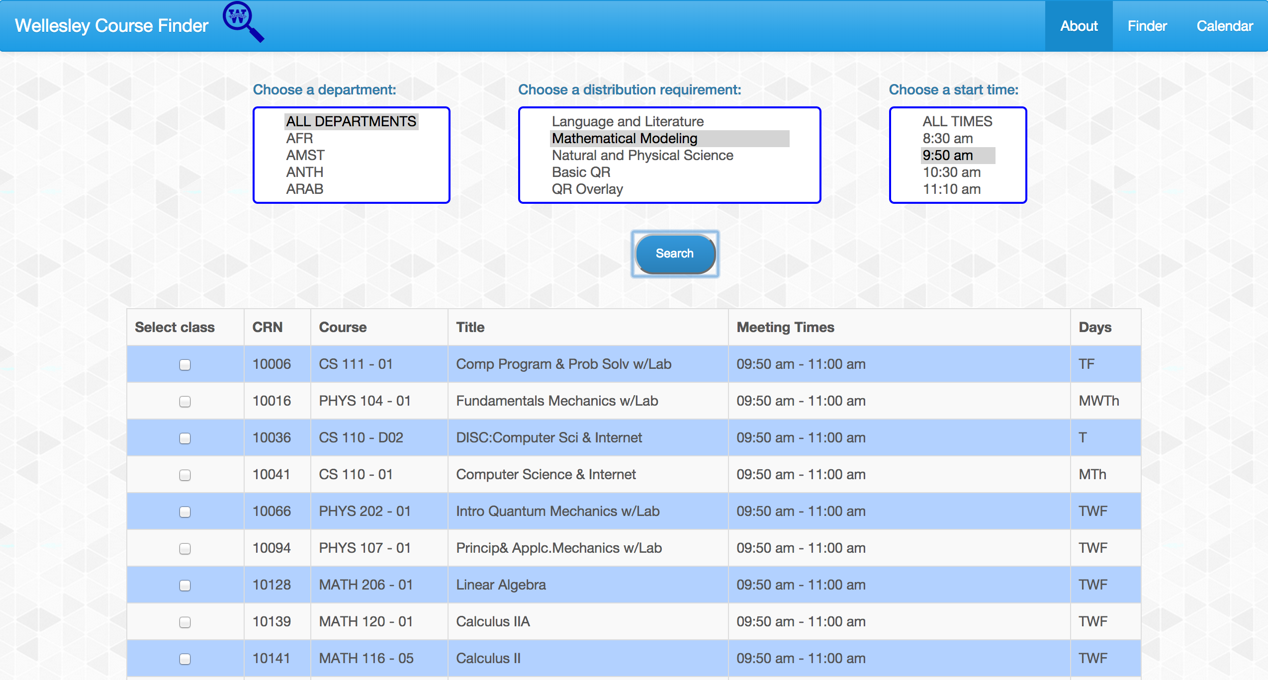
Some nice features:
- The filtering based on each search criteria works great as well as the combination of all criteria.
- Events are successfully added to the calendar (in the primary).
- Interface with three tabs, nice background and logo, and table presentation of most information.
Things to try to improve:
- There are several buttons showing up at once, maybe only shown them when needed.
- Instead of showing one alert after adding each course, show only one at the end.
- Show the number of found courses after submitting the search criteria.
One Solution
Here is a solution that is constantly responsive to user choices, filters by combining all the search fields, and adds all events in the current week in a separate calendar.
Part 1: Choose courses.
Part 2: Add to Calendar.