D3.js Tutorial 2 - Working with Data
Tutorial Material
This tutorial was prepared by Wellesley student, Lucy Shen '17, while she was learning D3.js, using the book D3.js in Action. Lucy took examples that appeared in the book, broke them into pieces, in the style of labs we have in our CS courses and added additional information and questions to facilitate understanding.
Concept Overview

When working with data through D3, this is the basic workflow, assuming that you have a dataset and you want to create (and possibly update) an interactive or dynamic data visualization. In this tutorial, we will be using a small dataset of some made-up Twitter tweets.
Task 0 - Preparing the files
Base HTML file:
<html>
<head>
<script src="http://d3js.org/d3.v3.min.js"></script>
</head>

<body>
  <div id="infovizDiv"></div>
  <svg width="510" height="510" style="border: 1px solid gray"><svg>
  <script>
  </script>
</body>
<html>
The JSON file that we'll be working with can be found here: tweets.json (you can right-click to save it on your desktop). Some of the examples use the file cities.csv, download that as well.
Task 1 - Loading the Data
In lecture you saw the process of data binding with small arrays of data. Usually, you
will have external data stored in files. D3 offers several functions for loading data of different formats:
d3.text(), d3.xml(), d3.json(), d3.csvt(), and
d3.html().
In this example, we’ll be using d3.json(). To call the function,
declare the path to the file you want to load and
define a callback function to receive the data from the file.
Let’s start with a simple example. Upload your HTML and JSON files to the CS server, open the console on the HTML page, and type the following code in. What do you expect it to do?
d3.json("tweets.json",function(data) {console.log(data)});
Task 2 - Formatting the Data
Now that you have your data loaded, think about how you would like to present it. What kind of a table or chart or other visualization did you have in mind, and how can you create that through code? Here are a few tools you can use to help you handle the data:
Casting - changing one data type into another
Loaded data is automatically a string. To change it to any other type, use JavaScript functions that allow you to transform data. Some examples:
- parseInt("77")
- parseFloat("3.14")
- Date.parse("Sun, 22 Dec 2014 09:00:00 GMT")
- text = "alpha, beta, gamma"; text.split(",")
Scaling - d3.scale().linear()
Scaling helps to normalize data for easier presentation. For instance, datasets with outliers or drastic differences between their minimums and maximums can be scaled so that values still have meaningful size and shape differences, depending on your medium of visualization.
Let’s take a look at one possible scale, d3.scale().linear(). Say we have a dataset that documents the populations of a list of 10 different cities. If we wanted to visualize this data as a bar graph on a 500px-wide canvas, we could take the smallest population (e.g.500,000) and the largest population(e.g. 13,000,000) and create a ramp that scales from smallest to largest. You would see the same linear rate of change from 500,000 to 13,000,000 being mapped to a linear rate of change from 0 to 500.
Here’s how you create the ramp:
var sizeRamp = d3.scale.linear()
    .domain([500000,13000000])
    .range([0, 500]);

sizeRamp(1000000);
sizeRamp(9000000);
sizeRamp.invert(340);
sizeRamp(1000000) would return 20.
This means that you would place a city with a population of 1,000,000 at 20px, according to this scale.
- What does
sizeRamp(9000000)return? .invert()reverses the transformation. What doessizeRamp.invert(340)return?
You can also create color ramps. Here’s an example of one:
var colorRamp = d3.scale.linear()
    .domain([500000,13000000])
    .range(["blue", "red"]);

colorRamp(1000000);
colorRamp(9000000);
colorRamp.invert("#ad0052");
What do you think each of the statements returns*?
Note: the .invert() function only works with a numeric range, so this case would return NaN (Not a Number)
Categorizing - d3.scale.quantile()
Use this function to place values into “bins” or categories by splitting the array into equally-sized parts. The scale sorts the values in its .domain() from smallest to largest and splits the values at appropriate points to create the necessary categories.
var sampleArray = [423,124,66,424,58,10,900,44,1];
var qScale = d3.scale.quantile()
    .domain(sampleArray)
    .range([0,1,2]);

qScale(423);
qScale(20);
qScale(10000);
qScale(423) returns 2. What do qScale(20) and qScale(10000) return?
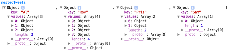
Nesting - d3.nest()
The basic idea behind nesting is that data can be represented hierarchically. Shared attributes of data can be used to sort them into separate categories and subcategories. If were to group the tweets in tweets.json, for instance, here’s one way we could do it:
var tweetData, nestedTweets;

d3.json("tweets.json",function(data) {
    tweetData = data.tweets;
    nestedTweets = d3.nest()
        .key(function(d) {return d.user})
        .entries(tweetData);
})
This would combine the tweets into arrays under new objects labeled by the "user" attribute values.
Measuring
To derive information on your dataset such as the maximum, minimum, and mean, we use the following functions: (enter them one by one in the console, to see the result for each)
//working with an array of numbers
var testArray = [88,10000,1,75,12,35];
d3.min(testArray, function (el) {return el}); //returns 1
d3.max(testArray, function (el) {return el}); //returns 10000
d3.mean(testArray, function (el) {return el}); //returns 1701.833

//working with a JSON object array or CSV data file
d3.csv("cities.csv", function(data) {
    console.log("min: ", d3.min(data, function (d) {return d.population}));
    console.log("max: ", d3.max(data, function (d) {return d.population }));
    console.log("mean: ", d3.mean(data, function (d) {return d.population}));
});

//d3.extent() returns min and max in a 2-piece array
d3.extent(testArray, function (d) {return d;});
What do you expect that last line to return?
Task 3 - A Basic Bar Graph
Let's turn our attention to our Tweets visualization problem now. Our plan is to create a bar chart of number of tweets per user.
Step 1:
Load the data.
d3.json("tweets.json", function(data) {dataViz(data.tweets)});
Remember, the d3.json() function expects as arguments a filename and a callback function.
You can also notice that instead of processing the data inside the callback function,
we have a defined a new function that will be shown in Step 2.
Step 2:
Define the function the will format the data
function dataViz(incomingData) {
    var nestedTweets = d3.nest()
       .key(function(d) {return d.user})
       .entries(incomingData);
}
In the above code, we are specifying a variable nestedTweets to store the nested data.
If you are confused about the operator .nest() you should look at the
API documentation,
which also explains .key() and .entries().
Note: Any code in the steps below this one all go within the dataViz
function, not outside of it! Why do you think this is necessary?
Step 3:
Measure the data and set up a scale.
// add within the body of "dataViz" function

// Step 3: Measure and scale
nestedTweets.forEach(function(d) {
  d.numTweets = d.values.length; // add a new property to each object
});

var maxTweets = d3.max(nestedTweets, function(d){return d.numTweets});
var yScale = d3.scale.linear().domain([0,maxTweets]).range([0,500]);
Looping through each datum in the nestedTweets variable,
we count the number of tweets for each user and store it as a new
property called numTweets.
What are the maxTweets and yScale variables doing?
Step 4:
Add the rectangles.
d3.select("svg")
    .selectAll("rect")
  .data(nestedTweets)
    .enter()
    .append("rect")
      .attr("width", 100) // fixed value for each bar width
      .attr("height", function(d) {return yScale(d.numTweets)})
      .attr("x", function(d,i) {return i*110}) // fixed start for a bar box
      .attr("y", function(d) {return 500 - yScale(d.numTweets)})
      .style("fill","blue")
      .style("stroke","red")
      .style("stroke-width","1px").style("opacity",.25);
This code makes use of the data join concept you learned in lecture. After
binding the data to the elements "rect", the code will execute the .enter()
subselection, because we don't have any rectangle elements yet in the SVG.
.enter() will create placeholder nodes for each element in the .data(nestedTweets)
and .append() them to the SVG. To each node, the attributes and styles
calculated by the .attr() and .style() operators will be applied.
Upload your file to the CS server and take a look at it. Is the result what you would expect?
Solution for bar chart example.
Task 4 - Scatterplot
Let's wipe the slate clean and try a different visualization with the same dataset. This time, we will create a scatter plot where the size of a dot will indicate the "impact" of a tweet, as measured by the sum of the retweets and favorites it has received.
You can make a copy of your file, delete the code from the script tag and start entering the excerpts below.
Step 1:
Load the data (exactly the same as the previous data loading!)
d3.json("tweets.json",function(data) {dataViz(data.tweets)});
Step 2:
Measure the data and set up some scales and ramps.
function dataViz(incomingData){
    incomingData.forEach(function(d){
        d.impact = d.favorites.length + d.retweets.length;
        d.tweetTime = new Date(d.timestamp); //
    })

    var maxImpact = d3.max(incomingData, function(d) {return d.impact});
    var startEnd = d3.extent(incomingData, function(d) {return d.tweetTime});
    var timeRamp = d3.time.scale().domain(startEnd).range([20,460]);
    var yScale = d3.scale.linear().domain([0, maxImpact]).range([0,430]);
    var radiusScale = d3.scale.linear().domain([0, maxImpact]).range([1,40]);
    var colorScale =
        d3.scale.linear().domain([0, maxImpact]).range(["white","#990000"]);
}
Each element in the data gets new properties: impact (an integer) and tweetTime (Date object), both retrieved from the data itself.
maxImpactstores the largest impact of a tweet (an integer).startEndis an array with the minimum (earliest) tweetTime and maximum (latest) tweetTime.timeRampis a scale for tweetTimes.yScale, radiusScale, and colorScaleare scales for impact.
Based on these ramps, what do you think this scatter plot is going to look like?
What is on the x-axis, and what is on the y-axis?
What is the significance of the radius and color of each plotted point?
Step 3:
Make the pretty pictures happen!
Before plugging in the code below, read it through and see if you can guess what the data is likely to look like. This isn’t just a simple scatterplot, of course. How are we utilizing the ramps and scales created in the previous steps to make this scatterplot more interesting and tell us more information than a normal scatterplot?
d3.select("svg")
    .selectAll("circle")
    .data(incomingData)
    .enter()
    .append("circle")
    .attr("r",function(d) {return radiusScale(d.impact)})
    .attr("cx",function(d,i){return timeRamp(d.tweetTime)})
    .attr("cy", function(d) {return 480-yScale(d.impact)})
    .style("fill", function(d) {return colorScale(d.impact)})
    .style("stroke","black")
    .style("stroke-width","1px")
Solution of the scatter plot for the Tweets data.