Intro to Visualization
The greatest value of a picture is when it forces us to notice what we never expected to see.
A tour of interesting visualizations
We will start with a tour of some interesting and useful visualizations, which can serve as inspiration.
- The OECD Better Life index. Use the sliders on the right side to increase the importance of a topic and watch what happens. Switch view to display countries by rank, instead of alphabetically. Hover over the flowers to watch details for each country. Scroll down and choose "Mapping well-being", by clicking on "Explore the map". Allow the app to get your location (it's using the HTML5 Geolocation api to do that) and see the data about Massachussets. Choose your state in the map. Explore to your wish.
- Anscombe's Quartet. A powerful example that shows why we need to visualize data and not rely on summary statistics. (Visualization as a discovery tool)
- The Wind Map - a real-time, interactive visualization of wind in the USA. By Ferndanda Viegas and Martin Wattenberg. It is an example of how "function and form" can go together instead of prioritizing one over the other.
- Literary Organism - a static visualization of the "On the Road" (Part 1) book. Created by Stefanie Posavec.
- Visualizing the MBTA data - an interactive exploration of Boston's subway system, by Mike Barry and Brian Card.
Data Visualization
Creating useful data visualizations is not easy. It requires many skills and a lot of practice. Routinely, you might need knowledge from multiple disciplines, such as: cognitive science, statistics, graphic design, cartography, and computer science. As such, we can say that visualization lies at the intersection of art and science.
Cognitive science role can be seen in the Gestalt Principles of visual perception, a theory advanced by the Gestalt School of Psychology. Some of these principles are similarity and proximity that allow us to organize visual elements. These are important for people who visualize data, in order to minimize the amount of mental effort a user needs to perform in order to figure out the meaning of a visualiation. This is why the common definition of visualization is related to the insights of cognitive science. Here is a common definition:
The representation and presentation of data that exploits our visual perception abilities in order to amplify cognition.
If we were to break down this definition into its parts:
- Representation: what physical forms we're using: bars, lines, dots, etc.
- Presentation: colors, annotations, interaction, etc.
- Visual perception abilities: how eyes and brain process information, pattern recognition, spatial reasoning, etc.
- Amplify cognition: move from information to insights and knowledge.
Useful reading resources
The Web is full of wonderful resources that can enlighten use more on visualization. Here are just a few samples. If you come across some other resource you find useful, please let me know to add it here.
- Data Visualization for Human Perception (book chapter)
- Visual Representation (book chapter)
- The 8 Hats of Data Visualization Design. Slides by Andy Kirk.
- Emotion and Design: Attractive Things work better. An essay by Don Norman, the author of the acclaimed The Design of Everyday Things.
Visualization Design Objectives
Here ares some established guidelines followed during the design process. They come from the book "Data Visualization: A Successful Design Process" by Andy Kirk.
- Strive for form and function. This is part of the old debate: style over substance, is one more important than the other? One should strive to find a balance between both. People are more tolerant of beautiful things that don't work well, but they also get attached to things who are very useful, despite their appearance. Read the work of Don Norman (see links above) to learn more about how are emotions influence our choices. The WindMap animation we saw at the beginning is an example of something both beatiful and very informative. However, if you are just starting in the field of visualization, start with functionality first (build the house), and then enhance its form (decorate the house).
- Justify the selection of everthing you do. Just because we can do certain things (add shadows, make 3-D bar charts, have fancy animations, etc.), that doesn't mean we have to do it. The guiding principle should be: what does this add to the visualization, is it necessary? Everything that you do should be planned and have a reason. Challenge your decisions. Constantly ask yourself, why am I using this color, this shape, this animation, and so on. The Literary Organism visualization we saw above is an example where every visible property is used to communicate data. Visualization should not be a platform to showcase technical competence.
- Creating accessibility through intuitive design. Intuitive design is very difficult. Think of how difficult is sometime to figure out how to open a door (push or pull). The same applies to designing visualization. If we are making the users think very hard simply to understand how to interpret something, we have failed. That doesn't mean that we should avoid novelty and only stick to old and established means. The novelty is often something that will draw the user in. But, make the user's effort worthwhile. Once they understand your design, reward them with insights. Don't use complex visualization for conveying simple information. The work of Edward Tufte gives a comprehensive overview into accessible designs and how often, less is more.
- Never deceive the receiver. You might have heard at some point in your life the phrase Lies, damned lies, and statistics. It is possible to lie and deceive with visualization too. Sometimes this might be unintentional, because of optical illusion, but in other occasions it can be done in purpose. Especially our political views and other life choices can bias our work. As an example, consider this article that dissects visualizations about the politically divise debate "pro-life" vs. "pro-choice". There is ethics to visualization, and it's important to question not only our technical reasons for the design choices, but our motivations too.
Purpose of Visualization
When people create visualization, their intentions are different. Below is a list that summarizes some of them.
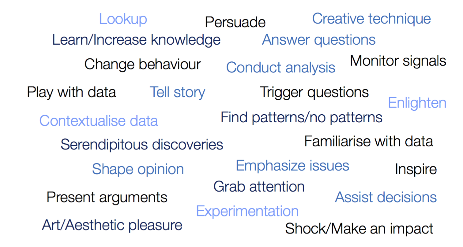
The above-shown phrases can be clustered in three categories that can convey the purposes of visualization:
- Convey an explanatory portrayal of data to a reader. Explanatory visualization has a specific and focused narrative, it's telling a story. The users don't have to do much work, the designer has synthesized information in a concise way for them. An example is the infographic about water consumption shown below, which appeared in the article Which nations consume the most water?
- Provide an interface to data in order to facilitate visual exploration. This is different from the explanatory function, because it doesn't have an immediate story to tell, the users are invited to draw their own conclusions and reason about the data with the help of the interface. One can see the difference also as a function of who is doing the discovery work. In explanatory visualization, the work is done by the creator. In the exploratory visualization, the work is done by the user. As an example, see this scatterplot interactive visualization, which displays a technique known as linking and brushing. You can select a region of points in one plot and see the view of that data in all other plots.
- Use data as an exhibition of self-expression. This is a more rare function of visualization, also known as data art. The author doesn't want to explain or convince or help the user understand a topic, she is more interested in the creation aspect, the deliberate act of creating an artifact for aesthical pleasure. An example would be this visualization of all adjectives used in the novel "The Road". The Literary Organism we saw above is another one. You can find more at this website that collects "data art".

Reflection Post
One of your reflection posts for this week is about visualization and its effective use. Find and describe a visualization that has affected you (positively or negatively) and try to analyze it based on the principles we discussed in these notes, in terms of design objectives (form vs. function, justification, accessability, ethics) and purpose (explanatory, exploratory, or exhibition).
Deadline: End of week (March 15).