Trails of Propagation
Network Visualizations
One of the focuses of the Trails lab is visualizing social media data for human consumption. The massive amounts of data generated during events or through trending topics are too large to be easily navigated or consumed by a human, so we turn to visualizations to order the data in some comprehensible form. The following are graphs of networks from various events and topics on Twitter. Nodes in these graphs may represent Twitter accounts, tweets or hashtags, and edges co-occurences or manual connections made by users.
The thumbnail images link to interactive version of the visualizations.
 A graph of the co-occurencce of the 1,500 most used hashtags in the masen2010 dataset.
The nodes represent the hashtags, and edges between the nodes represent the two hashtags
being used together in a tweet.
A graph of the co-occurencce of the 1,500 most used hashtags in the masen2010 dataset.
The nodes represent the hashtags, and edges between the nodes represent the two hashtags
being used together in a tweet.
MASEN2010: Friendship of Vocal Users
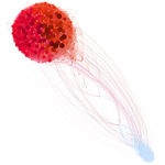 A graph of the friendship network of the 500 most vocal users in the masen2010 dataset.
The nodes represent the vocal users, and edges a mutual following relationship between the nodes.
The colors on the graph represent the three detected modularity classes, one of which is made up
of a small group of liberal accounts, while the other two are conservative accounts.
A graph of the friendship network of the 500 most vocal users in the masen2010 dataset.
The nodes represent the vocal users, and edges a mutual following relationship between the nodes.
The colors on the graph represent the three detected modularity classes, one of which is made up
of a small group of liberal accounts, while the other two are conservative accounts.
MASEN2010: Retweet Network of Vocal Users
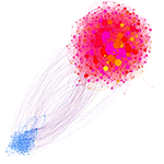 A graph of the retweeting network of the 500 most vocal users in the masen2010 dataset. The nodes
represent the vocal users, and an edge between User A and User B represents User A retweeting User
B. The colors on the graph represent the detected communities, one of which is made up of a small
group of liberal accounts, while their are six among the conservative accounts.
A graph of the retweeting network of the 500 most vocal users in the masen2010 dataset. The nodes
represent the vocal users, and an edge between User A and User B represents User A retweeting User
B. The colors on the graph represent the detected communities, one of which is made up of a small
group of liberal accounts, while their are six among the conservative accounts.
WIP: Retweet Graphs of the Most Retweeted Tweets
 A graph showing the retweeting spread of the most retweeted tweets in the 2010 dataset. The nodes
represent tweets, and are colored by the political orientation of the tweeting account (red for
conservative, blue for liberal, grey for neutral). The edge color represents whether a tweet was unmodified
(green), modified by adding hashtags or mentioning users (orange) or modified (purple).
A graph showing the retweeting spread of the most retweeted tweets in the 2010 dataset. The nodes
represent tweets, and are colored by the political orientation of the tweeting account (red for
conservative, blue for liberal, grey for neutral). The edge color represents whether a tweet was unmodified
(green), modified by adding hashtags or mentioning users (orange) or modified (purple).
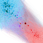
 A graph showing the co-retweeting patterns of the 1,500 most retweeted users in the 2012 Massachusetts Senate
Election dataset. Two users are connected in the graph if they have both been retweeted by another user. The
colors in the graph represent the different communities.
A graph showing the co-retweeting patterns of the 1,500 most retweeted users in the 2012 Massachusetts Senate
Election dataset. Two users are connected in the graph if they have both been retweeted by another user. The
colors in the graph represent the different communities.
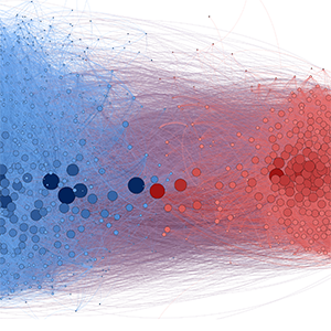 This graph visualizes the co-retweeting patterns during the
2nd presidential debate. Two accounts are co-retweeted when at least one user has retweeted both of them. The
nodes in the graph represent the top 1,500 most retweeted accounts during the debate, and the edges indicate
that these two accounts have been co-retweeted. The edge weight is based on the number of users retweeting both
nodes. The layout of the graph is based on Gephi's Force Atlas algorithm, in which two nodes are attracted to
each other if they have an edge between them. The size and darkness of the node's color represent the calculated
Eigenvector Centrality of that node, which ranks nodes by their influence in the network. The colors of the nodes
(red or blue) are based on the Modularity algorithm, which finds communities within the graph. Nodes in the same
modularity group are more closely connected to each other than to other nodes in the network
This graph visualizes the co-retweeting patterns during the
2nd presidential debate. Two accounts are co-retweeted when at least one user has retweeted both of them. The
nodes in the graph represent the top 1,500 most retweeted accounts during the debate, and the edges indicate
that these two accounts have been co-retweeted. The edge weight is based on the number of users retweeting both
nodes. The layout of the graph is based on Gephi's Force Atlas algorithm, in which two nodes are attracted to
each other if they have an edge between them. The size and darkness of the node's color represent the calculated
Eigenvector Centrality of that node, which ranks nodes by their influence in the network. The colors of the nodes
(red or blue) are based on the Modularity algorithm, which finds communities within the graph. Nodes in the same
modularity group are more closely connected to each other than to other nodes in the network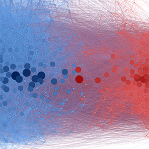 This graph visualizes the co-retweeting patterns during the
3rd presidential debate. Two accounts are co-retweeted when at least one user has retweeted both of them. The
nodes in the graph represent the top 1,500 most retweeted accounts during the debate, and the edges indicate
that these two accounts have been co-retweeted. The edge weight is based on the number of users retweeting both
nodes. The layout of the graph is based on Gephi's Force Atlas algorithm, in which two nodes are attracted to
each other if they have an edge between them. The size and darkness of the node's color represent the calculated
Eigenvector Centrality of that node, which ranks nodes by their influence in the network. The colors of the nodes
(red or blue) are based on the Modularity algorithm, which finds communities within the graph. Nodes in the same
modularity group are more closely connected to each other than to other nodes in the network
This graph visualizes the co-retweeting patterns during the
3rd presidential debate. Two accounts are co-retweeted when at least one user has retweeted both of them. The
nodes in the graph represent the top 1,500 most retweeted accounts during the debate, and the edges indicate
that these two accounts have been co-retweeted. The edge weight is based on the number of users retweeting both
nodes. The layout of the graph is based on Gephi's Force Atlas algorithm, in which two nodes are attracted to
each other if they have an edge between them. The size and darkness of the node's color represent the calculated
Eigenvector Centrality of that node, which ranks nodes by their influence in the network. The colors of the nodes
(red or blue) are based on the Modularity algorithm, which finds communities within the graph. Nodes in the same
modularity group are more closely connected to each other than to other nodes in the network
 This graph visualizes the co-retweeting patterns during
the 2013 State of the Union Address. Two accounts are co-retweeted when at least one user has retweeted both of them.
The nodes in the graph represent the top 1,500 most retweeted accounts during the debate, and the edges indicate that
these two accounts have been co-retweeted. The edge weight is based on the number of users retweeting both nodes. The
layout of the graph is based on Gephi's Force Atlas algorithm, in which two nodes are attracted to each other if they
have an edge between them. The size and darkness of the node's color represent the calculated Eigenvector Centrality
of that node, which ranks nodes by their influence in the network. The colors of the nodes (red or blue) are based on
the Modularity algorithm, which finds communities within the graph. Nodes in the same modularity group are more closely
connected to each other than to other nodes in the network.
This graph visualizes the co-retweeting patterns during
the 2013 State of the Union Address. Two accounts are co-retweeted when at least one user has retweeted both of them.
The nodes in the graph represent the top 1,500 most retweeted accounts during the debate, and the edges indicate that
these two accounts have been co-retweeted. The edge weight is based on the number of users retweeting both nodes. The
layout of the graph is based on Gephi's Force Atlas algorithm, in which two nodes are attracted to each other if they
have an edge between them. The size and darkness of the node's color represent the calculated Eigenvector Centrality
of that node, which ranks nodes by their influence in the network. The colors of the nodes (red or blue) are based on
the Modularity algorithm, which finds communities within the graph. Nodes in the same modularity group are more closely
connected to each other than to other nodes in the network.
 On Feb 15th, 2012, the hashtag #ThoughtsInClass
was trending in the US, of which we collected 90,000. The graph is of the co-retweeting behavior in the hashtag. The nodes
in the graph represent the top 1,500 most retweeted accountsfrom the hashtag, and the edges indicate that these two accounts
have been co-retweeted. The edge weight is based on the number of users retweeting both nodes. The layout of the graph is based
on Gephi's Force Atlas algorithm, in which two nodes are attracted to each other if they have an edge between them. The size
and darkness of the node's color represent the calculated Eigenvector Centrality of that node, which ranks nodes by their influence
in the network. The colors of the nodes (red or blue) are based on the Modularity algorithm, which finds communities within the graph.
Nodes in the same modularity group are more closely connected to each other than to other nodes in the network.
On Feb 15th, 2012, the hashtag #ThoughtsInClass
was trending in the US, of which we collected 90,000. The graph is of the co-retweeting behavior in the hashtag. The nodes
in the graph represent the top 1,500 most retweeted accountsfrom the hashtag, and the edges indicate that these two accounts
have been co-retweeted. The edge weight is based on the number of users retweeting both nodes. The layout of the graph is based
on Gephi's Force Atlas algorithm, in which two nodes are attracted to each other if they have an edge between them. The size
and darkness of the node's color represent the calculated Eigenvector Centrality of that node, which ranks nodes by their influence
in the network. The colors of the nodes (red or blue) are based on the Modularity algorithm, which finds communities within the graph.
Nodes in the same modularity group are more closely connected to each other than to other nodes in the network.
 This graph is based on a dataset of tweets collected on
Valentines Day 2013, containing the words "valetine","v day" or "vday". The dataset contains roughly one million tweets The graph
is of the co-retweeting behavior among the top 1,500 retweeted users in the hashtag. The edges indicate that these two accounts
have been co-retweeted. The edge weight is based on the number of users retweeting both nodes. The layout of the graph is based
on Gephi's Force Atlas algorithm, in which two nodes are attracted to each other if they have an edge between them. The size
and darkness of the node's color represent the calculated Eigenvector Centrality of that node, which ranks nodes by their influence
in the network. The colors of the nodes (red or blue) are based on the Modularity algorithm, which finds communities within the graph.
Nodes in the same modularity group are more closely connected to each other than to other nodes in the network.
This graph is based on a dataset of tweets collected on
Valentines Day 2013, containing the words "valetine","v day" or "vday". The dataset contains roughly one million tweets The graph
is of the co-retweeting behavior among the top 1,500 retweeted users in the hashtag. The edges indicate that these two accounts
have been co-retweeted. The edge weight is based on the number of users retweeting both nodes. The layout of the graph is based
on Gephi's Force Atlas algorithm, in which two nodes are attracted to each other if they have an edge between them. The size
and darkness of the node's color represent the calculated Eigenvector Centrality of that node, which ranks nodes by their influence
in the network. The colors of the nodes (red or blue) are based on the Modularity algorithm, which finds communities within the graph.
Nodes in the same modularity group are more closely connected to each other than to other nodes in the network.
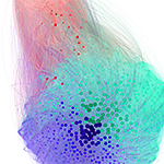
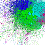
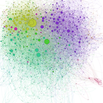
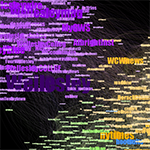 Graph of the Wellesley College friendship network. There are four
different communities detected by the modularity algoritm: The purple group contains official college accounts and professors from
Wellesley, the two green and orange groups contain celebrity and news accounts, the green predominantly local and the orange national,
and the blue group other colleges and education related accounts.
Graph of the Wellesley College friendship network. There are four
different communities detected by the modularity algoritm: The purple group contains official college accounts and professors from
Wellesley, the two green and orange groups contain celebrity and news accounts, the green predominantly local and the orange national,
and the blue group other colleges and education related accounts.