P2: Storyboards and Design Sketches
Scenarios
Scenario #1:
Today is Thursday and Emily's professor announced that their first Computer Science midterm is coming up next week. Emily immediately writes it down on her planner. Her midterm is next Thursday at 1:30pm. Emily writes in her planner that she must go back to her room and make a plan for the rest of the week. She also needs to review lectures from the first week to the fifth week.
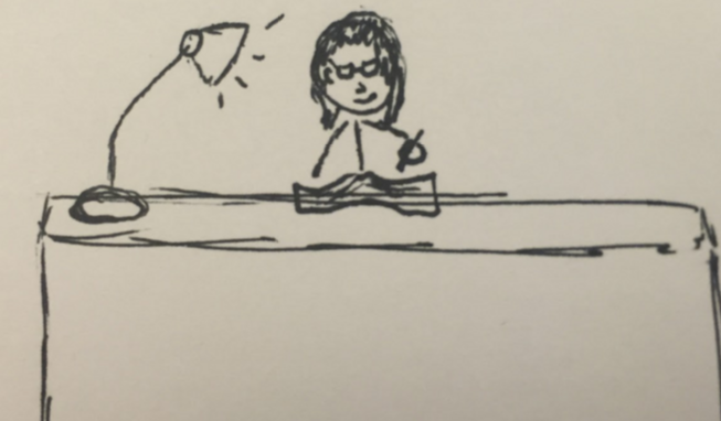
Class is dismissed. Emily walks back to her dorm room and sits down at her messy desk. Usually, she pulls out a blank sheet of paper and writes down a list of her tasks, but she remembers that recently downloaded PlanPal, a new productivity and planning app. She enters the due date for her midterm and selects the tasks she would like to do prior to the exam. She definitely wants to review all the slides from week 1 - week 5. She enters a task on PlanPal to find and collect all the class slides. Another task would be to collect all the previous problem sets (of which there are 5). The next thing on her list is to collect the solutions to all the problem sets. Emily is worried that she may miss some concepts or problems so she decides to visit her professor too and ask about any extra study guides or practice problems. Finally, she also checks off "do practice problems" and "review notes" before tapping the next arrow. PlanPal shows a suggested timeline for all of the tasks Emily selected, but she decides that wants to do all the paper collecting by tomorrow instead of 3 days from now and she only has time in her schedule to meet with her professor on Monday, so she makes some adjustments on the schedule. Finally, she taps Save. Emily's returned to the main screen, where she sees that her CS exam is now displayed.
Scenario #2:
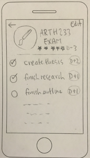
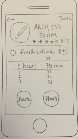
Ashna has a paper due on Gothic Architecture for her Art History class in 3 days. She made a plan using PlanPal last week, but has been busy doing other work since and hasn't logged any of the work she's already done. She opens the app and taps on the bar for her paper. She's already decided the topic of her paper, so she taps on the thesis button and then confirms that she's completed that subtask. The button changes color to indicate that it is now listed as complete. She's also finished with her research, so she taps on that button too and confirms. Ashna then sees that she's a day behind on writing her outline. She is concerned about having enough time to do two drafts, so she taps on the outline button with the intention of confirming that she's written an outline even though she hasn't. When she goes to confirm, however, she sees the note on the confirmation page reminding her how important making an outline is. She remembers someone telling her that making an outline will save her time in the long run, so Ashna decides to take 30 minutes to write one out right now. She taps the Get Started button, which launches the timer function. She sets the timer for 30 minutes and taps start. Ashna pulls out her laptop and gets to work.
Half an hour later, the timer goes off. She hasn't quite finished her outline, so she resets the timer for another 10 minutes. 8 minutes later, she ends the timer and notes in the app that she's finished the outline. She has no other tasks outstanding, so Ashna leaves the app and goes back to her room to take a nap. She's on schedule and deserves it.
Scenario 3:
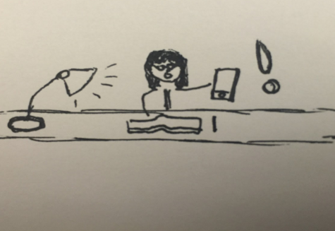
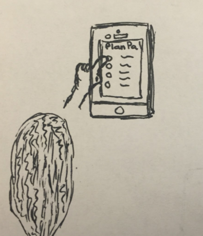
Dana has a midterm tomorrow in her Evolutionary Psychology class. Knowing that the professor has covered a lot of materials, she had wanted to start studying early, but she had too many assignments due this week that she couldn’t get started until now. She finds that she tends to do this every midterm and she wants to fix this study habit. She remembers that her friend was telling her about a new productivity app called PlanPal, which helps users plan out what they should do and helps them stay focused during their study sessions. Since she has to stay really productive today, she decides to download the app to help her stay focused. When she opens up PlanPal, it takes her through a brief tutorial that points out the important features of the application. Dana clicks on the new post button and decides to create a list of tasks she should go through tonight just so she has the list handy. She sees that on the new event page, the app already has some default tasks that she can choose to select. She selects some of the tasks listed on there and clicks “Add Exam.” She goes to the “Track” page and sees that there is a timer on there. She wants to review lecture notes first for about 2 hours so she sets the timer and clicks on “Start Session.” When she exits the app to reply to her text messages, however, she realizes that the timer stops and makes small beeping noises that remind her that she has started her study session. She opens up the timer page of the app again and resumes her review. She stays on the screen without doing anything else on her phone, so she does end up staying focused on reviewing her lectures.
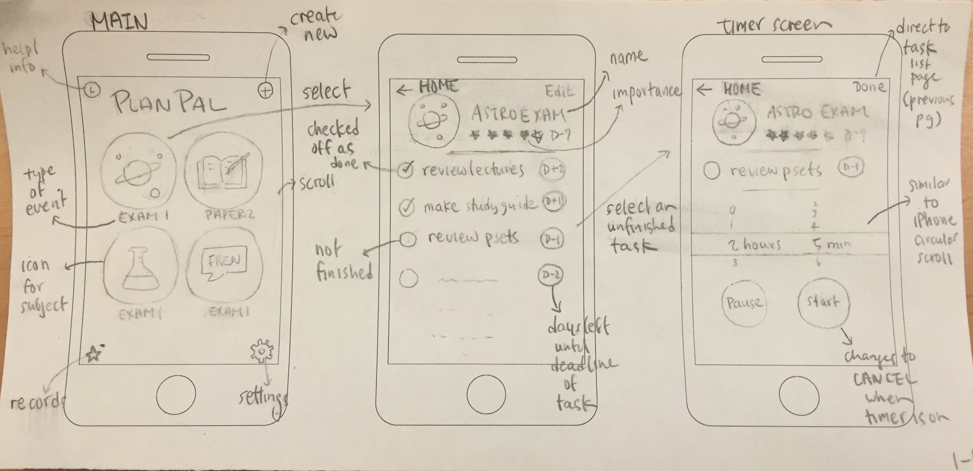
Design 1:
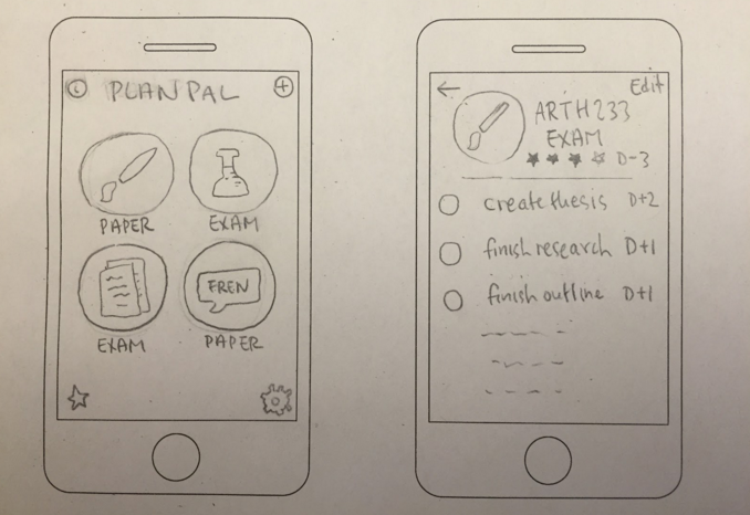
Design #1: Icon-Based Menu, Event-Oriented Navigation
a. The main screen contains an icon-based menu, with each bubble containing the appropriate icon for the subject matter. The bubbles are listed in the order that they were added. The text below each bubble indicates the type of the event (exam or paper). The top-left button is the help/info button and the top-right button enables users to add a new event. The bottom-left button takes users to a records screen and the bottom-right button directs them to a settings screen.
b. When users select one of the icons on the menu, they are taken to a page for that particular event. The second screen in the picture shows the subject matter, its icon, its perceived importance, days remaining until the date or deadline, and the list of tasks that need to be completed. Each task also has its own deadline, and it can be checked off by the users once it is completed.
c. When users select one of the unfinished tasks, they are taken to a timer screen which contains the event's basic information (consistent with the previous page), the specific task users want to complete, and a timer. The timer resembles the circular scroll that the iPhone has The top-left button takes users back to the main page while the top-right button takes users back to the previous page (list of tasks for the event).
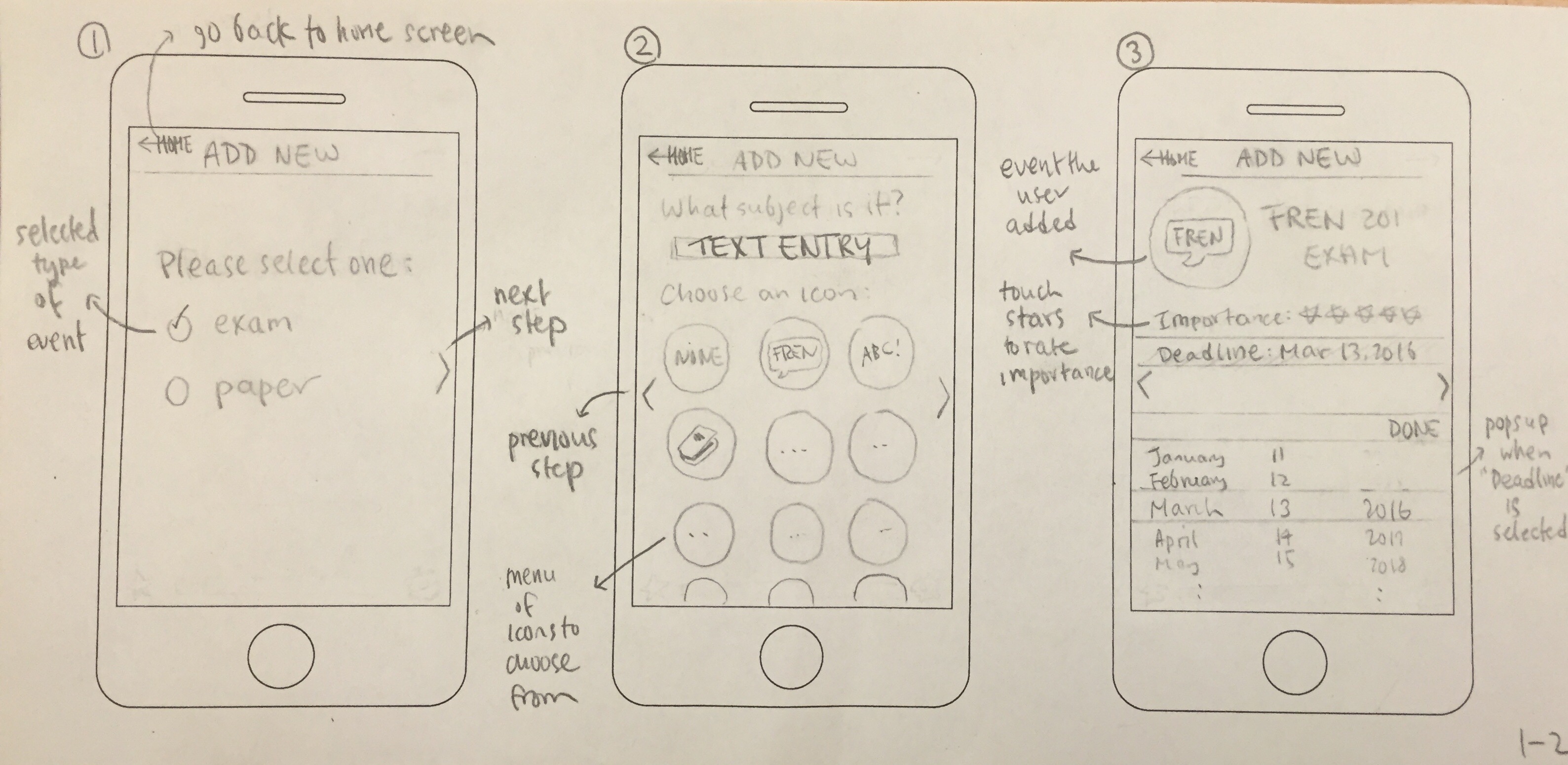
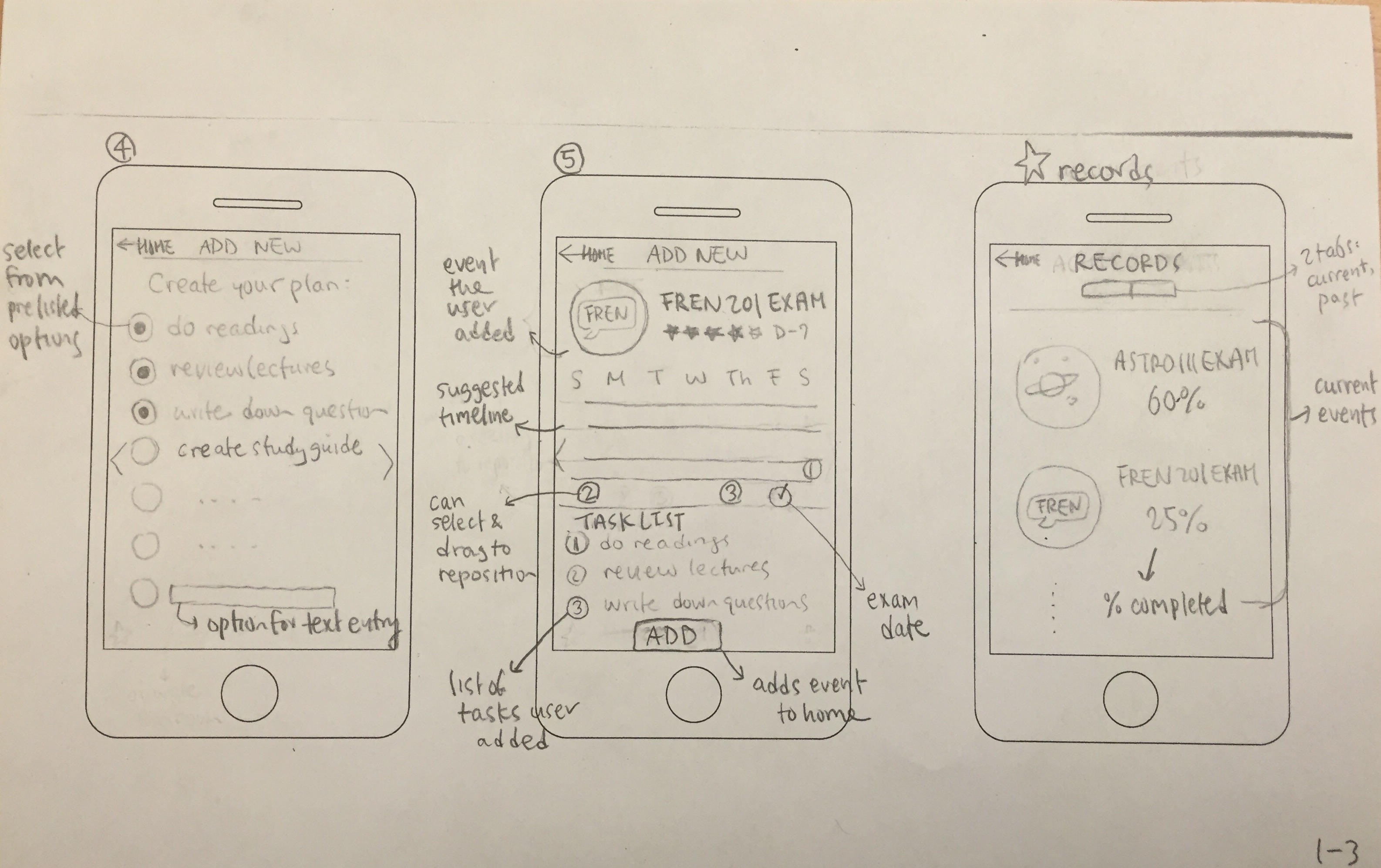
d. When users select the plus button on the main screen, they are taken to screen 1 (see below). They are asked to select the type of event they are creating. They write in the subject matter of the event and they choose an icon that corresponds to this event from a menu (screen 2). They don't have to select an icon if they don't want to, but icons help them identify which event is which when they are on the home page. Then, they choose how important this exam or paper is for them and indicate the date (screen 3). Gently touching each empty star fills it up with color. Screen 4 contains a list of tasks users can complete in order to prepare for their exams or write their papers. The list is different depending on the type of task users are creating because the process of exam preparation is different from that of writing papers, and it will cover the tasks identified in our Task Analysis of Phase 1. The page will be made so that users can scroll through it. They select each task they want to include in their task list for the event and there is also an option for text entry at the very end of the list if they want to enter tasks on their own. Screen 5 shows a realistic suggested timeline that shows when each task should be done. The number within each bubble corresponds to the task number. Users can look at the task list below the calendar if they're confused about what number each task is. The bubbles are made so that users can select each one and reposition. All screens that are part of the "add new" process all have a home button that would take users back to the main page without saving any work, and as well as an arrow on each side of the screen to go to previous or next steps.
e. Selecting the star button on the main screen opens up the Records screen. There are two mini tabs on this screen. The first tab shows a list of current events, with the percentage of completed tasks and the corresponding icon for each one. The second tab shows a list of past events (past exams and papers users completed) with the percentage for each one so they can look back at how much or how little they followed through their study plan.
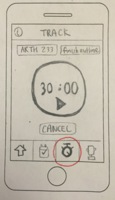
Design 2:
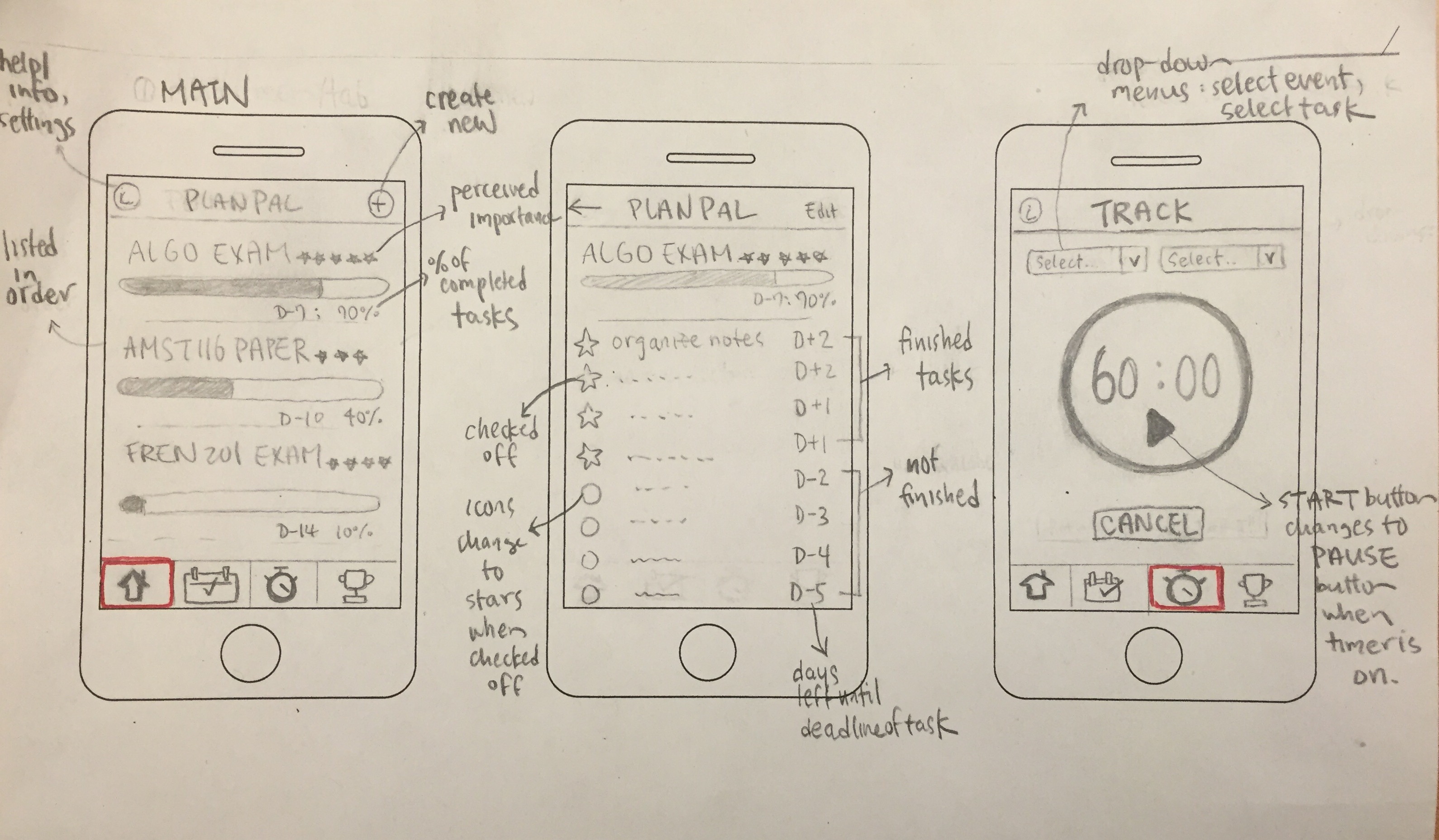
Design #2: Menu Tab, Task-Oriented Navigation
This design enables users to use a menu tab to navigate from one screen to another.
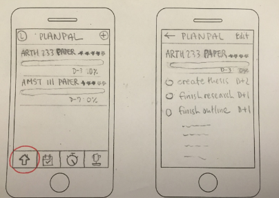
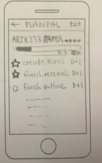
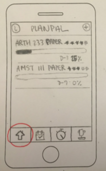
a. The main screen contains upcoming exams and papers using text and progress bars. They are listed in chronological order. Each event has stars indicating perceived importance, the number of days left until the exam or paper date, and a progress bar indicating the percentage of tasks completed. The top-left button opens up a help/info page that also contains settings. The top-right button enables users to add a new event. When users select one of the events, they are taken to a page with the list of tasks under that event. Each task can be checked off once it is completed, and its icon will change from a circle to a star. Unlike Design #1, none of the tasks can be selected to go to the timer screen. In order to start a task, users need to go back to the main screen and select the third tab, which displays the Track screen.
b. The Track screen has two drop-down menus. The text of the left drop-down menu reads "Select event" and shows a list of current exams and papers listed when users click on the drop arrow. The text of the right drop-down menu reads "Select task" and shows a list of tasks under the selected event. Once users select those two, they can set the timer and start working.
c. The second tab displays the Today screen, which does not exist in Design #1 and it contains a list of tasks that need to be done for every event that is currently on the main screen. Again, users can check each task off as it is completed. There is a plus option under each event so that they can also add other tasks--that are not on the list--they want to complete or have already completed today. With this screen, users can not only keep track of tasks under each event (which Design #1 does), but they can also know what tasks need to be tackled for every event day to day (which Design #1 does not do).
d. The third tab displays the Achievements screen, which shows a list of "unlocked" trophies, which are past exams and papers that users ended up completing all tasks for. The "locked" trophies are current exams and papers listed on the home screen and they will be unlocked once users complete the corresponding tasks.
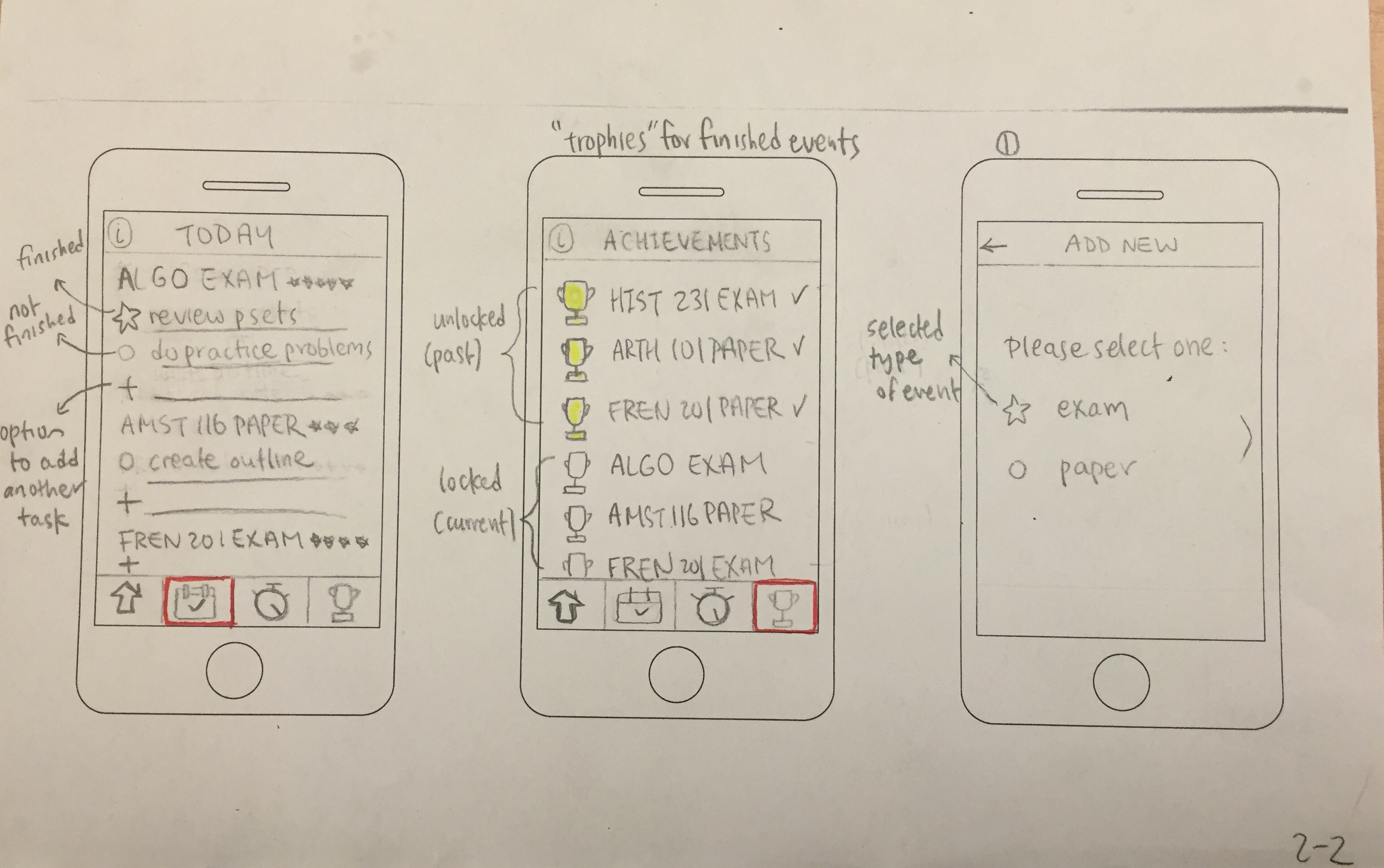
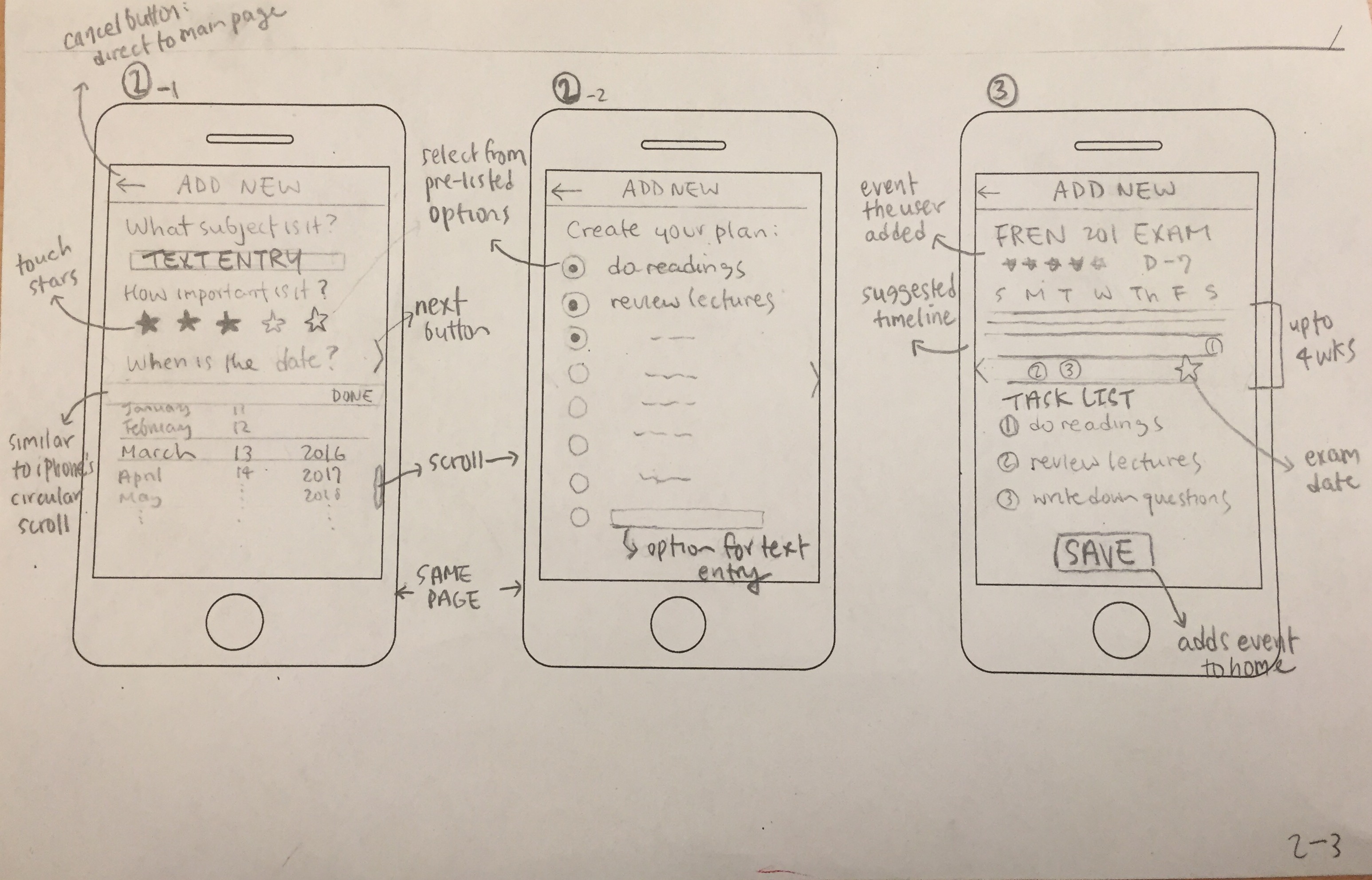
e. Selecting the top-right button on the main screen opens up screen 1 (see above), which asks users to select the type of event. The "add new" procedure of Design #2 is similar to that of Design #1, except that screen 2 resembles adding an event to a calendar mobile app, with all the necessary entries on one long page that users scroll through. Since Design #2 is text-heavy compared to Design #1, which aims to take users through the procedure step-by-step, and since users wouldn't need to select any icons like Design #1, we thought it would be better to combine Design #1’s screen 2, screen 3 and screen 4 of the "add new" process onto one page and make Design #2's screen 2 more similar to traditional calendar apps, which only has a single page for users to fill out when adding new events or schedules. Screen 2-1 and screen 2-2 in the picture below are showing one single screen. Screen 3 is the last step of the process and it is similar to Design #1's last page, with a suggested timeline users can adjust and the list of numbered tasks users just selected in the previous step. Selecting the save button adds this new event to the main screen (tab 1), and reorganizes the events so that they appear in chronological order.
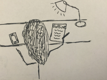
Storyboard #1
| Ashna is currently working on her Art History paper | She realizes that she created her events and tasks, but has not recorded any of her work | She selects the Art History icon on the menu and she sees the list of tasks she had created before. None of the tasks have been checked off. | She checks off the tasks she's already done. | She selects her unfinished task, which is finishing the outline, to complete it now | She sets the timer to 30 minutes and starts her task | She then finishes her outline! |
|---|---|---|---|---|---|---|
 |
 |
 |
 |
 |
 |
 |
Storyboard #2
| Ashna is currently working on her Art History paper | She realizes that she created her events and tasks, but has not recorded any of her work | She selects ARTH 233 paper on the home screen and she sees the list of tasks she had created before. None of the tasks have been checked off! | She checks off the tasks she's already done. | After she checks off her completed tasks, her progress bar is updated | When she goes back to the home screen, she finds that the progress bar for her art history paper has been upgraded. She then clicks on the track tab | She selects the event and the task she wants to accomplish today and starts the timer. | After she's done with her outline, she goes on the today tab to check out what other tasks she has to complete today |
|---|---|---|---|---|---|---|---|
|
|
 |
|
 |
 |
 |
|