P3: Paper Prototype Implementation and Testing
Briefing
Students are not able to get enough sleep when they cram on the last day before an exam, a paper deadline, or a major assignment deadline because they do not allocate the time they spend on these well enough. We want to prevent this by doing two things: helping our users better distribute their time over the course of several days and help them stay focused on what they're working on.
With this application, students can add upcoming exams, papers or other assignments as they would in a calendar application, plan out for what specific tasks they would have to complete in preparation for those events before their timeline, and thirdly, time themselves while working tasks.
We will be giving you 3 scenario tasks that you can carry out on our application's paper prototype. Please remember that you're not being tested on your skills and performance and we just want to see how users would interact with our mobile application. Please remember to take us through your thought process and feel free to stop or take a break when you feel uncomfortable.
Photos of Our Prototype
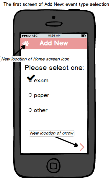
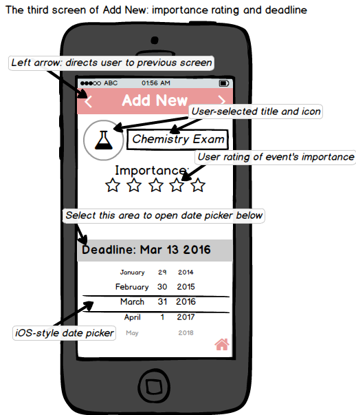
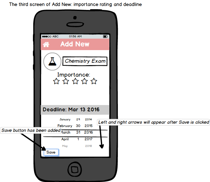
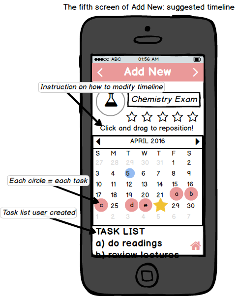
Here are some of our main screens
Before Pilot Users After Pilot Users
Before Pilot Users After Pilot Users
Before Pilot Users After Pilot Users
Before Pilot Users After Pilot Users
Before Pilot Users After Pilot Users
Scenario Tasks
Scenario #1:
(Assume that today is April 21) You have a chemistry exam next Thursday (April 28) and you want to plan ahead by adding it on PlanPal and creating a list of tasks you will need to complete in order to be prepared for the exam.
Scenario #2:
You have an art history paper that is due in three days and you already have this event and its list of tasks created on PlanPal. You’ve also completed some of the tasks already, but you realize that you haven't recorded any of the work you've done. You want to check off tasks that are complete, see if you're supposed to finish anything for this paper by today, and if yes, quickly get it done without getting distracted.
Scenario #3:
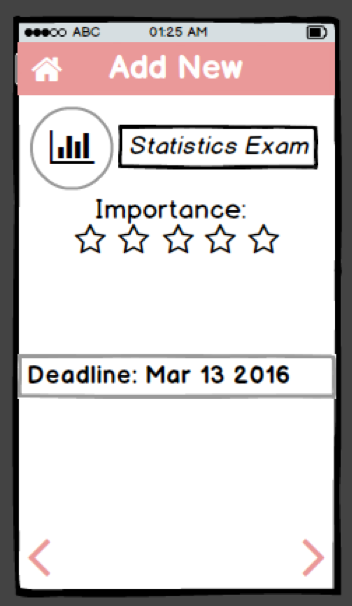
(Assume that today is April 27) You have a statistics exam tomorrow (April 28), but you haven’t studied or even figured out what you need to do to study for it. You decide to start off by adding it on PlanPal to make a list of tasks you need to do for the exam. Once you create this list, you also want to make sure you'll stay focused during your study time because you know you only have one day and you want to be prepared.
Observations
PILOT USERS
User #1Scenario #1:
User selected the plus icon without hesitation and then selected the event type as "exam" correctly. She didn't know what to do after. She was supposed to select the arrow in the top right-hand corner to proceed to the next screen, but she selected the home icon at the bottom, thinking that she was done.
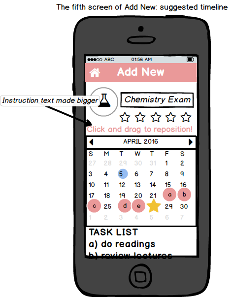
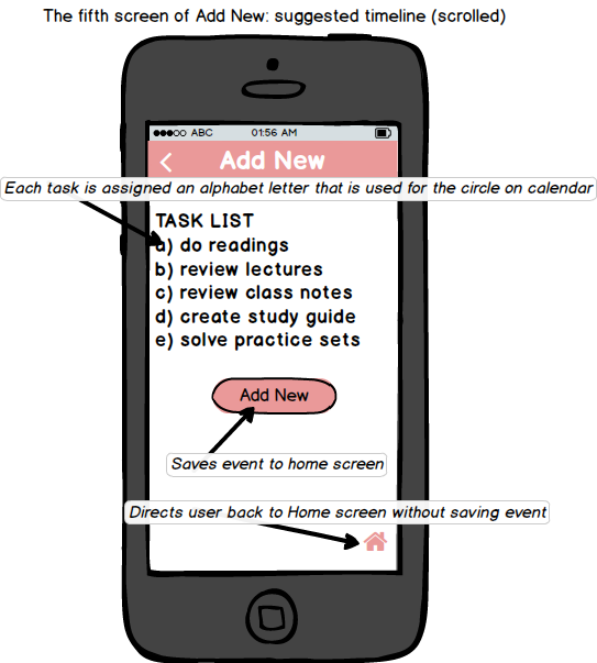
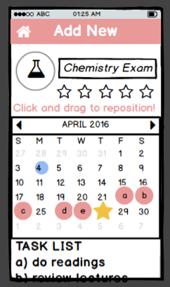
After some help and explanation, she selected the arrow to go to the next screen, where she typed in the event title and selected the icon correctly. The problem on the next page was that it was unclear to her whether she would be able to click on the "Deadline" text in order to set it to the right date. On the screen with a list of suggested tasks she can select from, she asked us if she is supposed to select all of them. The suggested timeline page was confusing for her overall because there wasn’t much instruction given: she didn't realize there was a "Task List" at the bottom which shows her the tasks she selected on the previous page and which task corresponds to which alphabet, and she also didn't realize that the screen could be scrolled. When finished, she tried to select the home icon instead of selecting the "Add New" button because she thought the button was for adding another task to the list.
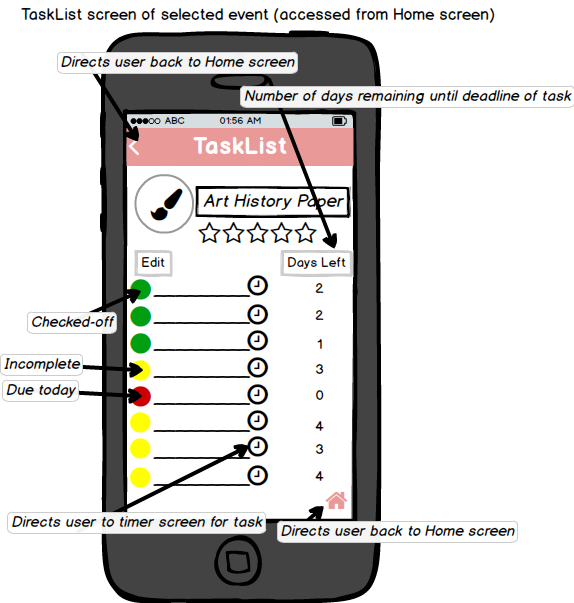
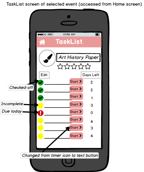
Scenario #2: User selected the Art History paper icon without hesitation, which led her to its task list page. She was confused about what to do on the interface to follow the scenario because the color coding of the circles threw her off. She kept tapping on the red circles and wondered if those were the finished tasks, when we had meant them to represent tasks that need to be done. She also thought that the clock icon on each line represented a reminder feature that enabled users to set up a reminder alarm for each task, when we had meant it to direct users to a timer screen for completing the particular task.
Scenario #3: Because she had already gone through Scenario #1 and 2, the plus sign, text entry, and deadline/date scroll were obvious to her. She also assumed correctly on the suggested timeline page that the alphabet circles were all on top of one another since the scenario is taking place the night before the exam, but wanted to know if she could move some of them to the day of the exam because it might be taking place later in the day and she might be able to do some of the tasks on the day of.
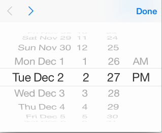
User #2Scenario #1: No usability problems were found with this user for the first few screens. On the screen where user selects the importance and deadline of the new event, after the user scrolled to the correct date, she didn't know if she could select the next arrow because she wasn't sure the date would be saved. She wanted a "Done" or a "Save" button, as you would see on an iPhone date chooser (see below).
She had no particular problems using the suggested timeline page, but wanted the tasks in the task list below the calendar to be highlighted when the user selects the alphabet circles they correspond to.
Scenarios #2 and #3. Unfortunately we ran out of time in class to complete these tasks on our pilot users.
REAL USERS
User #1Scenario #1: No usability problems were found for the first few screens, except for the event name and icon page, and the suggested timeline page. When she was directed to the name and icon page, she didn't notice the text entry box and selected the icon right away. On the suggested timeline page, she was wondering if the page could be scrolled because the second task in the Task List was cut off at the bottom, but there wasn't any indicator of a vertical scroll.
Scenario #2: She selected the Art History paper icon right away to go to its task list page. One usability problem on this page was that she didn’t know the circles could be selected to check off the tasks. She selected the "Start" button of one task right away because she thought she had to do that before she could do anything with the task (including checking it off as done). She was also confused because the tasks weren’t ordered according to the number of days left until their deadline.
Scenario #3: No usability problems were found for the first few screens as the user had gone through Scenario #1. However, she was confused by the suggested timeline page because the circles were all overlapped on one date--given that the scenario was taking place the night before the exam--and it looked like there was only one circle/task. It had to be explained to her that the circles were on top of one another.
User #2Scenario #1: User was not sure what the empty boxes were in the home page. She was confused at first but then read the task and clicked on the plus sign icon on the top menu bar. She missed the “Name your event” field box and her focus went straight to the image icons. She said the tasklist was pretty vague and would like to modify the options provided to her. She went on to complete the task without any further issues. She spoke out loud often and asked for clarification. She was freely providing feedback and gave us some suggestions.
Scenario #2: She clicked on the Art History Paper icon and immediately saw the exclamation point and thought that the task was very important rather than this assignment was due today. She would have liked some more instructions because she thought this assignment that was past due was already something she had completed. She was also not sure where the start button was suppose to take her so she was completely surprised when she found a timer for each task.
Scenario #3: She found it slightly easier to navigate the second time she had to add the event but she missed the "Name your event" field box once again. When she was about to highlight the stars for the "Importance" feature she clicked on all five stars once again. The scroll feature in the suggested timeline page was not very clear because she did not know where to go afterwards.
User #3Scenario #1: User stared at the beginning slide (which was the home page) trying to figure out what the empty circles meant. She then asked me "What do the circles mean?". I informed her that this is where her projects will be saved. She didn't question anything else and proceeded with the task. She was working on the paper prototype smoothly and her fingers were swiping and scrolling across the paper as if it was a real iPhone. When it came to adding a name to the project, she completely missed the data entry box where you type in the name of the project you are adding. Her eyes went straight to the image icons. After she realized that she missed the data entry box, she went back and filled in the title. Now, we were in the suggested timeline slide where she understood the timeline. She was aware that the bubbled letters on the timeline corresponded to the tasks she had previously selected. However, she did miss the "Click and Drag…" instruction. Everything after this went smoothly.
Scenario#2: User went into her paper project icon and then stared at her checklist. She was unsure what the bubbles next to the tasks meant but she saw the exclamation point next to one of the tasks. Then, with her finger, she pointed at the 0 days left column next to this specific task and asked me, "Oh so this one was already due?" I replied yes, and she was about to start on the task when she referred back to the task that mentioned that she needs to check off the tasks she had already completed. She suggested check boxes because then it would have been really obvious that she had to check them off upon completion. The exclamation on the paper did not confuse her because she saw the "Days Left" column where it said 0, so she knew it was due today. She continued with the task without any other issues.
Scenario #3: By this point, the user had learned how to navigate through the application so she was clicking faster than before and asking less questions until we got to the timer page where she began to ask if the timer was meant to be used right away. I explained that the timer is meant for her to start the specified task right away. Other than that, there was nothing particularly different for this scenario.
Prototype Iteration
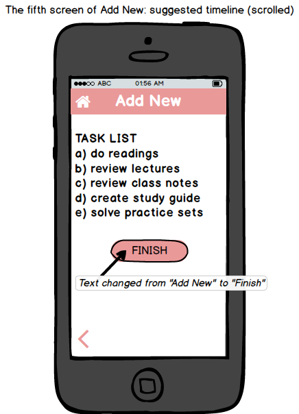
After testing our pilot users, we realized how many subtle things we had missed so before we began to test our real users we made these subtle changes. One of the changes was the relocation of the arrow buttons and the home button. Our arrows were location in the top menu bar while the home button was located at the bottom right corner. One of our pilot users suggested to place the arrows in the bottom because that is the direction they are reading in. This made it easier testing our real users. We also changed the timer icon located in our Task List page to a start button. The timer icon misled our pilot users because they thought it symbolized a reminder alarm they could set up for a task and not a timer. Changing the timer icon to a "Start" button made things a bit clearer for our real users. Another change we made to our design was color coding our task on the Task List screen. We wanted the green dots to represent completion, the yellow dots to represent “work in progress”, and red dots to symbolize incomplete tasks. However, this was very confusing for our pilot users, so we decided to use check marks for completion and an exclamation point to alert our users that they have not completed the task. Another aspect we added to our design was a "Save" button for when users are selecting a date for their event’s deadline during the Add New process to make it clear to real users that their date has been saved and they can move on to the next page. Pilot users were also unsure of what to do with our calendar on the suggested timeline page and it seemed like they missed the instruction that asked them to click and drag the bubbles on the calendar to change the due date for a specific task. So we decided to make the font of this text bigger. We also changed our "Add New" button that is at the very bottom of this page to a "Finish" button to reduce any further confusion about finalizing your newly created event. Lastly, we clarified some of our instructions. Our debriefing and scenario tasks were not very clear so we decided to add a bit more specific information to help guide our real users. The changes we made based on our observations from the pilot testing were useful as they made the rest of our tests much smoother.
Resolutions
1. Overall, we realized that we need to include more instructions on how to use the application, particularly for the whole "Add New" process and its suggested timeline page. This could be solved by having adding a separate page--that could easily be accessed from our home page--containing a brief tutorial on how to use this mobile application.
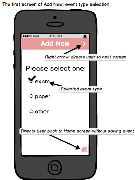
2. We should be clear with the terminology we use to help users understand what the purpose of each page is during the "Add New" process. We decided to change the header language of each page of this process to be more relevant to the page content, instead of having every page be called "Add New." We are planning to change the headers to these: Add New - for the exam type page Add Icon - for the icon selection page Add Deadline - for the deadline selection page Add Tasks - for the task selection page Add Timeline - for the suggested timeline page
3. The suggested timeline created a lot of confusion for participants. Although we have the "Click and drag to reposition!" text above the calendar, we realized that often, users don’t even know that the hint is there. We want to solve this problem by making the text more noticeable (modification in font color and size) and by making sure to show in our tutorial clip a person's finger dragging the task circles across different dates. One other problem was that some users didn't know the page could be scrolled to the bottom. We will be adding a subtle but noticeable vertical scroll bar on the right side of the screen to indicate to users that the page is long.
4. Users have the option to indicate the importance of the exam or paper they are adding on the deadline screen. However, we found that most users just selected all 5 stars without thinking much about it and we don't use the rating anywhere else in the application. We thus decided to take this feature out.
5. Users were generally confused when they were on an event's Task List page. Some didn't know what symbols represented tasks that were incomplete versus complete. Others didn’t know how to check off tasks.
We can improve the usability of this screen in two ways. First, tasks should be listed in the order of deadlines (since each task of an event has a deadline on its own), with those that are due sooner at the top of the list so users can clearly see what needs to be done first. Second, instead of having circles be filled up with a check mark, question mark, or the color yellow, we're going to put checkboxes because circles remind users of bullet points--they don’t come off to them as areas to click on to check off. Just so we can maintain consistency, circles on the Create Your Plan page can also be changed into checkboxes.
6. On the name and icon selection page, some users kept missing the text entry for the event they are adding and they went straight to choose an icon. We thought that the icon selection item was too attention-grabbing and decided to move the text entry item to the previous page. In other words, when users first add a new event, they will select the type of event and type in the name of the event on the same page.
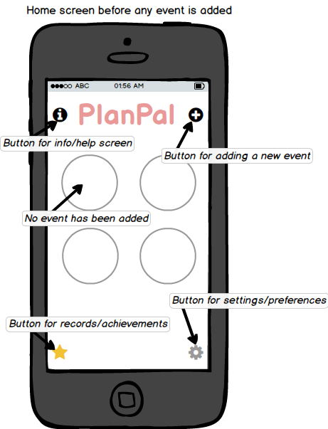
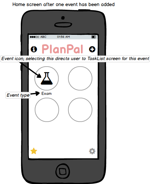
7. Some users were confused by the menu screen (home page) when they first went on the application because the circles were empty (Scenario #1 and #3), before users added any events. Some were asking what exactly the circles were for. We decided to solve this problem by having a plus sign inside each of the four event-less circles and having an additional plus sign at the bottom, if users want to add a fifth event on the application. We're going to get rid of the plus sign at the top right-hand corner and instead have an icon for our tutorial page placed in that location.
8. If an event is added the night before but its list contains more than one task, the suggested timeline page would place all the circles on the last day before the deadline on the calendar.
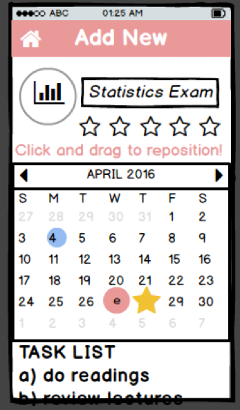
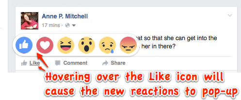
However, because these circles are on top of one another, it can look like there's only one task saved, and it is can be difficult to select just one of particular circles/tasks to move around. We want to solve this by imitating Facebook. When the user hovers over the overlapped alphabet circles, a pop-up that looks similar to the image below will appear, and we will show the different alphabet circles users can choose from (instead of the reactions icons).