Computer Prototype
Look and Feel
We decided to be minimalistic with our design and color choices because our application has a lot of textual content (i.e.: pages for Add New, page for Task List). We chose a color that's not highly saturated--a salmon pink--so that looking at our application isn not too much of a strain on the user's eyes and went with medium gray color for text instead of white or black. For our paper-based prototypes, we had chosen white for text on the header part and black for text on the content part of the page, but thought that pure white on salmon pink might make headers too overwhelming. The gray color complements the header color well, and is consistent with our button colors. We tried to be consistent with our color choices and used this salmon pink and gray theme throughout our application. Any other colors that are used are slight variations with a different saturation or lightness value, but essentially in the same color scheme.
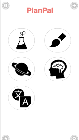
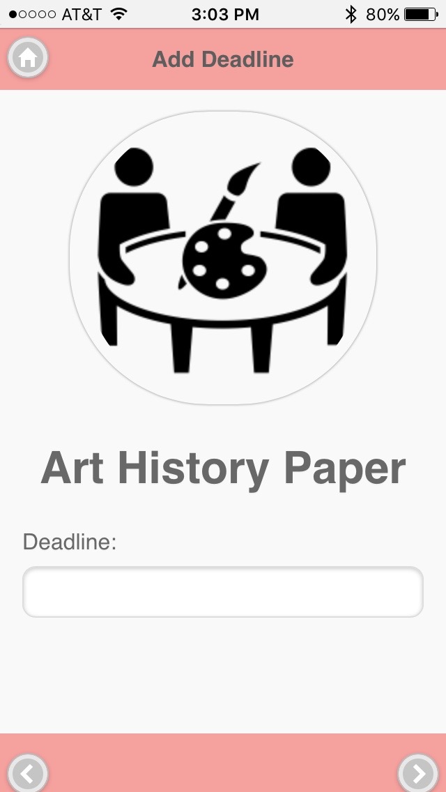
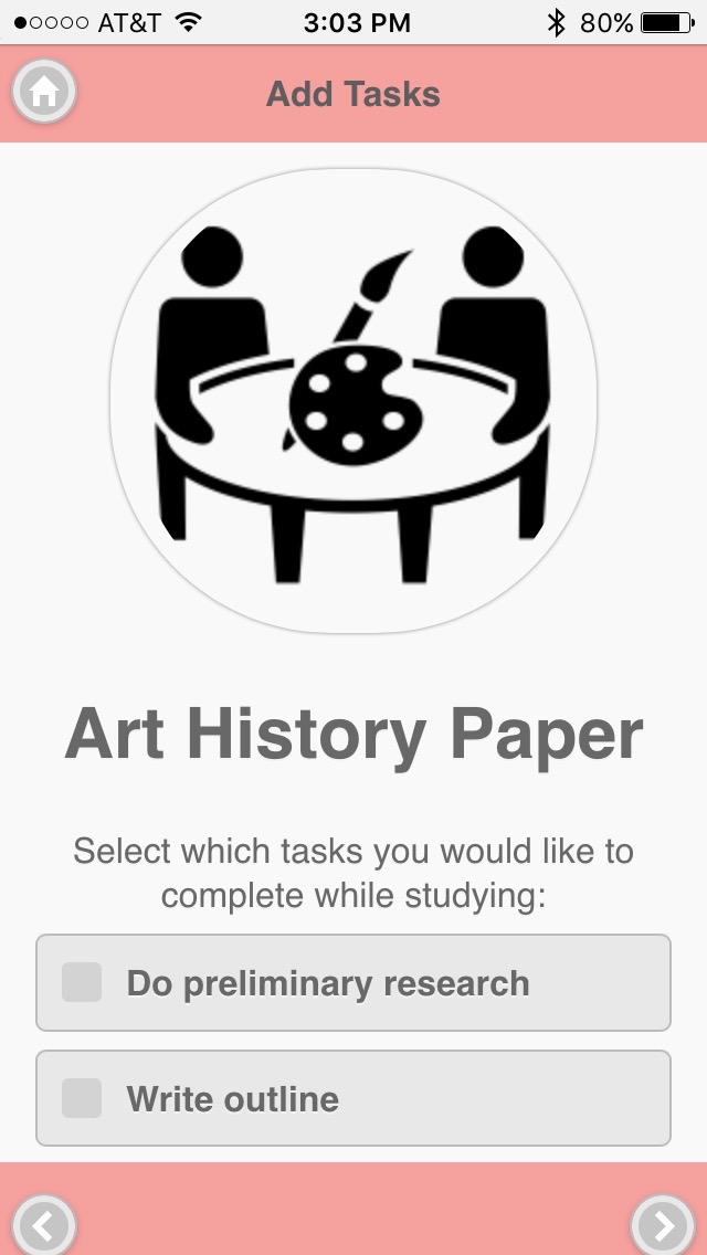
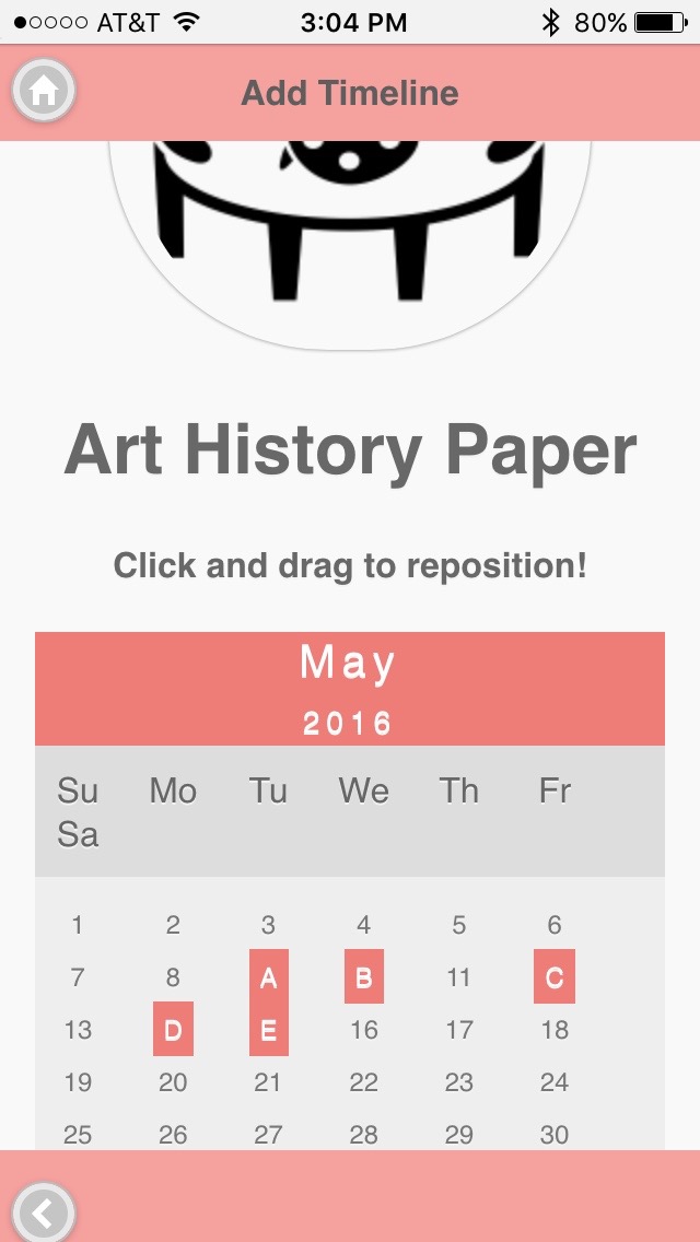
We stayed consistent with our design as well, with headers on every page except the home screen and our buttons on each of the four corners. The home button, again with the exception of the home screen, is always on the top-left corner of the screen while the previous or next arrow buttons are always on the bottom-left and -right corners of the screen. Icons that represent the subject matter of the user's event is also consistent in a way that each has a circular shape and a light-gray border.
The main screen has an especially minimalistic design because all our other screens have a lot of textual content and we didn't want to overwhelm our user with too much information about his or her upcoming events. The details, including Task List and the user's current progress for each event, can be easily accessed by the click of a button. The user doesn't need to have be presented with all of these details on one screen. It is enough to see what exams, papers, or other assignments are coming up in the next several weeks and then explore each event.
Complete Feature
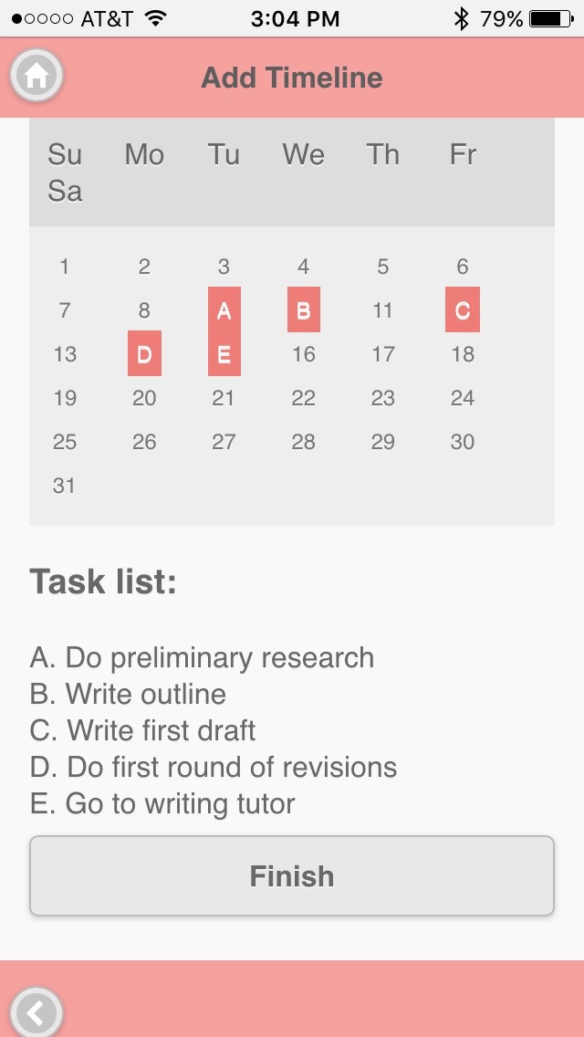
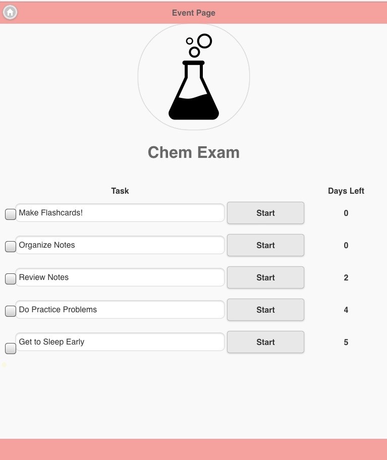
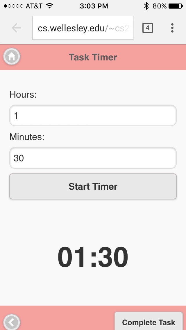
We decided to implement our Task List (covered by Scenario #2) for our vertical prototype because this feature confused some of our users during our paper prototyping testing. This feature is accessed by selecting any of the icons on the home page and it's supposed to show the task list the user created for the selected event. It shows the deadline of each task, and whether or not it has been completed. The user can check off any of the tasks when they're finished, or click the "Start" button to set a timer for the task and get working on it right away. Since it was difficult to make this feature "interactive" with scraps of paper during our paper prototype testing, we wanted to see if implementing it to make it actually responsive would make it easier to learn. The box in front of each task can be checked off by selecting the box, and clicking on the start button opens up a functional timer page. Each of these tasks can also be edited--clicking on the text will change this to a text entry box.
Screenshots
Home Screen
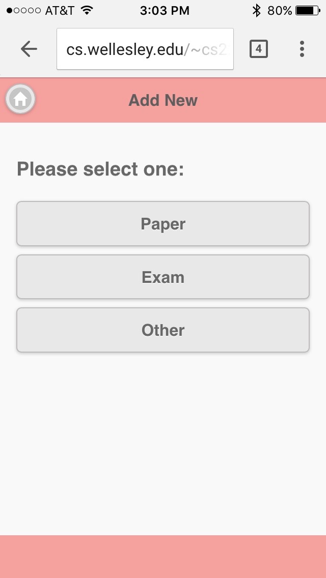
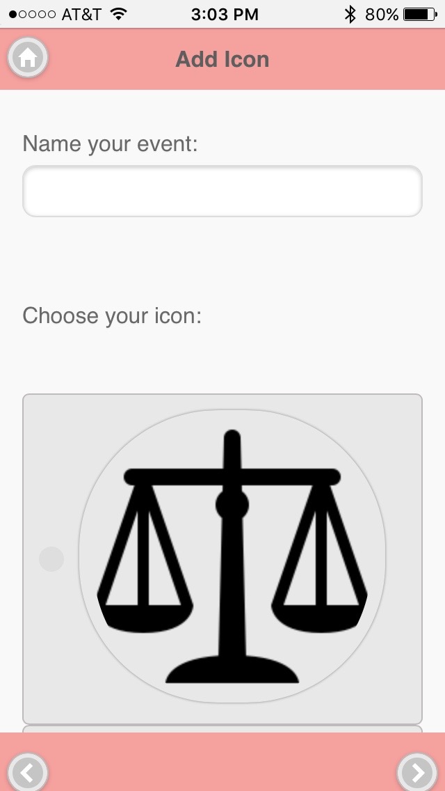
Add New Event
TaskList and Timer
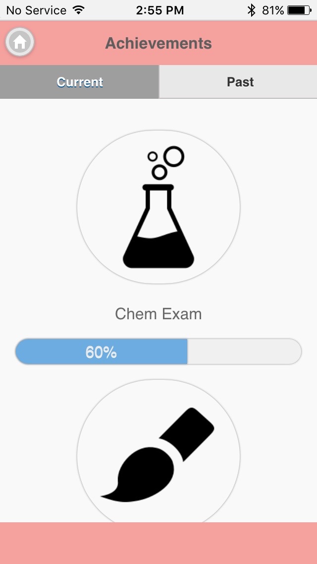
Achievements!