Wellesley students throw away countless clothes and household goods every year because they are not able to find someone who could reuse the items. This waste presents a huge problem for sustainability on our campus and an opportunity to decrease wasteful behavior and increase the life and utility of these goods. Right now, Free & For Sale is one way that students exchange goods and services. However, it is often very cluttered and disorganized. There is almost no way of finding items you want other than just happening upon them, and if you don’t happen upon them fast enough, you miss the opportunity entirely. Alternatively, if you put something up for sale on Free & For Sale, and it doesn’t get a lot of attention, it is buried and forgotten about within hours. We envision Welletsy as an application that continues Free & For Sale’s mission with a better user experience and greater organization.
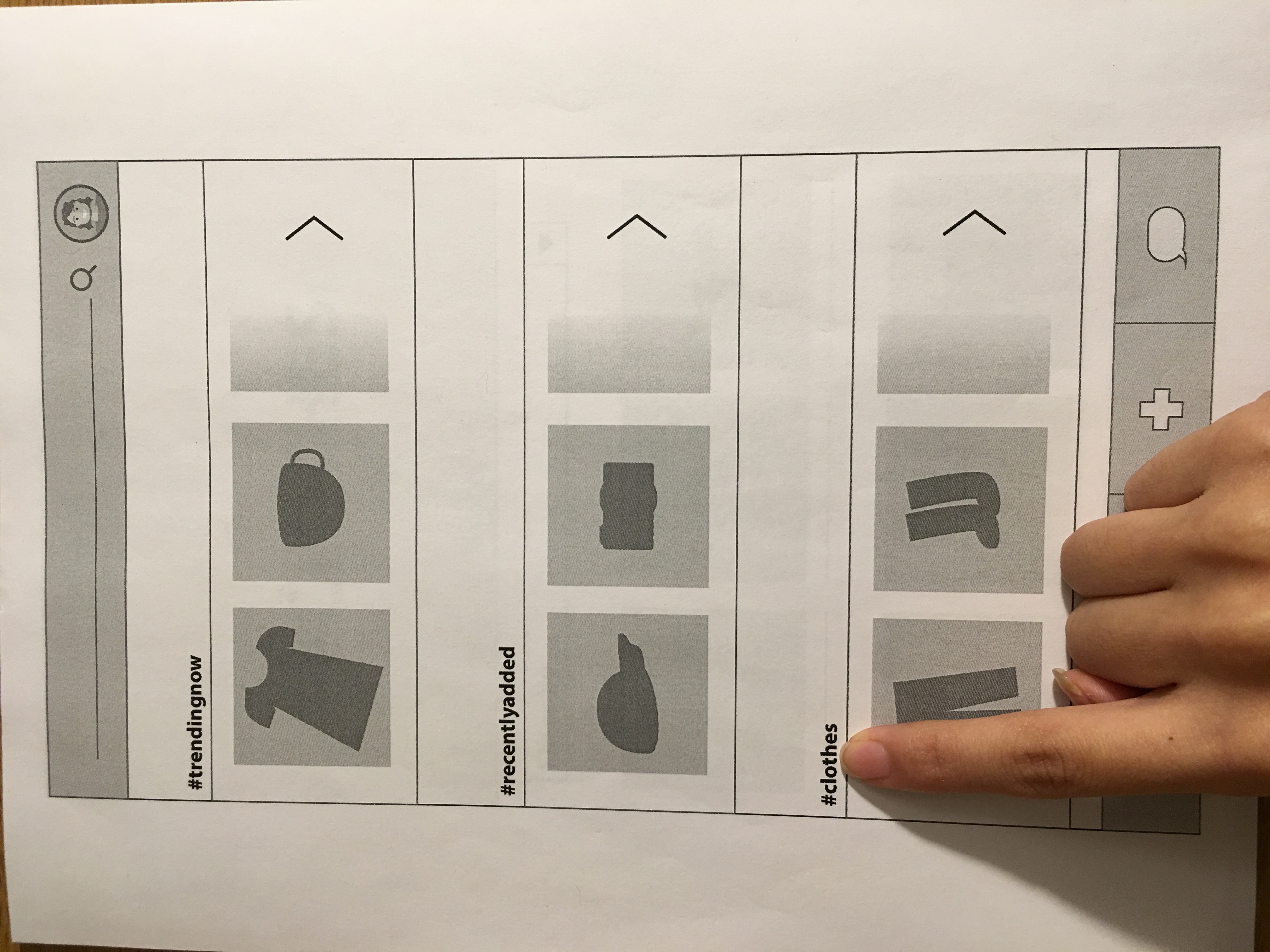
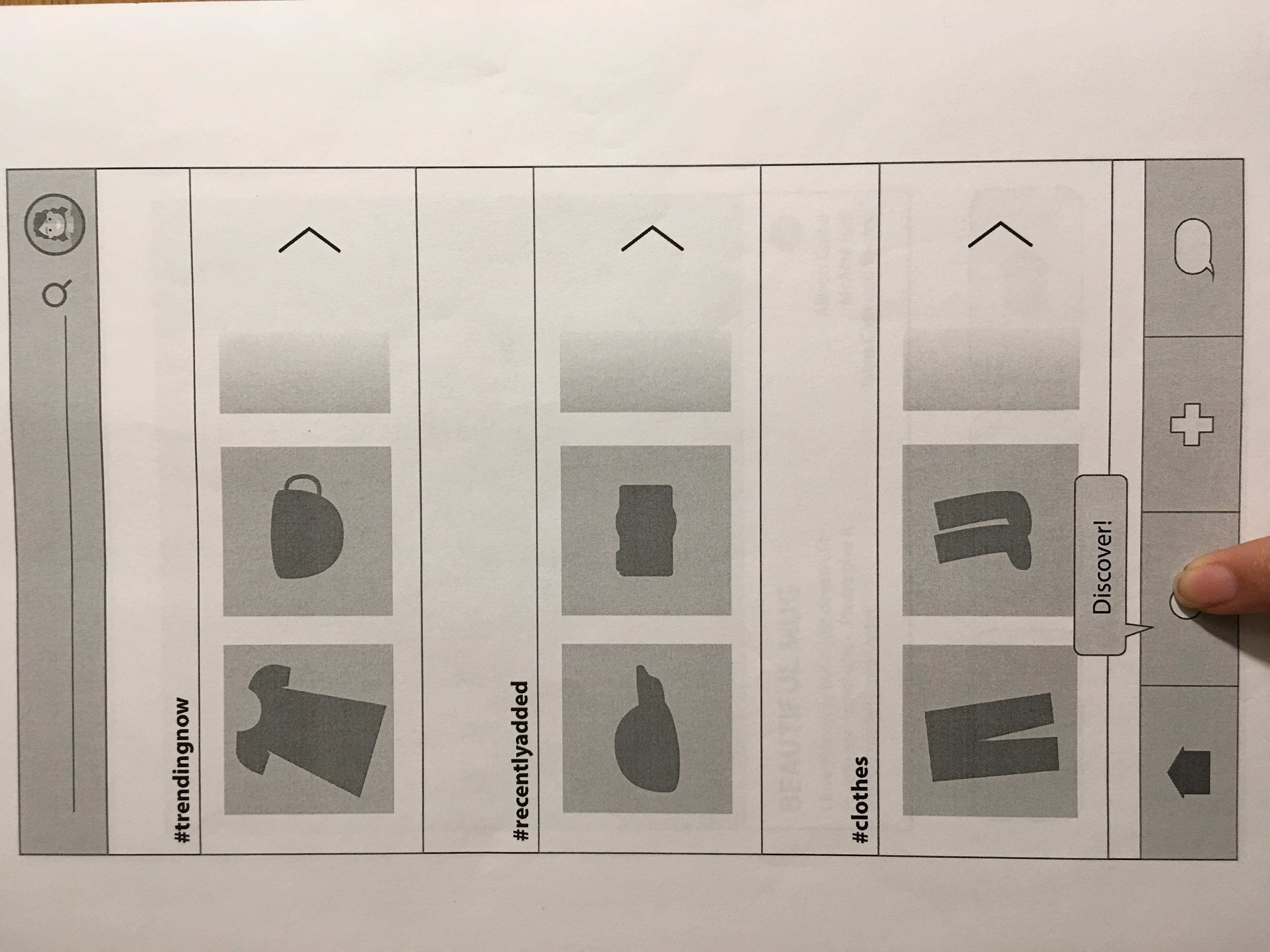
From our pilot users, we realized that different people approach the same task in a multitude of ways. For example, when we expected users to browse through categories, pilot user 1 went straight to the search bar while pilot user 2 clicked on the #clothes category as we had expected. Or when we expected users to discover new items through our discover screen, pilot user 2 prefered to just scroll through categories. This insight taught us that it is important that all of the routes to one goal are fleshed out and considered with equal importance. We previously had our minds set on one particular set of actions leading to the end goal.
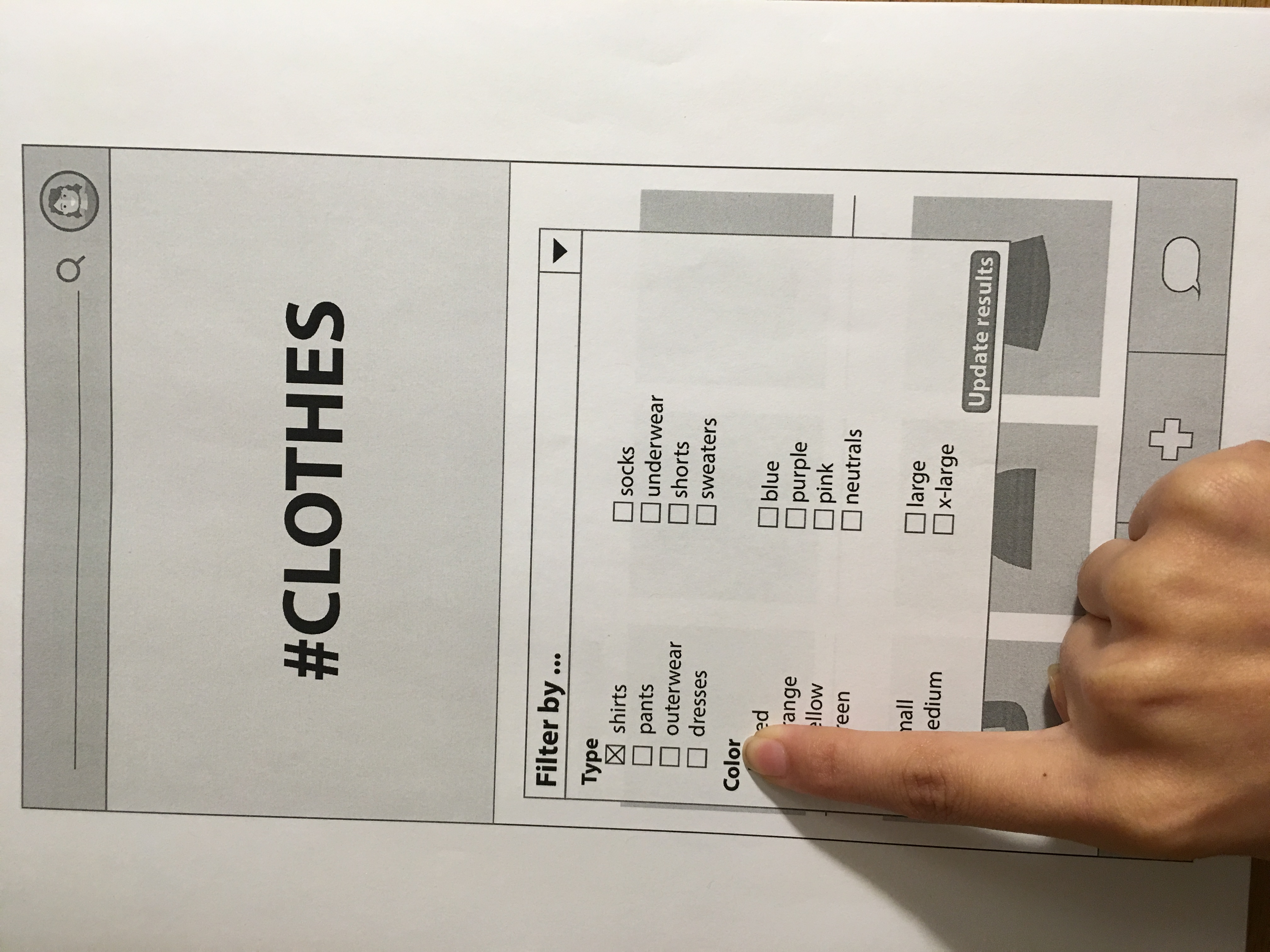
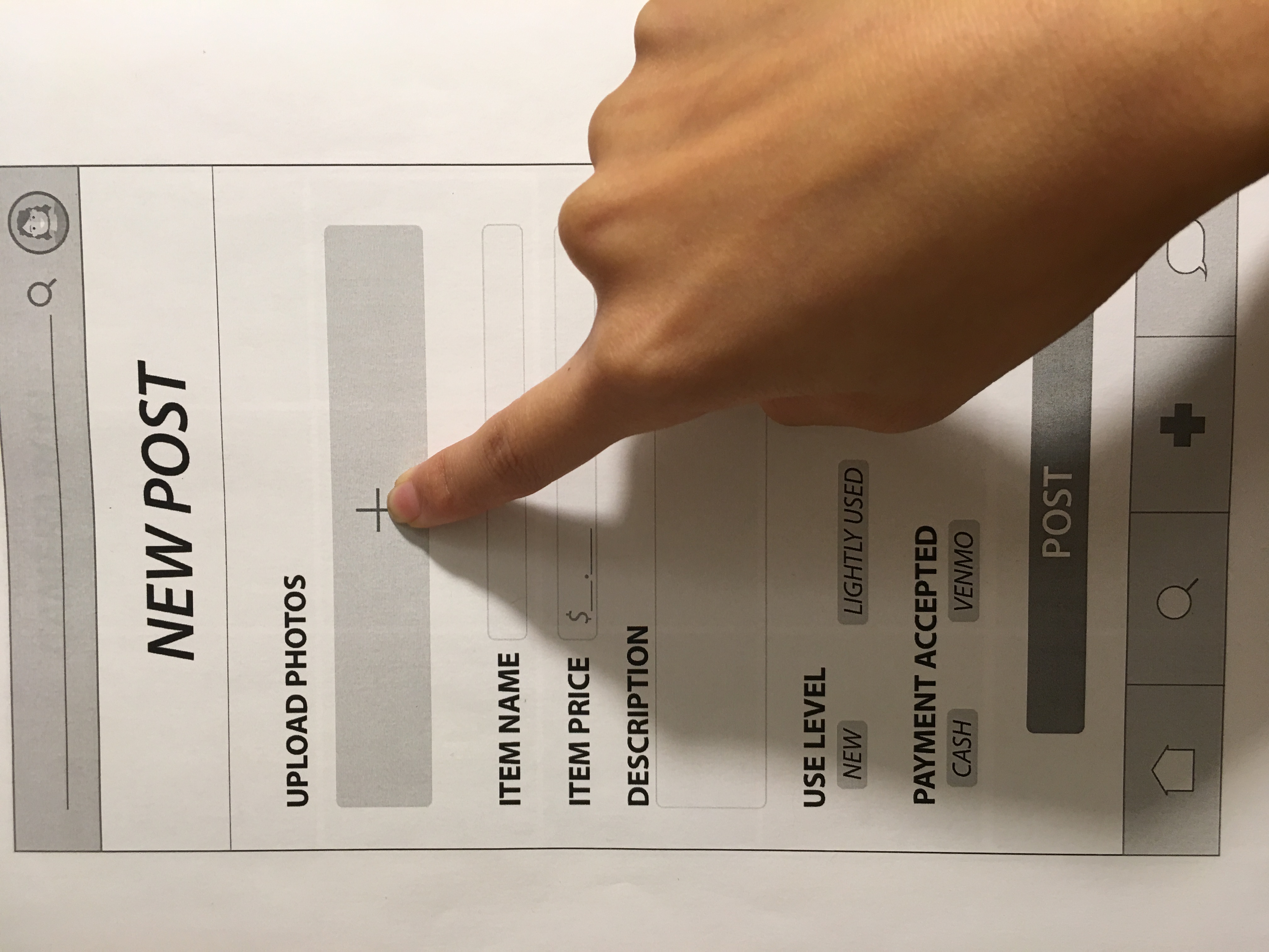
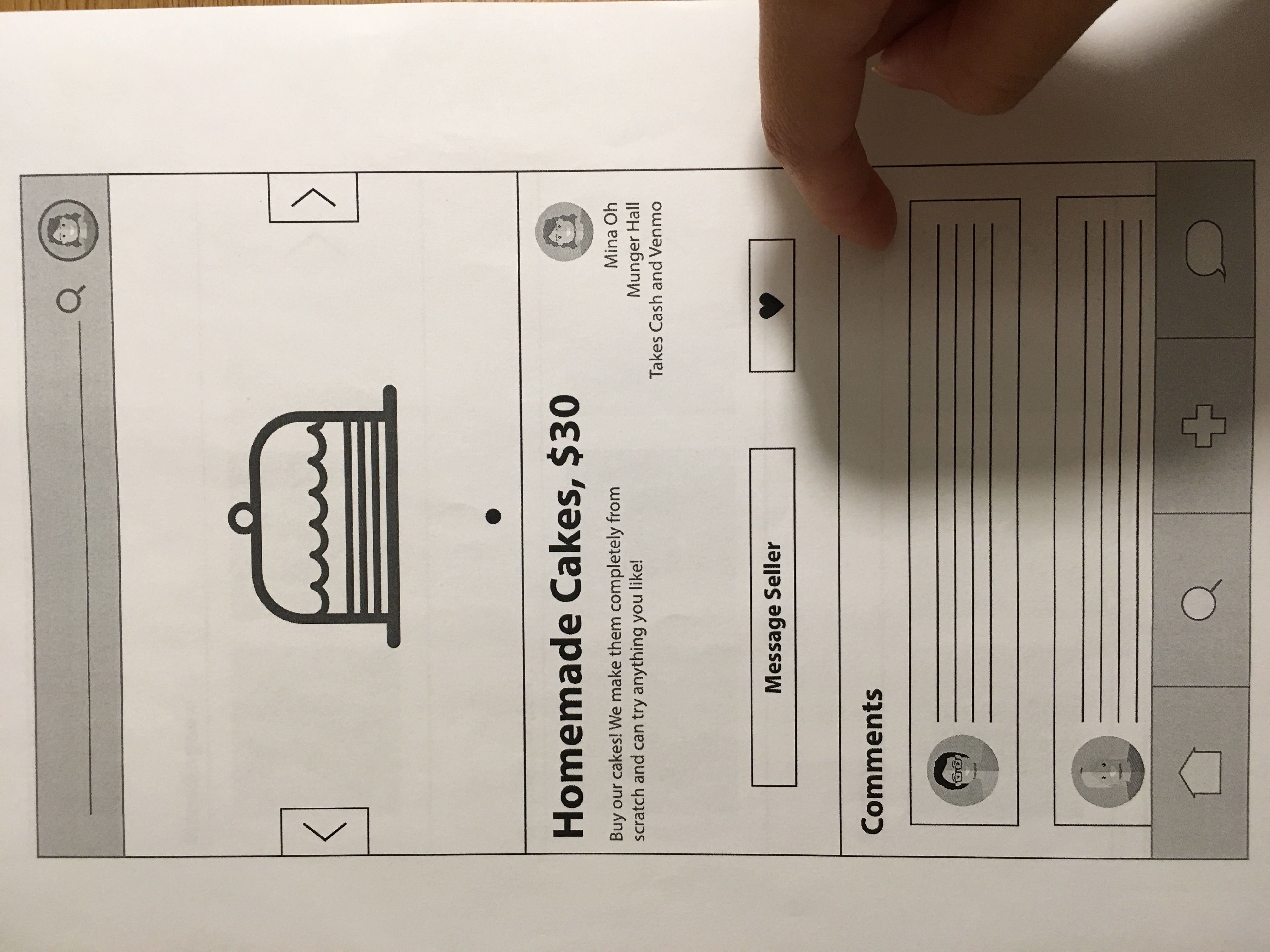
Additionally, we discovered that there were times when both Pilot User 1 and Pilot User 2 were uncertain what components of a page were clickable or not. In task 1, Pilot User 1 tried to click on a category name to open the category, rather than the arrow button, and was not sure whether that was just text or a link. Pilot User 2 tried to edit the “NEW POST” subtitle in task 2, thinking it was filler text for her post name. The contrast between clickable components and non-clickable components is definitely an important difference to highlight moving forward.
For first time users, we also realized that our icons need to be very clear and recognizable. For User 3, the symbol of a search magnifying glass as our discover icon was ambiguous and required a dialog box to guide the user to the meaning of the navigation tab. Going forward, we will need to really think about how universal our symbols are and the various misinterpretations that are possible.
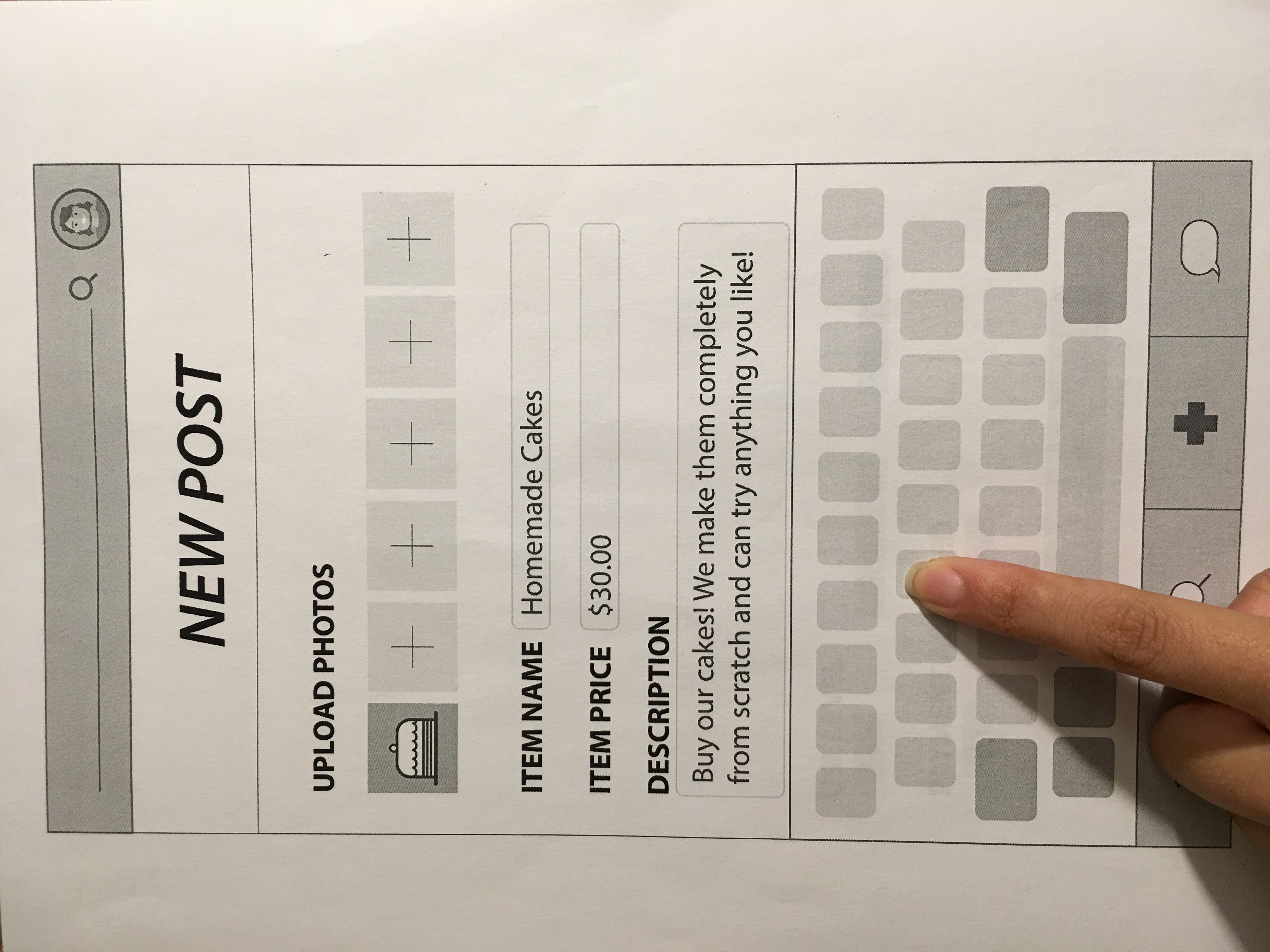
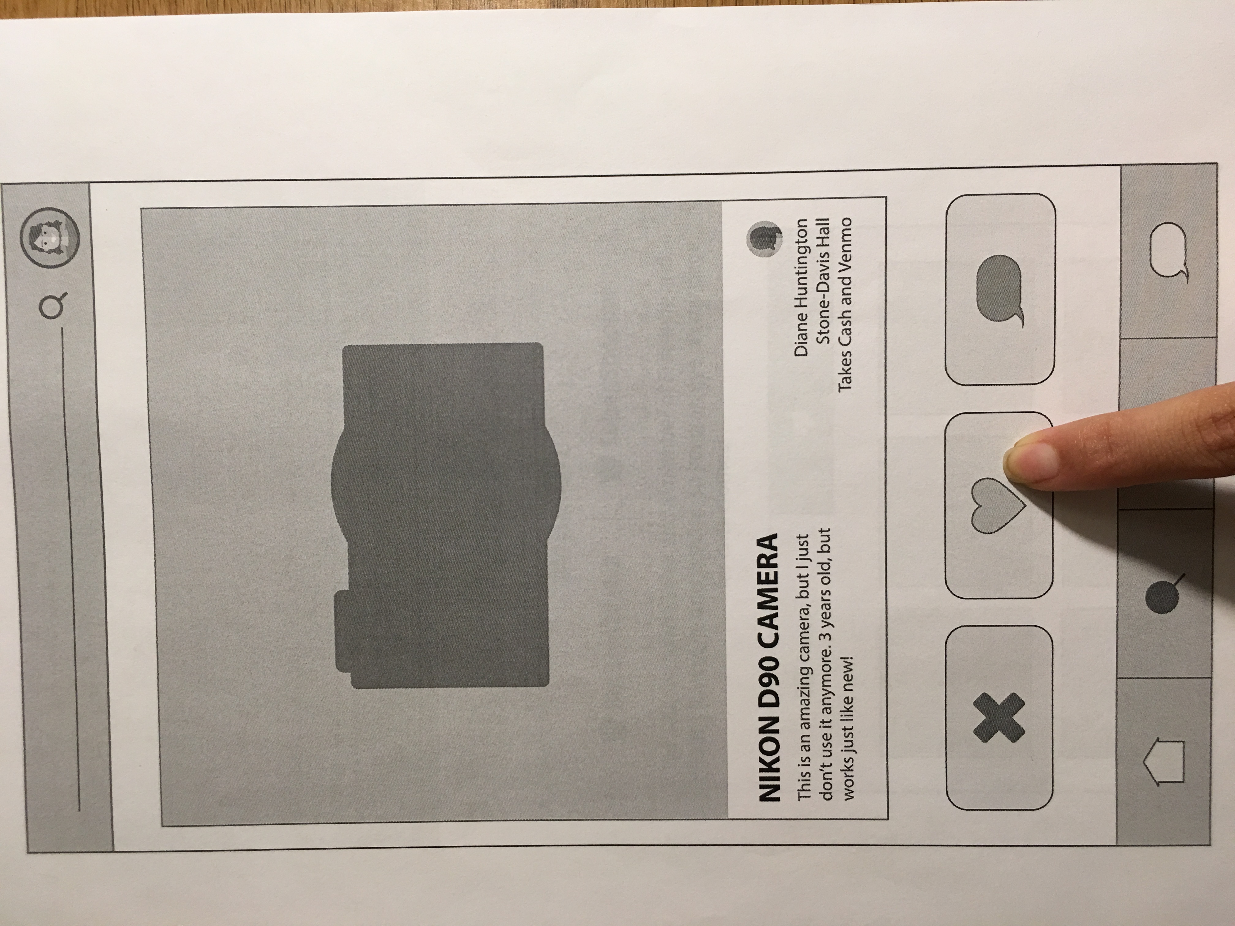
To add, we found the importance in making sure all our labelling for buttons or options on our app should be clear and straightforward. In Task 2, we initially thought that having “use-level” for the condition of an item to be clear enough; but upon seeing User 2 and 3 accomplish this task and have a hard time discerning what this option meant pertaining to an item such as a cake, we saw that attributes such as labels have to be heavily taken into consideration. Pilot User 2 also thought that having “Sell!” as the final button when posting an item did not make sense technically because she was merely posting an item at the time, not selling it. From this observation, we were able to make a quick alteration to our original prototype between pilot users and the real users.
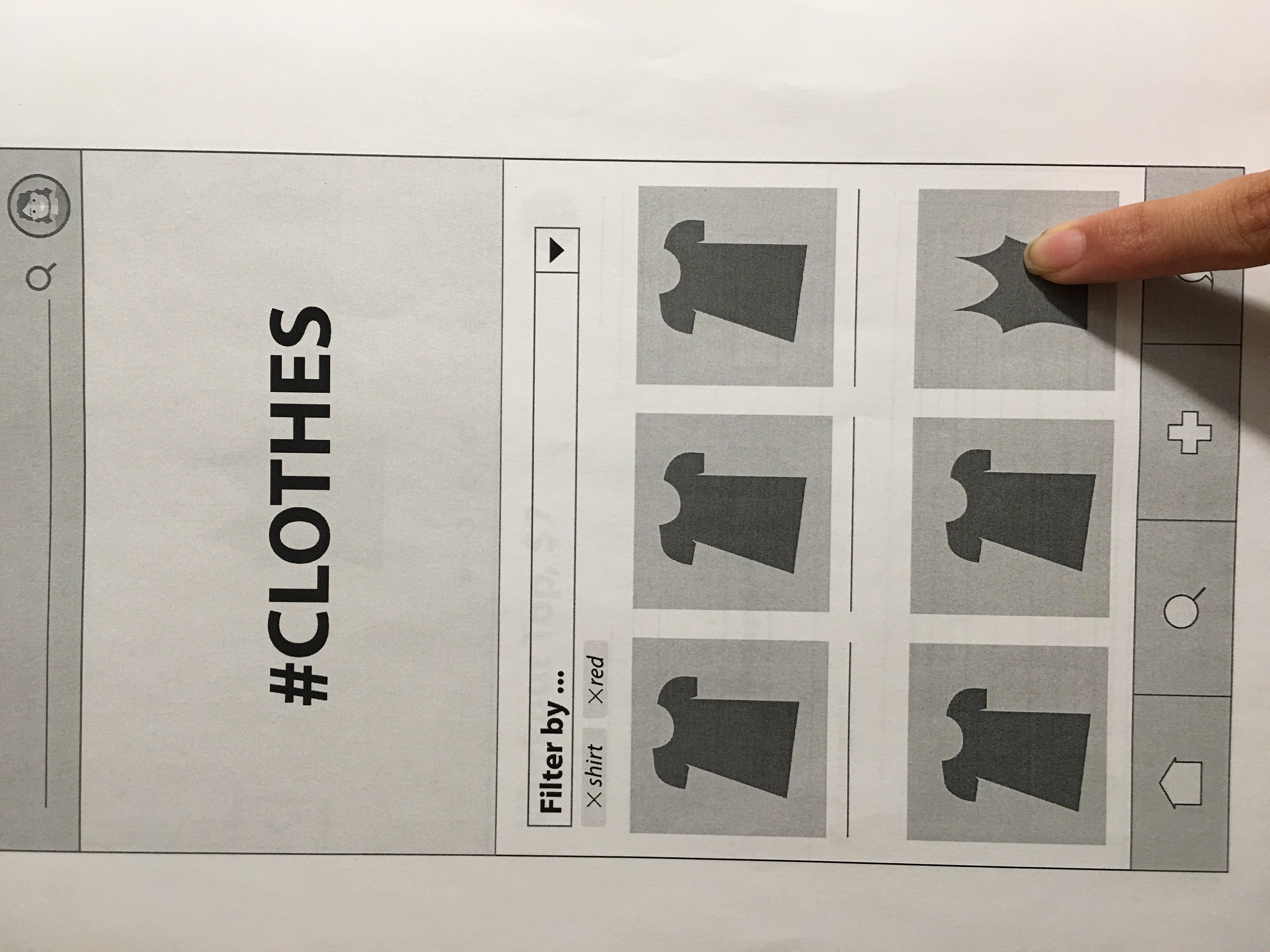
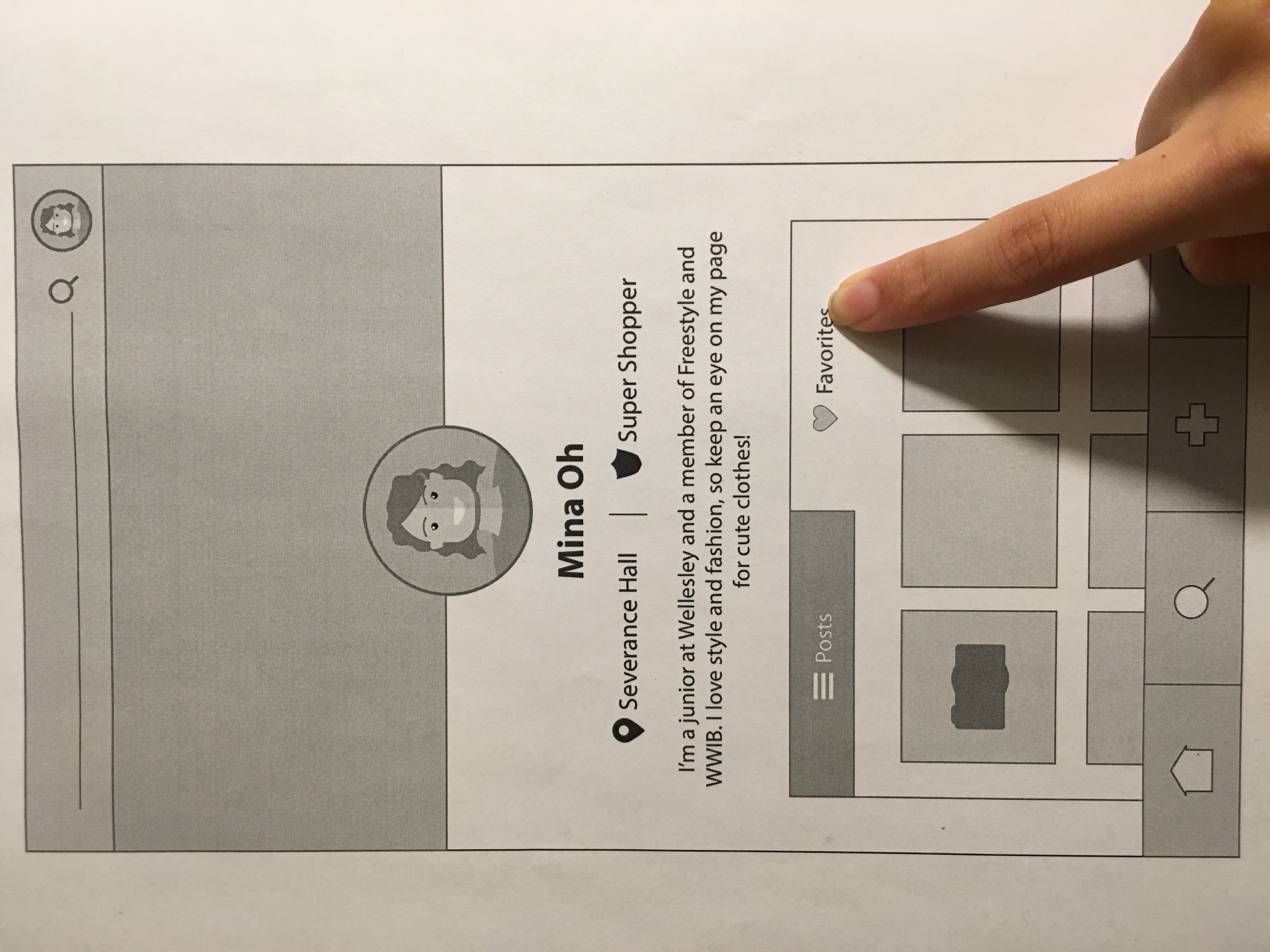
In terms of what users liked about the app, there was a synonymous agreement between User 1 and User 2 that the picture-oriented interface and familiar components to other social media platforms were positive attributes to our app. User 3 also liked the idea of having a profile because she likes the option of being able to keep an eye on certain sellers that sell a particular style of clothing she likes.
For the most part, our interface was understood and used correctly by our test users. We tried to allude to familiar layouts of major exchange sites like Amazon and Etsy, and users did find it relatively easy to navigate.
In terms of our usability problems, one frequent problem among our test users was understanding our icons located on our navigation bar. To solve this, we plan to research commonly used symbols in popular apps and utilize this universal imagery. Additionally, we want to make sure that our icons are all distinct. For example, pilot user 1 was confused because our search icon was the same as our discover page icon. We will avoid this by being more precise with our symbolism.
Another problem, the confusion between clickable objects and non-clickable objects, can be cleared up through simple changes in font and color. This is more detailed than our prototype is at this point, but in the future, we will keep this in mind and make sure that clickable objects are easily detectable and in the same style versus a more basic styling for non-clickable objects and text.
Though there were distinct usability errors that we made prior to testing on our users, we learned that paper prototypes are definitely limiting in how the user is able to accomplish the given tasks. On any app, users are bound to go about accomplishing a task differently, but with paper prototypes we were only able to provide them with the most logical ways to go about flushing it out.
In conclusion, paper prototyping was a very humbling and useful experience, and we are excited to take these findings into account in our next phase.