Paper Prototype Testing
Project Briefing
WellesleyBites is a mobile application created to enhance the dining experience of Wellesley College students. With its expansive campus, Wellesley College is able to offer students five dining halls to choose from during the week for their meals. The variation in dining options allows students to choose convenient locations and appetizing meals throughout the day, but also brings about the paradox of choice. WellesleyBites aims to combine the tasks of searching for delicious food in convenient locations with coordinating meals with friends and streamline the Wellesley dining experience. WellesleyBites allows users to view current meal hours, receive quick dining hall suggestions, browse and compare menus, search menus, make meal plans with friends, and view locations of friends on campus.
Scenario Tasks
1. You’re in the mood for good food. Check all the menus to see what is best for yourself.
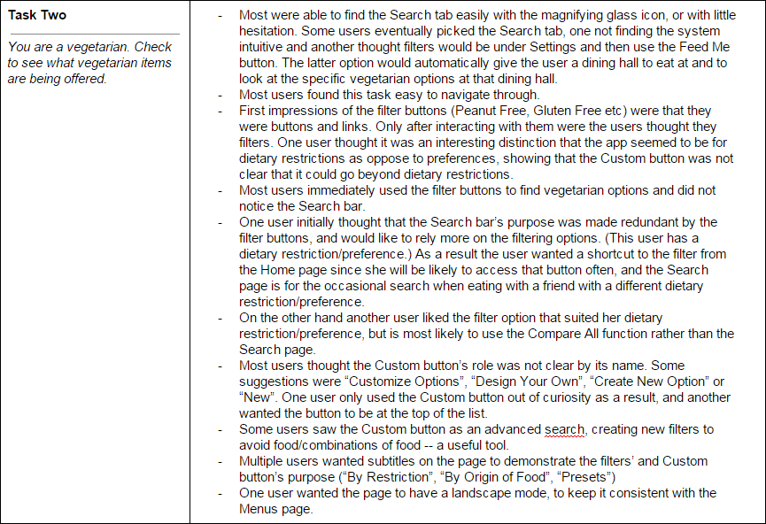
2. You are a vegetarian. Check to see what vegetarian items are being offered.
3. It’s 12:15. Arrange to eat with your org’s E-Board at Lulu.
Observations
Pilot Users


Target Users


Prototype Iteration
After our pilot testing, we were able to identify the major issues in our friends tab of the application. We changed the name of the “Suggest” button, and subsequent screen titles, to “Invite”. This presented a clearer representation of this buttons functionality. We also updated the friends list to look less similar to the list the user choose from when creating an invitation. Throughout the app, buttons were updated to be more consistent, including the back button. We also added screens for more of the app, including the “Feed Me” button on the home screen and “Find My Friends” page. While we didn’t include these pages in our scenario tasks, it seemed possible that users would encounter them while accomplishing the other tasks. We were able to use these additional pages in our second round of user testing to ask further questions after users had completed their tasks.
Resolutions
Intitial resolutions were primarily made in the invitations tab. The top buttons' roles weren't clear, particularly the Suggest button. One user said that the word choice was too passive, and Invite and Create were proposed as alternatives. The Suggest button was revised to be an Invite button in later versions.
Furthermore the invitations below the Suggest and Friends button were confusing to a user, who didn't know if the invitations were editable. The other user understood that the invitations were like events and that other people had sent her those invitations. We revised this area to have the subheading Invitations.
Thirdly, the visual addition of another invitation on the list was not sufficient of a confirmation of an event creation. We resolved this problem by having a confirmation alert box pop up after clicking the tick button and before the screen returns to the main invitations page.
Lastly, the addition of a pop up text box in the Menus page was added to inform the user that landscape mode was an option for easier comparison.


