INITIAL PROTOTYPE
Design Rationale
Since our app Circle focuses on friendships and communities, we wanted our color palette to reflect these same values. After researching, we discovered that the color yellow symbolizes friendships and, therefore, we decided to move forward with a warm tone color palette focusing on the color yellow.
We wanted the font to be very easy to read and aesthetically pleasing. After prototyping different fonts, we all decided that the font Open Sans followed our rules and was the best fit.
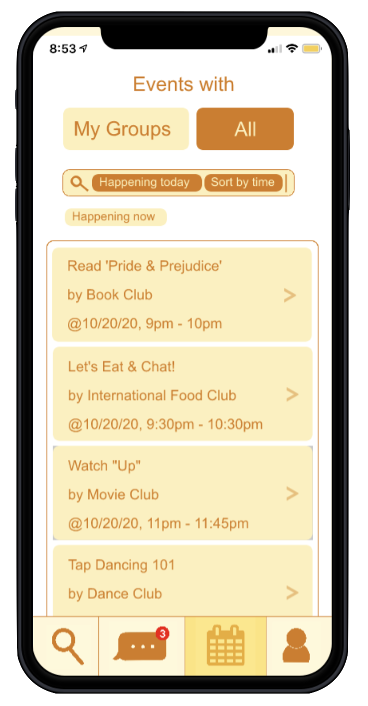
Following Gestalt's principles, we made sure to put various elements like the event buttons and event attendees within a common region and close proximity so users would be able to easily detect and understand where certain elements are located. Another design choice that we made was to eliminate harsh rectangular edges. All our edges in the app have rounded edges because we thought it was fitting with our app name Circle. We use bold font and colors to emphasize certain words and buttons such as event times and clickable items
Heuristic Design Evaluation Takeaways
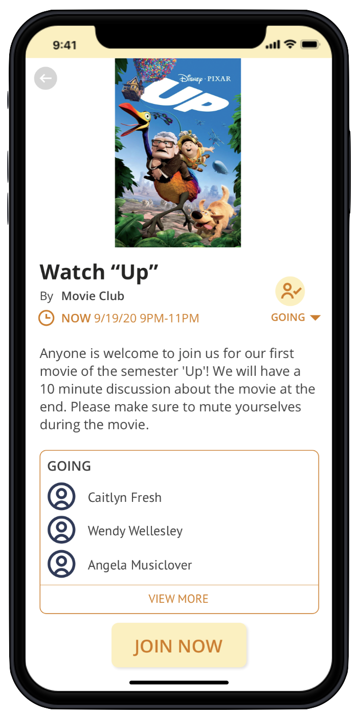
The layering of the orange & yellow colors made it difficult to read. We removed the yellow color from our backgrounds and changed the primary font color to be gray.
An evaluator suggested adding visual references for event types (e.g. movies, cooking) to make it more clear for users the themes of events.
Users wanted to be notified before joining the group event call, so we added a notification after the "JOIN NOW" button of an event is clicked.