AM5 - Visualizing Wellesley Academics
Overview
In this AM, you will work individually to create data visualizations for the Wellesley Courses historical data.
Similarly to AM4, there will be no template AM solution that you should follow. Instead, you are free to create the app according to your vision, following the generic guidelines discussed in this document.
Topic of Visualization
Wellesley Academics Visualization is the suggested topic for this AM. I have prepared a historical dataset that comprises 15 years of the Wellesley Courses website (divided by semester). The data is made available in CSV and JSON formats, one semester per file. There are 76 semesters of data, going back to Summer of 2000. For more on the data, read the data description section.
If instead of Wellesley Courses you would wish to visualize some other aspect of life and study at Wellesley, as captured in different kinds of data, please come and talk to me to discuss it together. A place to get interesting data is the Office of Institutional Research, which collects demographic data for all Wellesley students.
In relation to the Festival of Arts in the Sciences competition, you can also choose to visualize some scientific process (chemistry, biology, physics, astronomy, math, algorithms, history, etc.), provided you get the data from a Wellesley professor or a Wellesley class and the submitted work is entirely your own, as opposed to a modification of an existing visualization from the Web.
The Two Tracks
Visualization lies at the instersection of art and science. Since some of you might be stronger in one field or the other, you will have the opportunity to choose a track that best showcases your skills.
The Artistic Track
Students in this track can create an infographic using authoring tools such as svgEdit, Inkscape or other, which generate SVG format. Statistics from the data can be calculated using common tools such as Excel, STATA, SPSS, etc. You can think big and imagine an infographic that can be printed in a large poster to be submitted to the Festival of Arts in the Sciences. To get the full credit for the AM, your work should be viewable through a web page, and have a minimum of three interactive or animated aspects which will distinguish it from static infographics created in Illustrator or Photoshop. You will accomplish that by manipulating the SVG elements of your graphic. Finally, can choose between an explanatory or exhibitory function for your visualization. Data art is welcome too, as long as it uses one of the suggested datasets.
The Programming Track
Students in this track should strive to generate interactive visualizations by writing D3.js code. You are allowed to have a starting SVG graphic generated with authoring tools, as long as it is for elements that cannot be easily generated by code (maybe a fancy icon or certain texture). You can decide between one of the three functions of visualizations: explanatory, exploratory, or exhibitory. You can create multiple visualizations, but to get full credit, they should be connected to one another (like the example of the MBTA data visualization).
Milestone Nr. 1: Mockup phase
The first milestone for this AM is the creation of a mockup by the end of day March 18.
You should use this week to think of what is that you want to visualize and for what purpose. Do you want to educate, surprise, entertain, inform, help explore?
Look at lots of examples to get inspiration and ideas.
Explore the data to help you think what are some interesting questions you want to answer or certain patterns/trends you want to publicize.
After completing this research work, create (either by hand or some drawing tool) a mockup of how your visualization will look like. In a second page, briefly explain your purpose and what data are being displayed and what kind of interactive features you'll have.
Save these pages as a PDF file and email it to me.
I will strive to give you feedback before the Spring Break ends, so that you can then use that feedback to generate the visualization when you come back.
Reach for the Stars
If you happen to have no plans for Spring Break and want to become a Master of Universe in D3.js here is an idea that far surpasses what we'll learn in class.
Model the flow of movements in campus during every day of the week (hourly), as well as the capacity of academic building (number of students in each and hourly fluctuations).
This might be the kind of project that can allow you to win the competition, if it is not enough for you to become really great at D3.js.
You can find in the Directory how many students live in every residence hall, and even if you don't know which student from which hall is going to which academic building you can use probabilistic approximations to model that by distributing the flow proportionally.
There might be several ways of performing this task, a starting point might be choropleths.
Exploratory Analysis
There is a need for data visualizations that allow exploratory analysis of data, which would help us answer certain questions. For example, is it true that Political Science enrollments are declining at Wellesley? If one had a way to chart data over many years and then slice them based on course level, or topic, semester, etc. one might be able to answer this question in a nuanced way.
Another question might be related to the concern that Humanities are in decline even in Liberal Arts Colleges. How could we analyze that? What if Humanities are offering increasingly more courses that are about very narrow subjects? Is there a way to visualize how course offerings and class enrollments have changed over the years?
Yet another question migth be, which majors are attracting more students and how does that affect other majors?
The list of these questions can be long. If you are choosing the programming track, you can choose one single question and think deeply about how would you allow a user to explore the data to arrive at certain conclusions. If you are choosing the artistic track, you can use statistics to formulate your answers and then represent them in the infographic.
Grading
Students of both tracks can earn up to 10 points in this AM.
1 out of 10 points is for submitting the product of Milestone 1 in time, where your ideas are explained coherently.
The Artistic Track
The remaining 9 points for this track will be distributed in the following way
- Up to 6 points for the infographic, which should be either a single SVG (or multiple if needed) embedded in the HTML page. The reason for storing your infographic as an SVG is to allow you the opportunity to earn two more points by adding animation aspects to certain elements. You can have other HTML in the page, in case you want to explain what the graphics mean. Strive for a balance between the aesthetic value and the functional value. What will the readers learn or feel after viewing your infographic? Try to tell a story, as opposed to offering a variety of different statistics.
- 2 points for using either some animation or interaction using D3.js for your graphic elements. You should have at least three simple animation/interactions. An example of simple animation is the parts of your graphic show one after the other to guide the user in understanding the story. In D3.js this is achieved with the .transition(), .delay(), and .duration() methods.
- 1 point for writing a PDF document that explains in detail what data did you use for the infographic, what was the question you investigated, what is the purpose of your infographic, how your processed the data, and how you built your visualization.
The Programming Track
The remaining 9 points for this track will be distributed in the following way
- 1.5 points for creating a JSON data structure (either offline or with Javascript) that
contains all the information needed for your infographics, instead of accesing the
given JSON files during the interaction. The method
.nest()shown in the Working with Data Tutorial is going to be useful. If you have difficulty working with JSON objects, you can generate the data elswehere (maybe from Excel by using the CSV files) and storing your result as a simple CSV file (see tutorial for an example). You will not get the allocated points for this part, but at least you can move on to the next required part. [March 30, 2015: You can use MongoDB to create your datasets. In that case, you should provide a text file where you show all the MongoDB commands you used to prepare the data.] - 4.5 points for creating at least three visualizations from the data: bar charts, scatterplots (for examples of these two, complete the Tutorial) venn diagrams, timelines, pie charts, etc. whatever is needed to convey your purpose for the visualization. In this part, the visualizations don't need to be dynamic.
- 3 points for providing at least three kinds of interaction with the visualizations. There are different kinds of interactions you can implement: allow users to select different data sets and change your visualizations accordingly, select one graphic element in one visualization and show changes in the other visualizations too, animate charts, zoom-in or zoom-out, mouse-over effects that display additional information, and so on.
If you want to work on the "Reach for the Stars" project, none of the tasks above apply, you will be rewarded based on the degree of completion (doesn't need to be finished) and the amount of code and effort that you have put into the project.
Honor Code
This is an individual AM. All code that you write should be your own. If not, you should label it with source attribution and discuss why you need it.
As in some of the previous AMs, you are allowed to create small teams that are working on the same idea (e.g. the games with Google Maps in AM3), but everyone writes their own code and you help one another when in need.
Submission
Every student should have a subfolder AM5 in their cs249
folder and link to the am5.html file from the index.html page.
Your JS code should be in the am5.js file and CSS in the am5.css
file. You can have additional files that are needed by these three files.
Students who choose the Artistic Track should have a PDF document that summarizes their process.
Don't forget to comment your code and add the Honor Code statement.
Data Description
The data for this AM is in two formats, depending on the track you'll choose.
The ZIP archive of JSON files.
Each archive has the same number of files, 76, with the same names and information.
That is, file 200702.csv has the same information as 200702.json,
but stored in different formats. In CSV it is a table of rows, where every column represent
a field ("CRN", "Days", etc.). In JSON it is a single object that contains a property "courses"
that has as value a list of course objects, very similar to AM4 in format.
Data for this AM was collected with a Python script that sent requests to the Courses
website, giving as a parameter the semester code, in the form "201502" for Spring 2015
or "201009" for Fall 2010. Understanding this code is important, because the data for
every semester is stored in a separate file, with a 6-digit filename representing the code,
such as 201502.json or 201409.csv. There are five different codes:
- 01 - Winter semester
- 02 - Spring semester
- 06 - Summer I semester
- 07 - Summer II semester
- 09 - Fall semester
To generate the code names such as 200902, 200906, etc., I wrote a short Python script, shown below:
years = range(2000,2016)
months = ['01', '02', '06', '07', '09']
for y in years:
  for m in months:
    sem = str(y)+ m
    # more code here
Unfortunately, Javascript doesn't have a range() function like
Python, to generate an array of consecutive values. However, one can easily write
a range function like Python's. I found the following implementation (which is very
easy to understand) in this SO post (scroll deep down, the others are
needlessly complicated).
function range(start, stop, step){
  var a = [start], b = start;
  while (b < stop) { b += step; a.push(b)}
  return a;
};
// if you run it in the console
range(2000, 2015, 1);
[2000, 2001, 2002, 2003, 2004, 2005, 2006, 2007, 2008, 2009, 2010, 2011, 2012, 2013, 2014, 2015]
You might need to write Javascript code similar to the Python snippet, in order to access all your files
programatically, especially the JSON files. A double for loop will generate a semester
code, and you can use the method: $.getJSON(url, function(r){// do something})),
to access every file one by one. You can do this in a separate app, in case you want
to create a single JSON file for your AM5, given that you don't need all the information
for your visualizaton.
Alternatively, you can process the JSON files offline using Python or Java, aggregate the fields you're interested and save them into a new JSON file. Both languages have support for JSON via dedicated packages or libraries.
Here is how the JSON objects for every course look like:
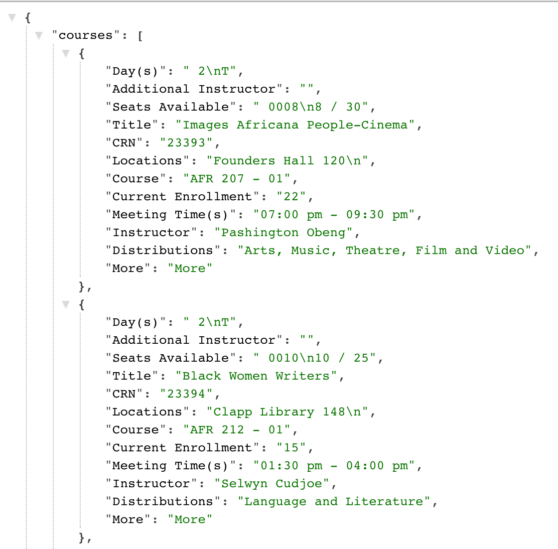
You can notice that the newline characters that the Google Spreadsheet feed had are still there and most of your cleaning code that your wrote for AM4 can be applied to this data directly.
For the CSV data, I have removed the newline characters before storing the information in the file, because the existence of "\n" will break the rows, which then would appear in different lines and mess up the table.
Google has a tool called Google Refine that allows you to upload spreadsheets, show an example of how you want to clean up a field and then apply that to all your fields. It is a very powerful tool for cleaning data and aggregating them, so, give it a try if you plan to work on the artistic track and don't have time to write clean-up code.
Final Note: The data was collected automatically and also processed and stored automatically. Since there are 76 files, I haven't opened them to check their content. I hope that they are usable, based on a very small sample I've checked, but I cannot give a guarantee, you need to do some investigating on your own. One missing piece of information that I noticed is that for the yearly years, the Distribution field is empty. They might have started adding it in later years.
If you find problems with the data, please post on Tumblr or the Google group to notify the whole class.
Python Script to Calculate Enrollments
Here is a Python script that you can use to
find the historical enrollments for any given course. Instructions for how to run the
script are in the comments part of the file. You can run the script in the console, by
typing: python wellesley_json_data.py, provided you are in the same folder
where also the wellesleyJSON subfolder is.
You can run the script many times, by entering a different course code every time. For example, "CS 230", "ECON 101", "MATH 225", etc.
Completion Milestones
The final deadline for submitting AM5 will be April 22, 2015. If you want to submit your work to the Festival of Arts in the Sciences, remember that the deadline for that is April 18.
To help you stay in track with AM5, we will use a new hashtag #am5, which
will be added to the Tumblr aggregator to show your posts. Everytime you write a post related
to AM5, include as the first tag #am5.
Here is a list of required posts to document your continuous progress with AM5.
- By April 5, end of day: Summarize the status of your data collection. Have you created a JSON or CSV file that contains the data you need? If yes, explain a bit the structure of your data and how you created (or collected it). If not, what is the difficulty and would it be possible to temporarily create a dummy dataset that will be similar to the real data.
- By April 8, before class: Make sure that you have completed the D3 tutorial Working with Data. To show that you understand how to create a simple graph (bar chart of scatterplot), modify the code of the tutorial to work with one of your datasets, creating this way either a barchart or scatterplot. Some of you can keep this chart as part of the AM5, if that was in your original plan (or it fits with your topic). Show a screenshot of your created graph on you blog, or an explanation of what problem you run into that prevented you from creating the chart.
- By April 12, end of day: Make sure that you have found in the resources I have shared with you examle(s) of charts that are close to what you're planning to do. Provide links to these examples, and spend some times figuring out what is going on. If you don't understand part of the code, then write your questions.
- By April 17, end of day: Write a blog post to show your progress on modifying the examples to work with your data. What have you accomplished? What difficulties are you encountering? Put a screenshot of how your charts look at this moment in time.
- AM5 will be presented in class on April 22. Afterwards, you can write a reflection post about your experience with D3.js and the entire process of going from an idea to a completed visualization.