Design Directions and Rationale
In the preliminary design stages, we decided on two design directions that were based on the two main ways that an app could help users gain financial literacy and confidence. The first is a learning app, and the second is a budgeting and savings tracking tool.
Design 1
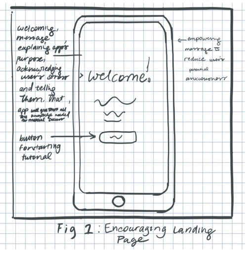
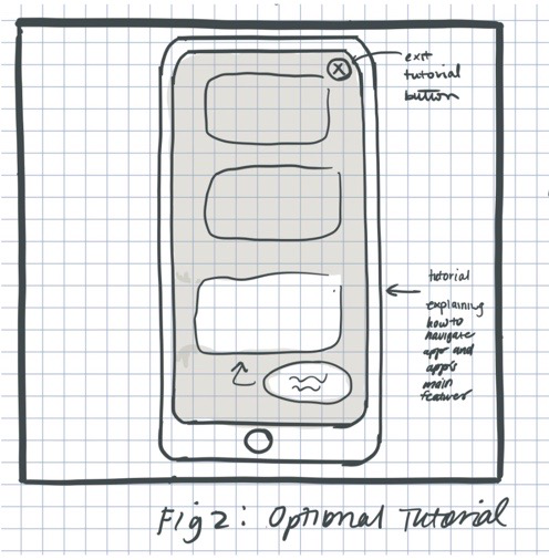
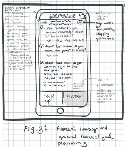
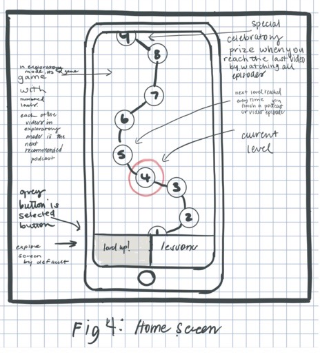
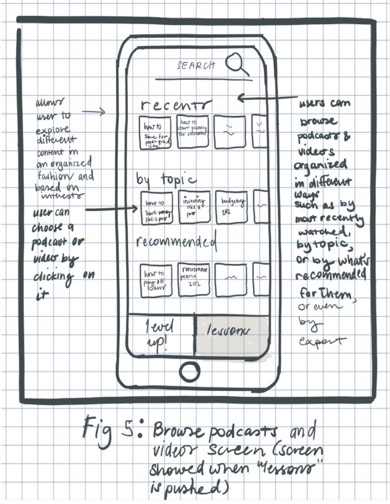
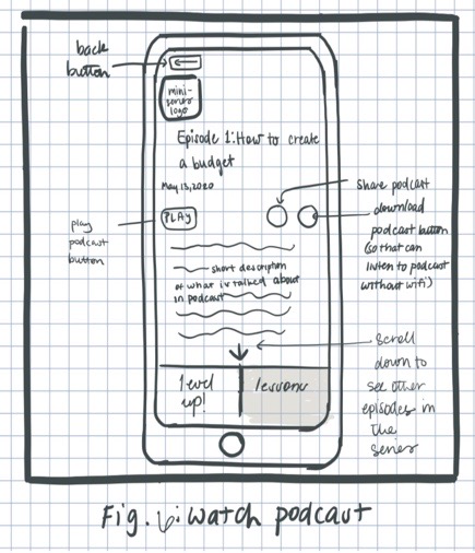
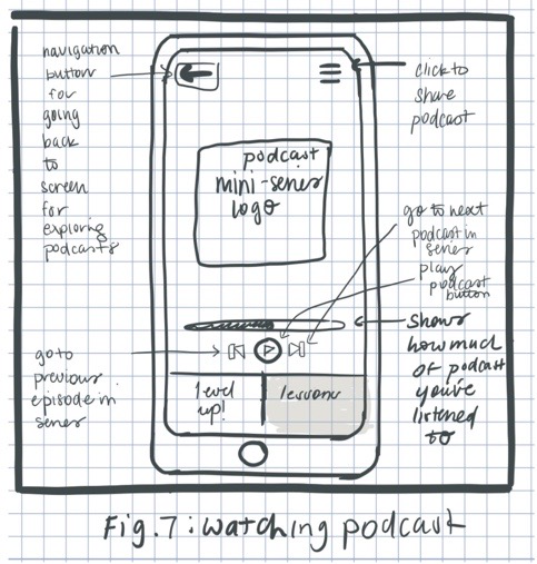
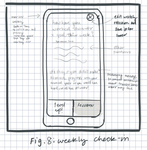
Design 1 illustrates the system of a learning app in which users learn about personal finance through articles, podcasts, and videos. Upon opening the app, users can watch a tutorial about how to use the interface. Then, they fill out a questionnaire that will be used to customize the app's content to match their current amount of financial literacy and confidence. Design 1 includes a gamification aspect where users can advance through different levels after completing a video, podcast, or article. The strength of this design is that it can make learning about different financial topics fun, which may encourage young adults to actually want to learn about personal finance. It might also reduce the stress that individuals feel when they think about money since the gamification would hopefully make the app less stressful and more fun to use. The weakness of this design is that it does not help the app user to take concrete steps to apply their gained knowledge to how they budget and save, but rather solely provides them with the information needed to effectively do so.
Design 2
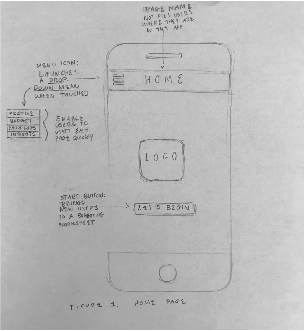
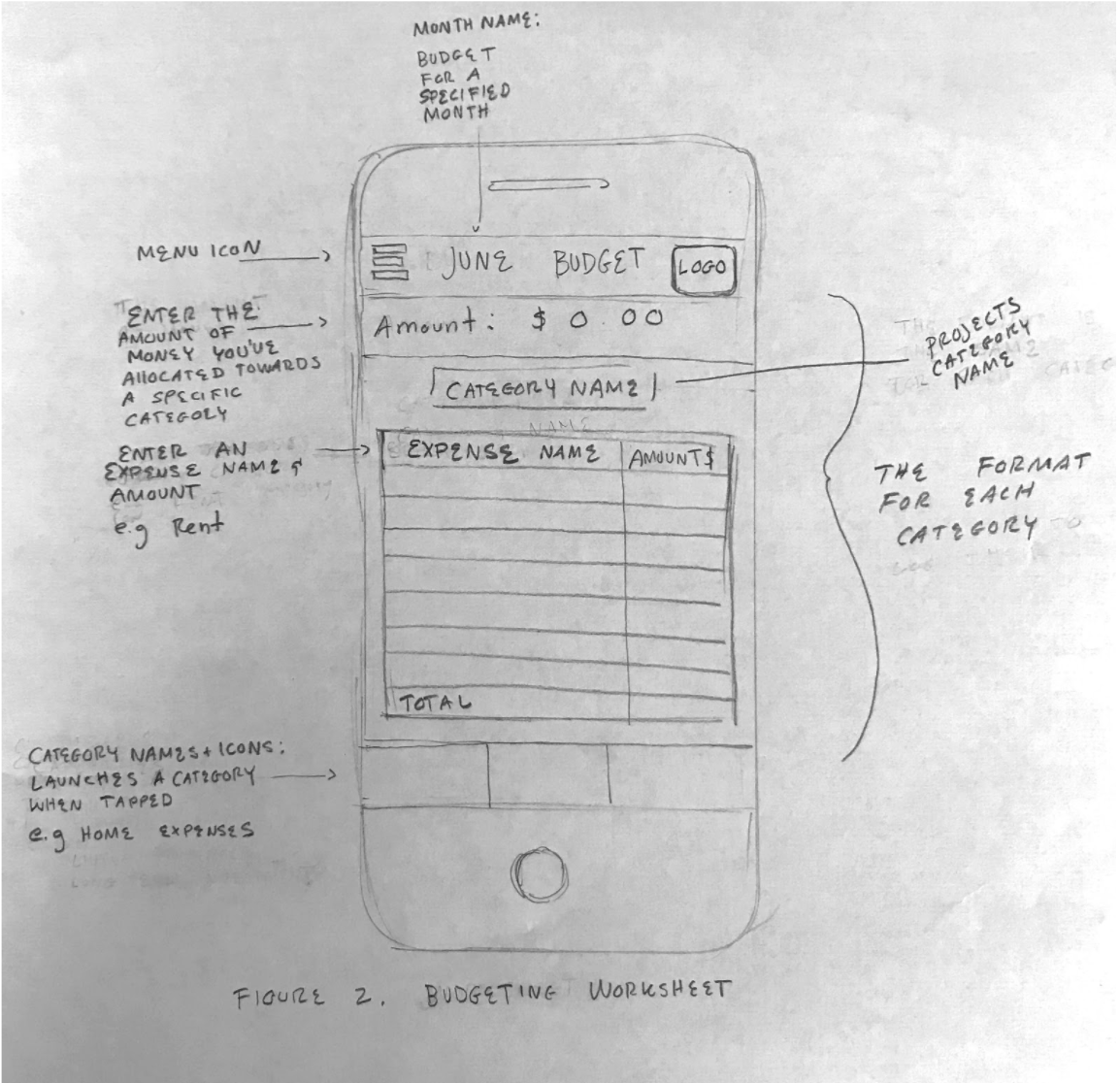
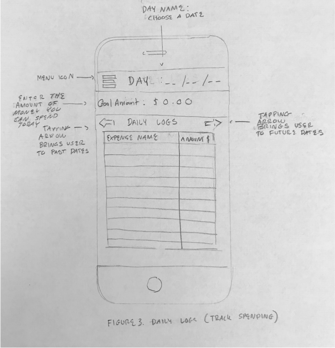
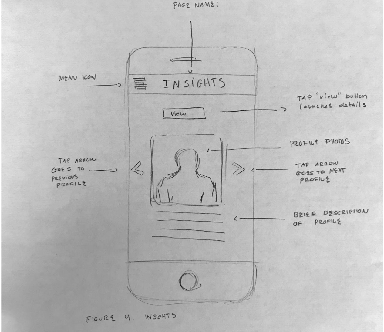
Design 2 depicts the controls and layout of a budgeting and savings tracking tool where users can track their daily spending, create budgeting plans, and connect to resources for guidance. The three main pages include a planner where users can enter and categorize their expenses, a daily log where users can store and view their receipts, and a connect page where users can share and observe how other people manage their finances. The strength of this design is that it is a tool that would be extremely useful for maintaining financially sound budgeting and spending habits. It could potentially decrease the stress of the app’s users by acting as a platform where they can gain control over their finances. The main weakness of this design is that it assumes that its users already know how to effectively budget and save, which is often not the case with young adults.
In-class Design Review Takeaways
Our three main takeaways were:
- Increase gamification: The feedback from a design review session of Designs 1 and 2 pushed us to expand in the direction of Design 1 (the learning app) because people responded well to a learning app that uses gamification to increase financial literacy. Our peers mentioned that gamification could encourage users to learn more about financial topics since the app would be more fun, which was our goal. They mentioned that we could explore how other learning sites and apps, such as Khan Academy and Duolingo, make the learning process more fun for inspiration of how we could do the same in our own app. These sites and apps became useful references for us when we were figuring out how we could make our app more game-like. Due to the positive feedback to the gamification aspect, we iterated upon Design 1 to make it feel more like a game by adding different starting levels of difficulty and by creating a “Congratulations!” screen that shows a trophy each time that the user completes a video, podcast, or article.
- Give the user more options: Our classmates also thought that the option to explore the lessons freely rather than only by completing levels would be useful, since it would give users more options for how to learn. As a result, we kept the “lessons” feature that is shown in Design 1’s paper prototype, but we renamed it “Explore” in order to make it sound more exciting. Our classmates also liked the idea of having a search bar and a filtering system that the user can use to find content relevant to their interests, so we kept Design 1’s “recent”, “topics”, and “recommended” filters in our future prototypes.
- Follow our own gut: Additionally, we received positive feedback in regards to the questionnaire that was at the beginning of Design 1’s user flow, but we decided to exclude this questionnaire from our wireframe prototype since we thought that it might be annoying for potential new users. However, we later implemented a shorter version of the questionnaire in our final prototype due to feedback from a heuristic evaluation.