Prototypes
Wireframes
Design rationale
Gamification
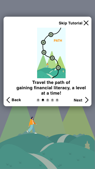
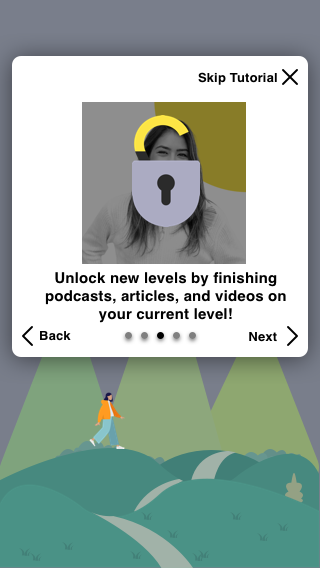
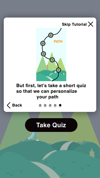
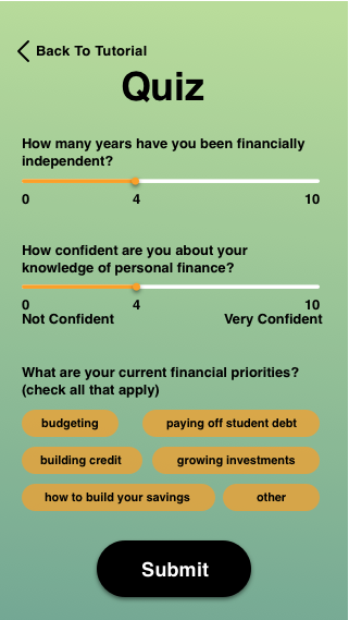
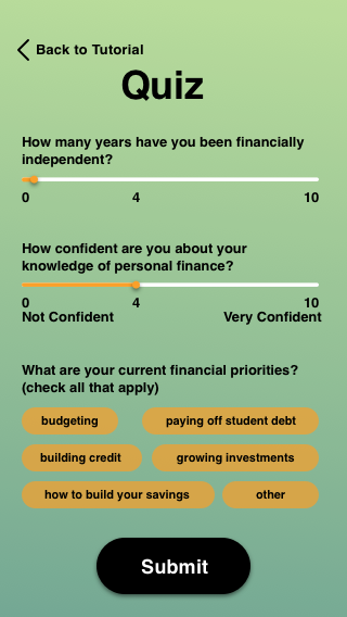
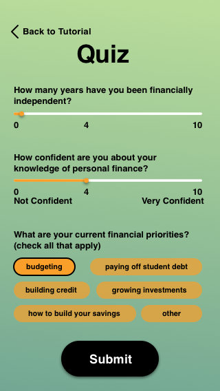
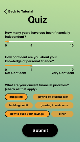
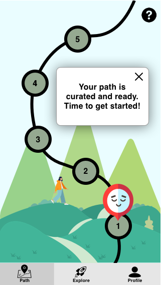
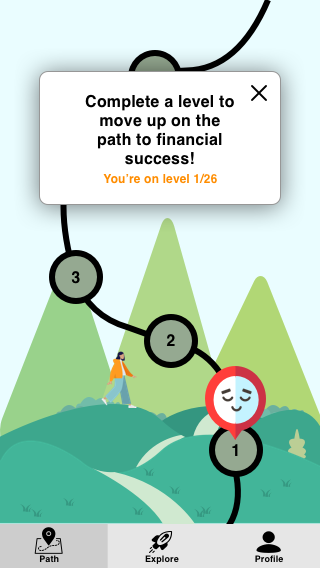
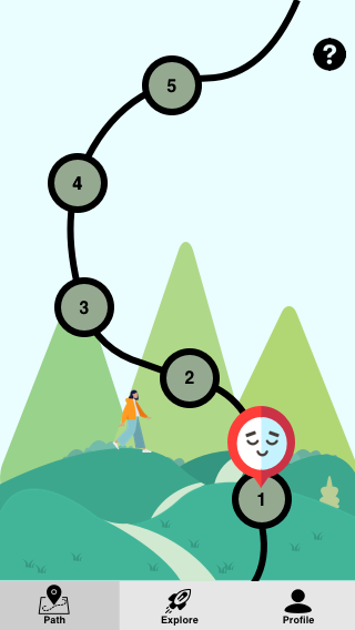
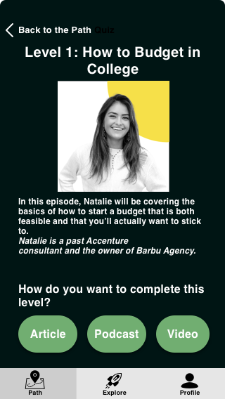
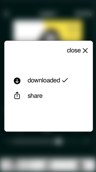
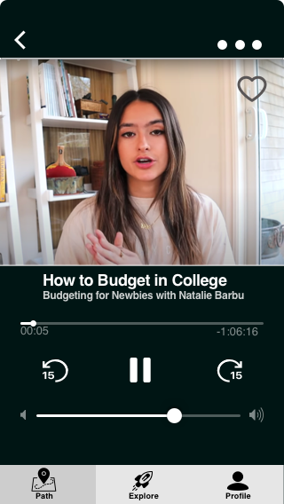
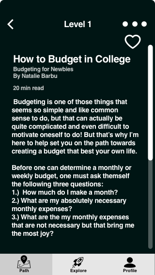
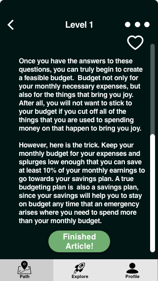
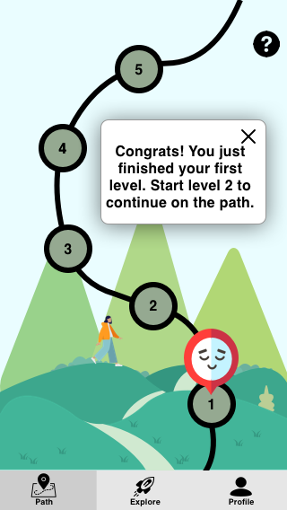
- The wireframe prototype is largely based on our paper prototype of Design 1 (the game-like learning app) since this design had a positive reception from our peers. We implemented the changes mentioned under “In-class Design Review Takeaways” (which is at the bottom of the Ideation page that can be accessed above) in order to further gamify the app.
Simple and Minimalistic
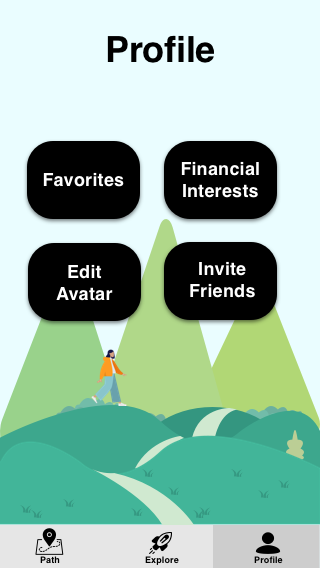
- We designed our wireframe prototype to be simple and minimalistic. In this prototype, we used the default fonts and UI/UX symbols and icons provided by the prototyping tool that we were using, since we were focusing on designing the site’s functionality and not on determining its aesthetics.
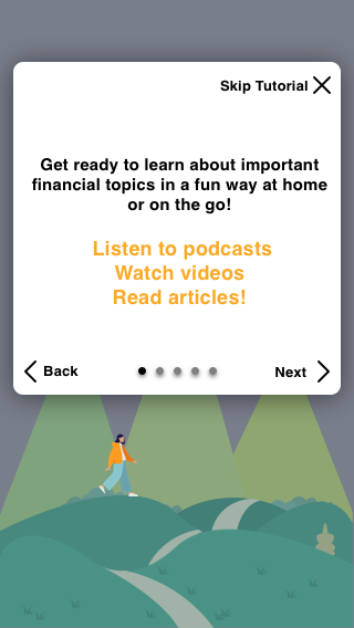
- We also designed our prototype to be simple and minimalistic since we wanted to only include useful features in the app. This will allow it to not be cluttered, which will make the app easier to learn how to use and easier to remember how to navigate. It was important to us to make the app easy to use so that it’s features do not overwhelm the user and add to the stress that they may be feeling as a result of actively thinking about their personal finances while using the app. To further increase the app’s learnability and memorability, we included a tutorial that a user can use to learn how to use the app’s main features when they open the app for the first time.
General Structure and Hierarchy
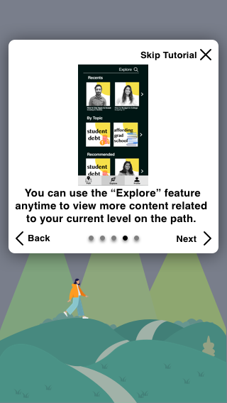
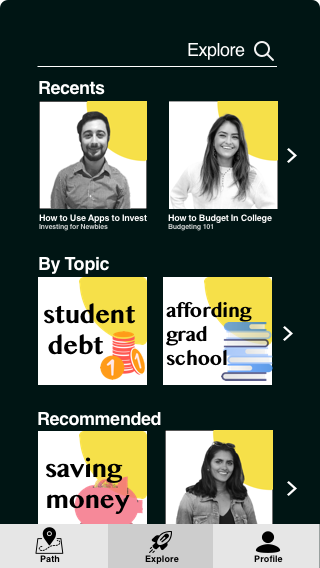
- Additionally, we referenced other apps when designing our own to see where different features and functionalities are typically placed on learning and streaming apps. We wanted to place features in spots where they commonly are in apps in order to further increase how easy the app is to learn and remember how to use. As a result, we made the main navigation buttons to be the two most important pages of the app, the landing pages of the game, or “Path”, feature and of the Explore feature. We made links to the Path and Explore features to be the main navigational buttons since these are the two main functionalities of the app. We also did so since this makes the most important features of the app easy to access and toggle between no matter what page of the app the user is on, which increases the app’s usability.
