Storyboard and Design Sketches
Scenarios
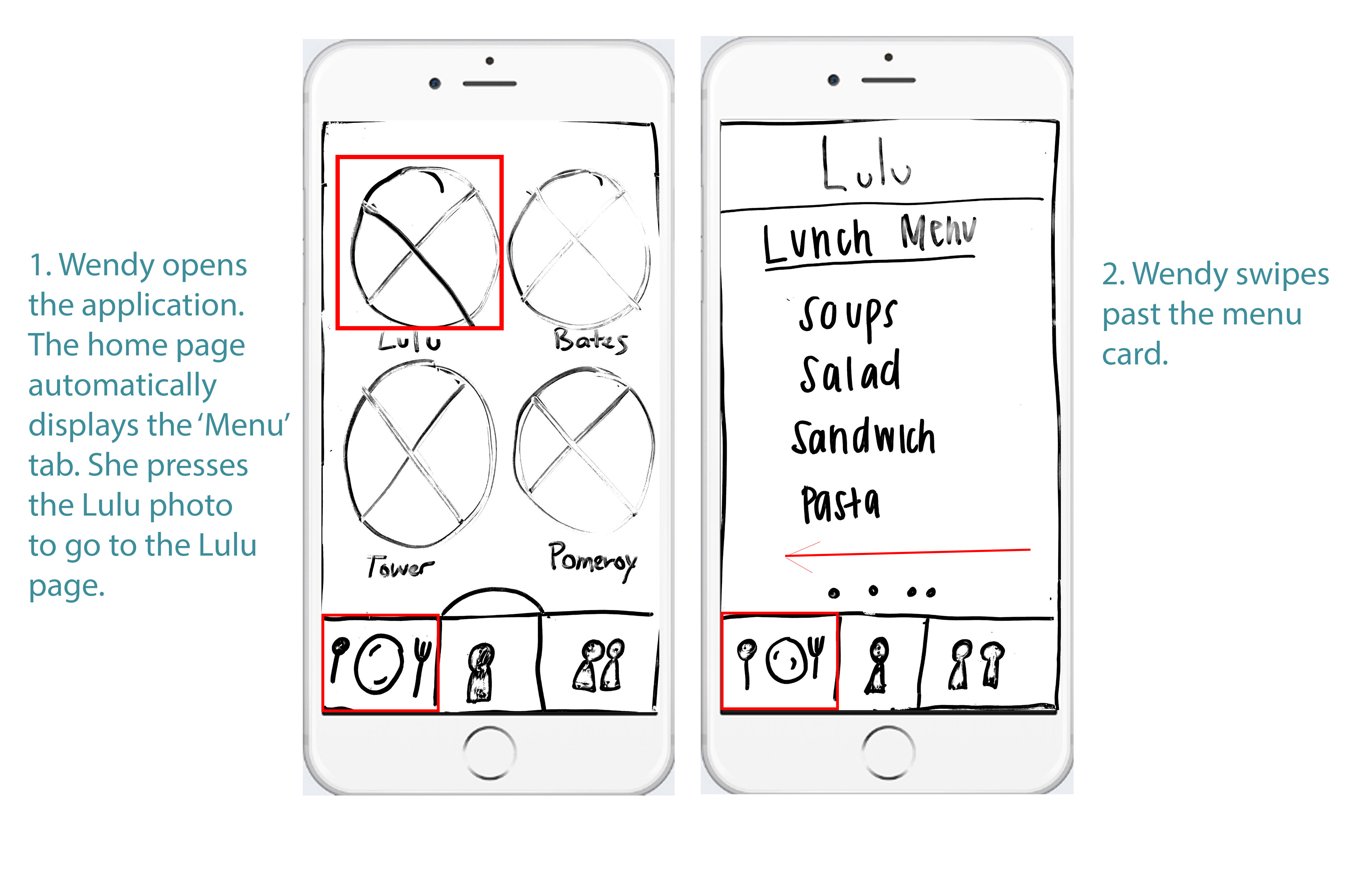
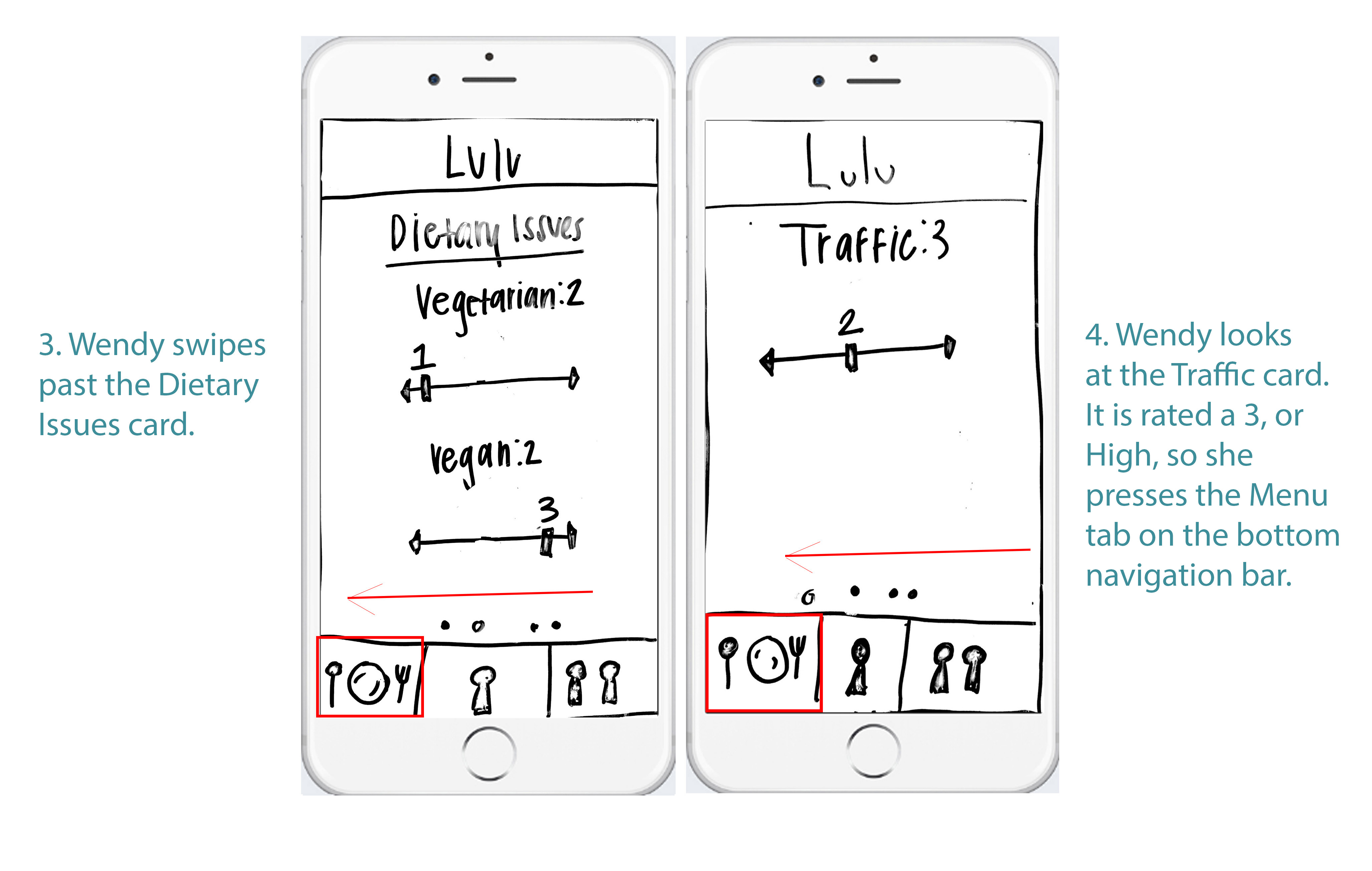
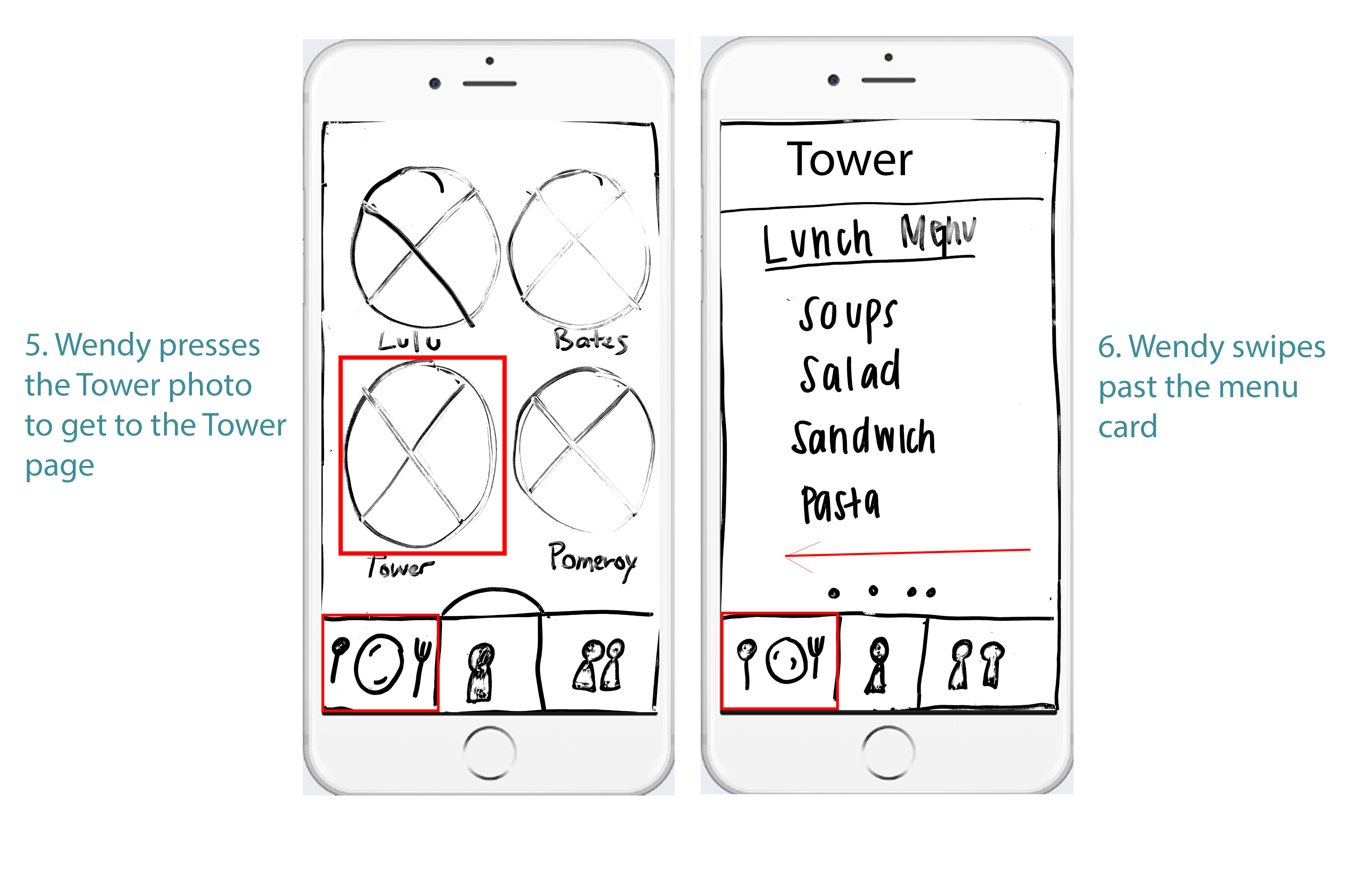
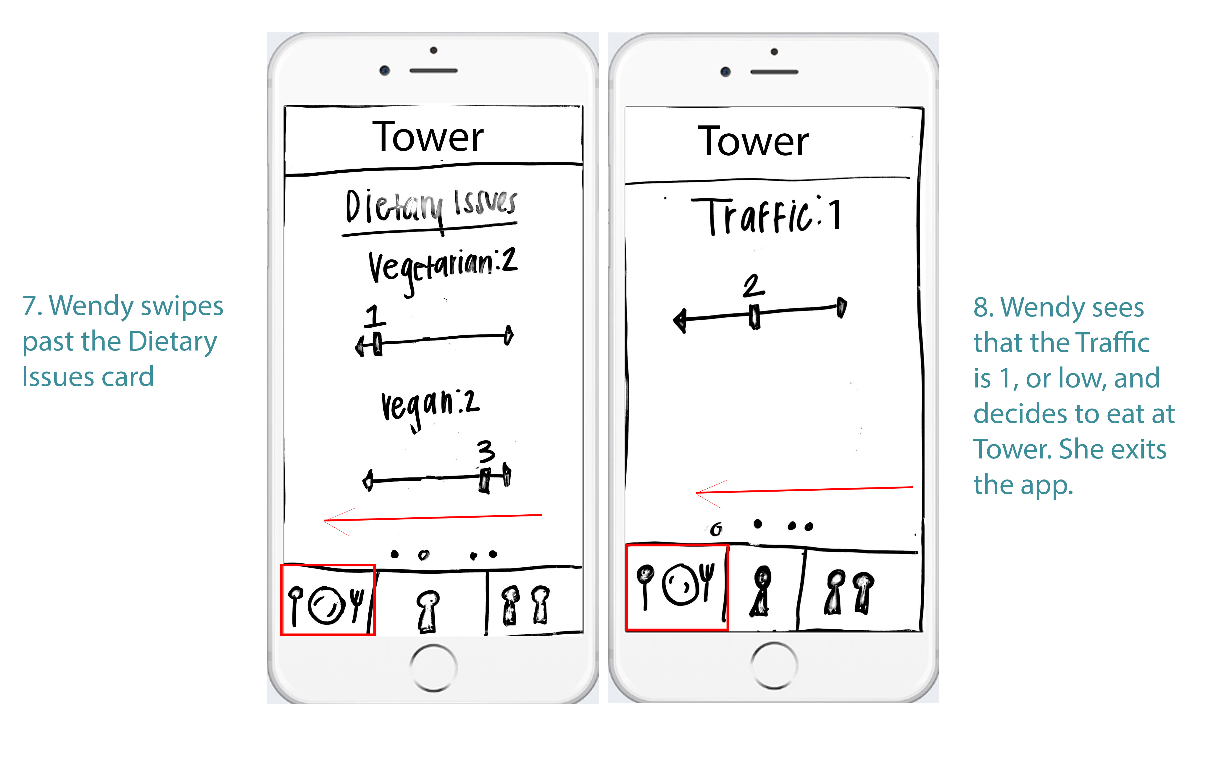
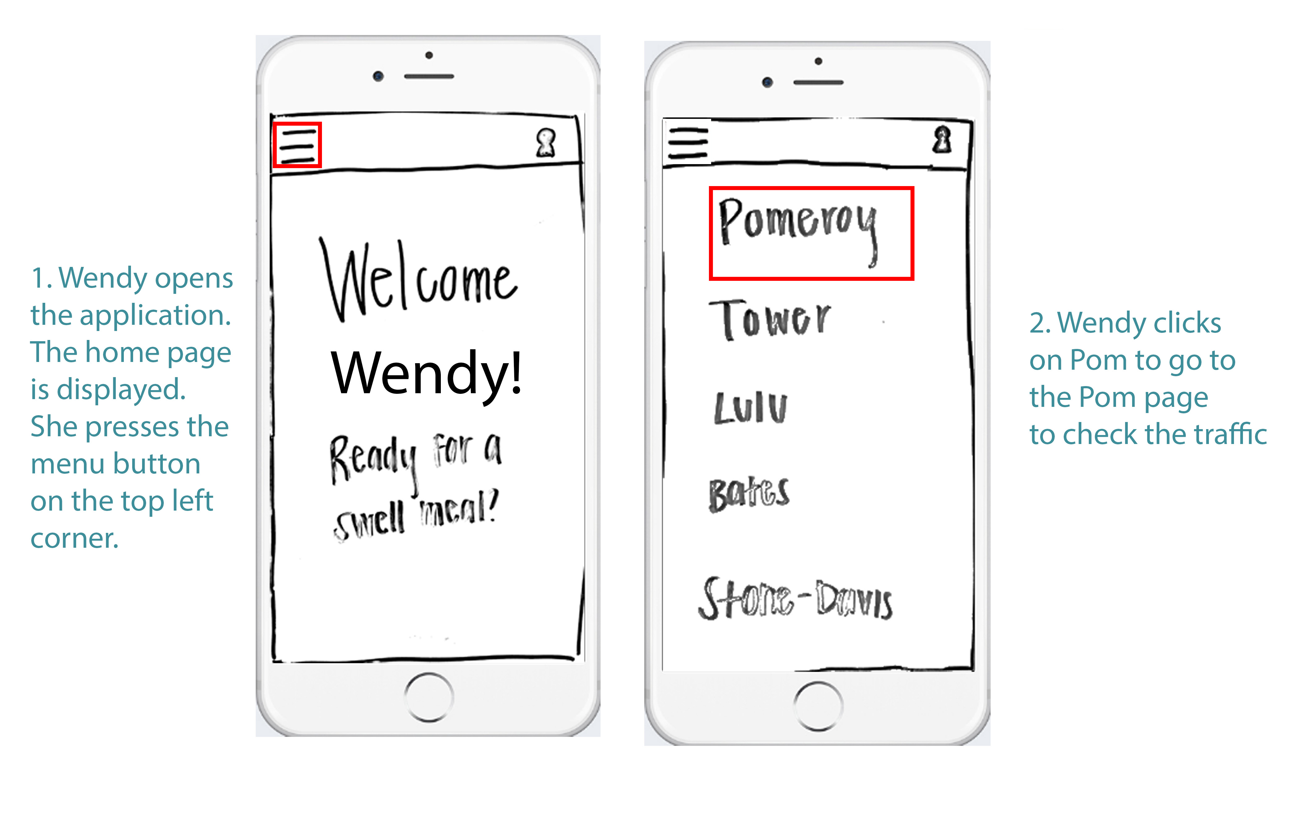
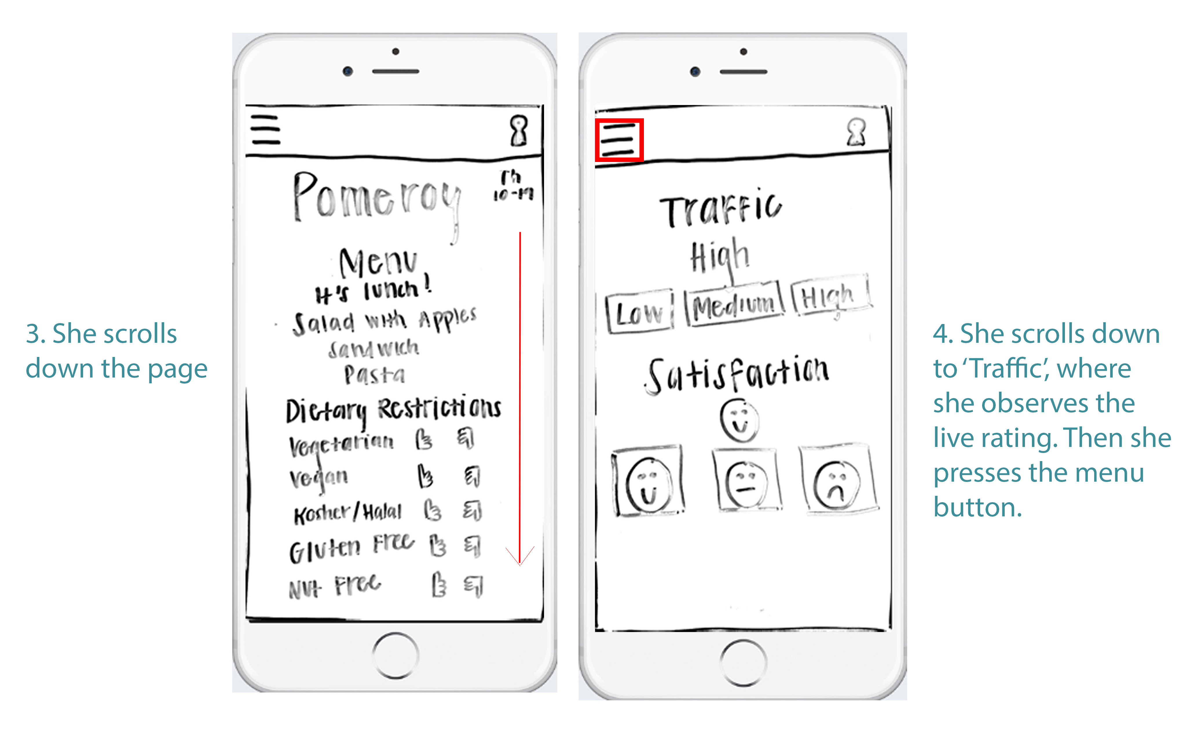
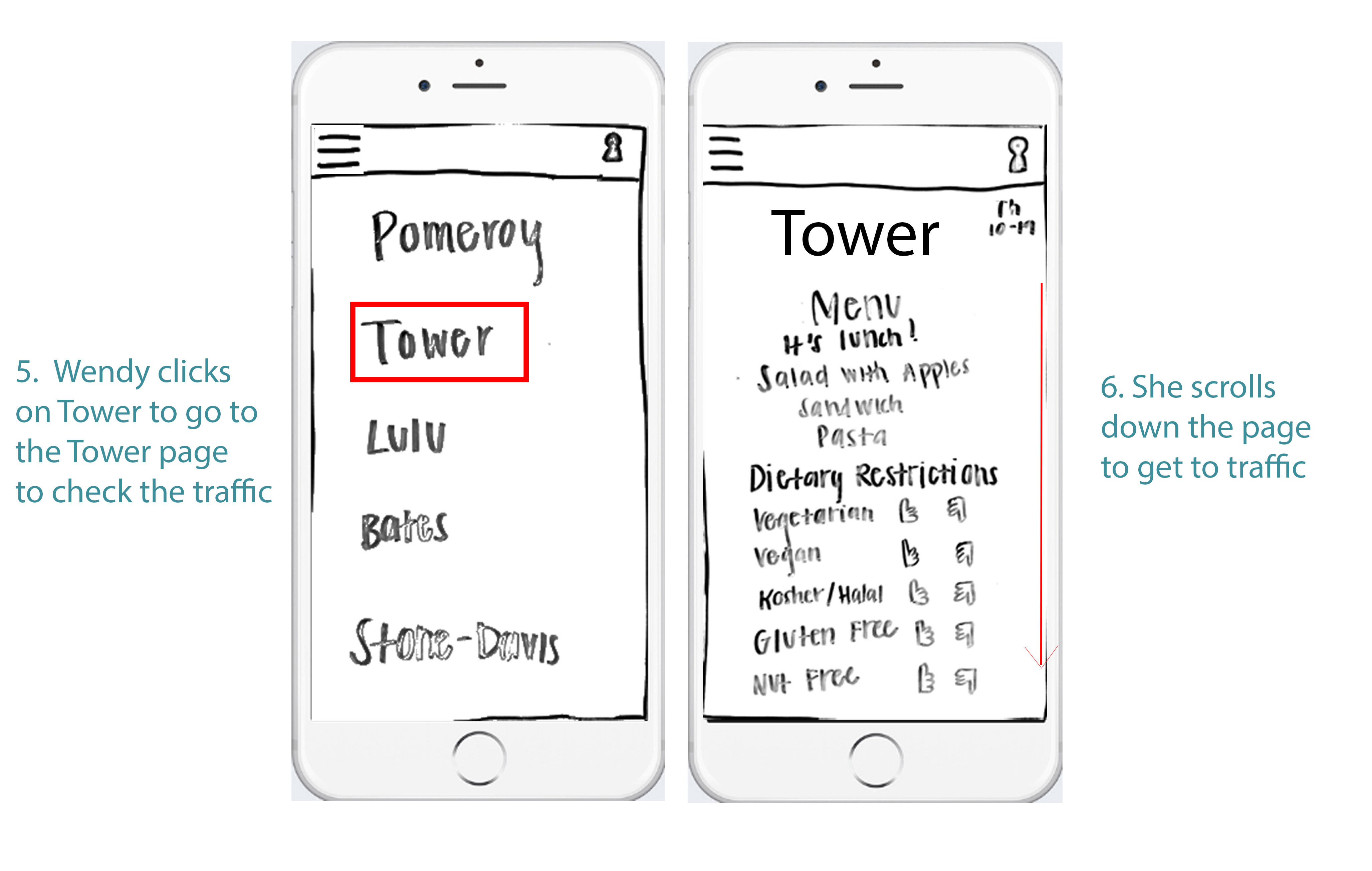
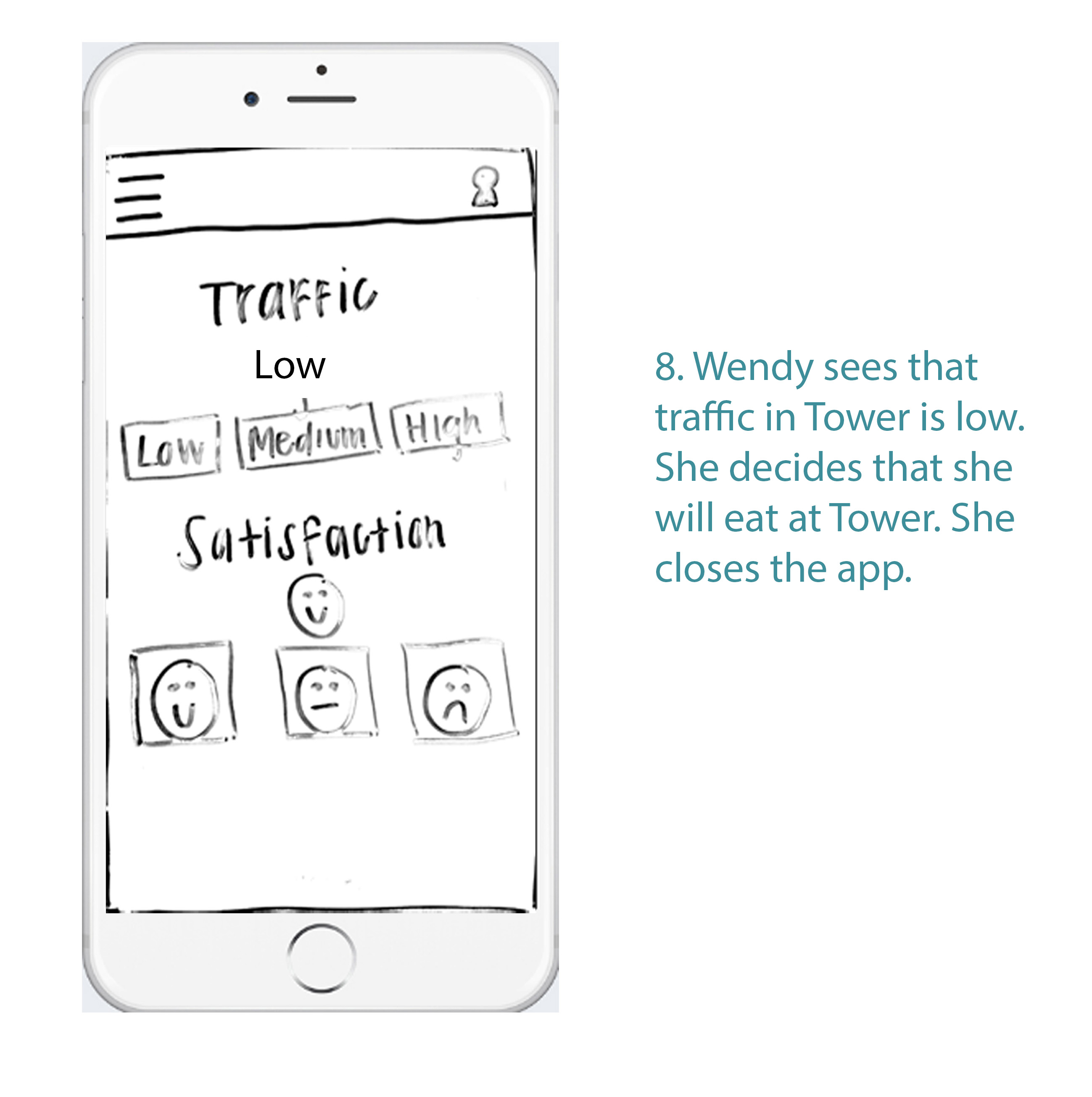
Wendy: Wendy is an overloaded sophomore who has class until 12:20 and catches the 1 bus for her MIT class. She has very little time to eat, but doesn’t know which dining hall has the least amount of traffic. After class, she pulls out her phone and starts walking as fast as she can. While speed walking, she checks Eat Swell to see which dining hall has the least amount of traffic. She picks the first dining hall with low traffic, which is Tower. Therefore, Wendy heads over while checking up on her emails since she has little time to spare.
Alex: Alex is a vegan upperclassman who starts class at 11:10 every day and doesn’t have to leave campus. She has plenty of time to spare and enjoys relaxing at her meals. Alex takes her time waking up in the morning, so she’s still lounging around when people are at their 8:30 classes. Her computer is put away from her study session the night before, so she pulls out her phone to check the menu. Since Alex is vegan, she looks for breakfast options that fit her dietary needs. Looks like Pomeroy was ranked highly by vegans this morning — she’ll go there before class.
Jane: Jane is a first year who is still making friends at Wellesley. Since she’s not involved in many organizations yet, most of her meals are time for her to get to know new people. She runs into an acquaintance, Beth, in her 9:50 class who asks her if she wants to join a group of friends later for dinner. Later, Jane realizes she forgot to ask where they were eating, so she pulls out her phone to check Eat Swell. Beth checked in at Lulu, so Jane will look for her there.
Preliminary Interface Designs
Design 1
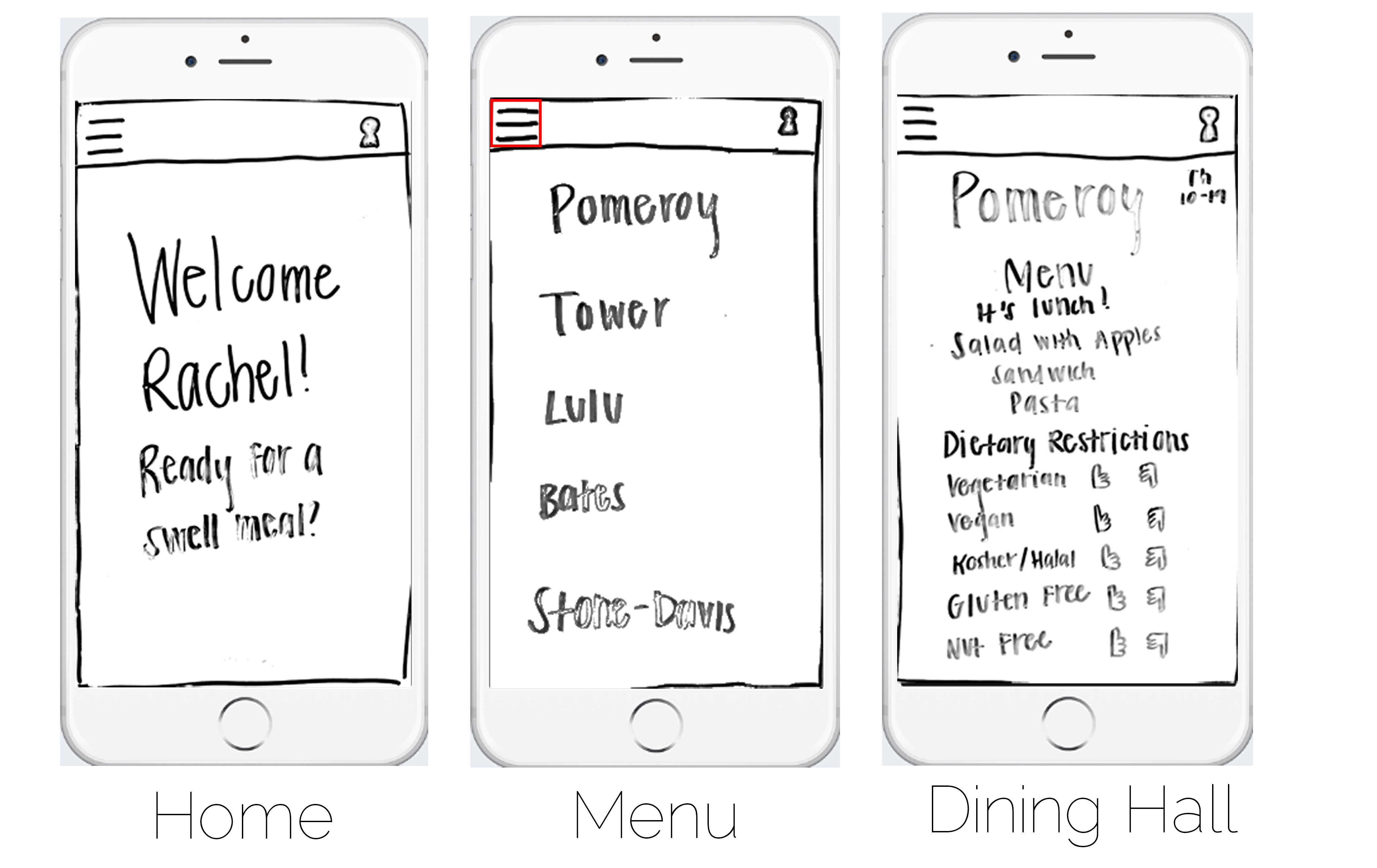
Home: The home page (which shows up every time the user opens the webpage), is just a welcome message with the user's name and a little quip ("Ready for a Swell Meal?"). There are two menu icons on the top left and right corner. Pressing the top left corner causes the menu to slide out from the left to cover the whole screen. Pressing the top right menu icon gives you the option to either go to your profile, or view your friend's locations.
Menu: The menu page (which slides from the left after the user presses the top left menu icon) displays all of the dining halls for the user to choose.
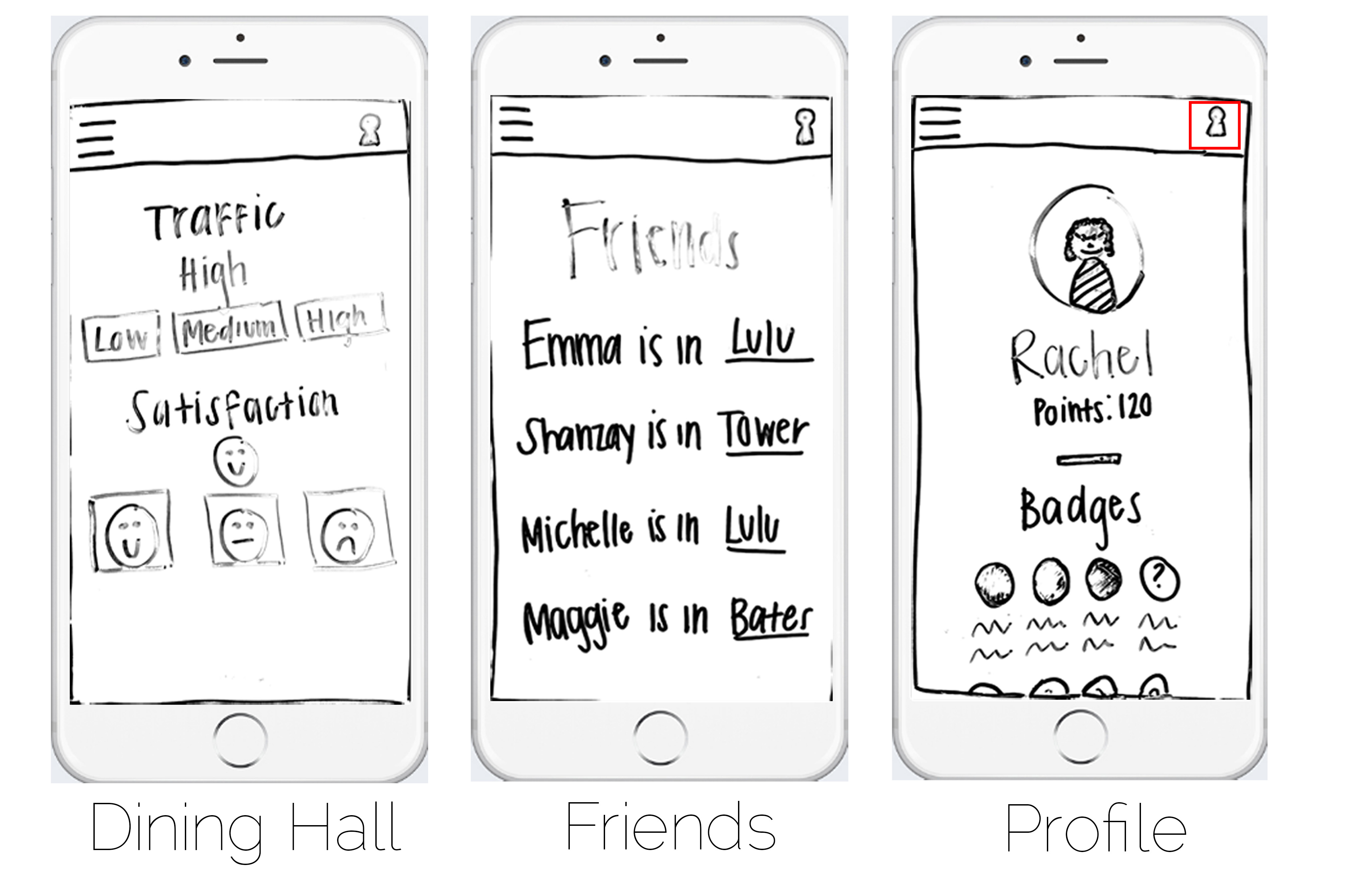
Dining Hall: The dining hall page is displayed after the user chooses a dining hall. Each dining hall has a similar page with the menu, traffic, dietary restriction, and satisfaction dispalayed. The user first sees the menu for the dining hall for that day and meal (the app uses the time to estimate what meal it should be showing), then dietary restrictions. The app will display the 'rating' for dietary restrictions for that dining hall, as well as give an option for the student to rate it herself if she is currently in the dining hall. The user can then scroll down and see the traffic (which will show the current rating and allow the student to rate it herself), and similarly, the satisfaction (with a rating an option to rate it herself).
Friends: The friends page will show the user all of their friends (who are using the app and have a profile) who have 'checked in' to a dining hall by rating it in any way. For example, if a user rates Pomeroy's dietary restrictions, she will appear 'checked in' to Pomeroy to her friends. Friends that have not currently 'checked in' anywhere will not show up on the friend's list.
Profile: The profile page shows a little profile picture of the user as well as the user's name. Underneath, the amount of points are displayed that the user has earned. The user earns points by rating dining halls and 'checking in'. Underneath, all of the badges that the user has earned is displayed. There will be mystery badges that the user can earn as well.
Design 2
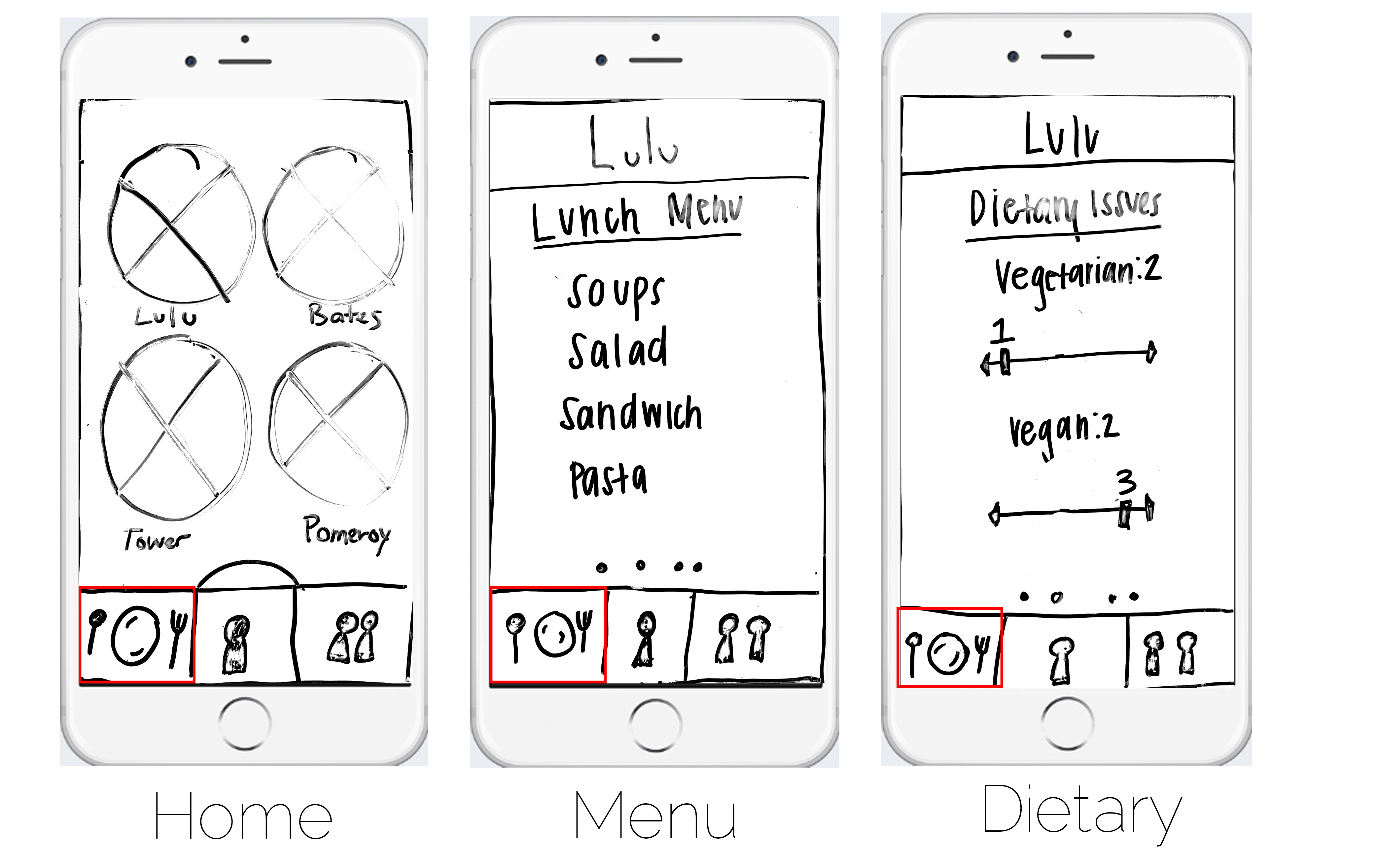
Home: The home page (which shows up every time the user opens the webpage), shows pictures of the dining halls, in circles, arranged on the screen in a grid pattern. The user can click on these images to be taken to their respective menu pages. On the bottom of the page is the tabbed navigation bar, with three images. The red box demonstrates the 'active' tab.
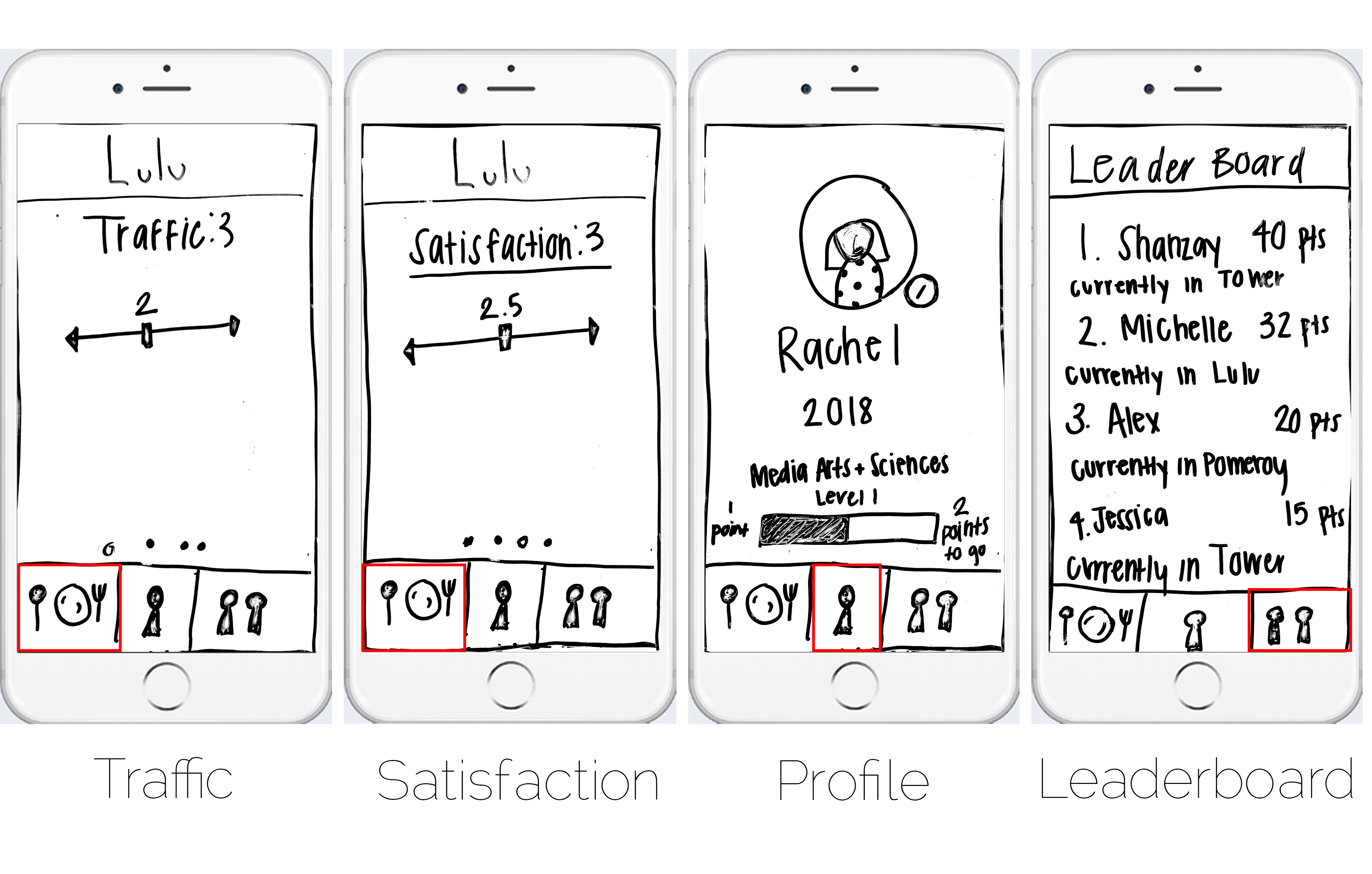
Menu, Dietary, Traffic, Satisfaction: When the user clicks on a dining hall, he or she is taken to a page with a sliding carousel. Each section (Menu, Dietary Restrictions, Traffic, and Satisfaction) has it's own little card or slide, where the user can simply swipe to the left or right to display or interact with (like inputting their own information).
Profile: If the user presses the second icon on the tabbed navigation bar, it takes the user to their profile. The profile shows their photo in a circle with an edit button next to it, their name, class year, and major. Then it shows what 'level' the user is on with a progress bar. The progress bar shows the user's progress toward the next level. The user gets points and upgrades levels by inputting dining hall information.
Leaderboard: If the user presses the third icon on the tabbed navigation bar, it takes the user to the leadboard page. The leadboard page shows the user's friends, ranked by their points. Everybody's points and levels are public and ranked for everybody to see. Underneath each ranked person is their current location (where they have 'checked in').
Storyboards
Storyboard One
Storyboard Two
