Phase 3: Paper Prototype Implementation & Testing
Briefing
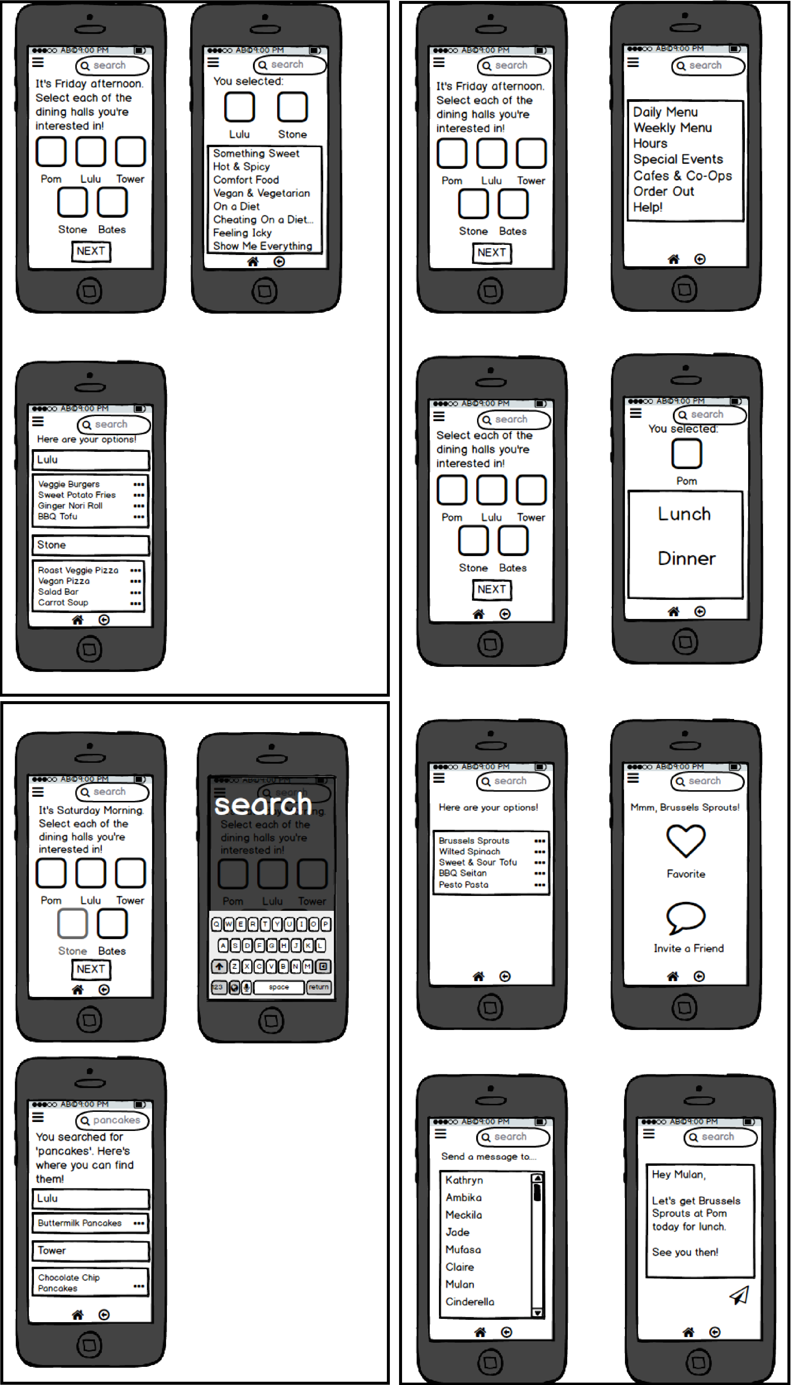
Hello participant! Thanks for checking out the paper prototypes for our application “Fresh”. This application is designed to be an interactive and personalized way for Wellesley students to view the AVI Fresh menu. Through this application you should be able to search for specific food items, dining halls, invite friends to meals, and favorite certain foods. You could use “Fresh” on your way to class, from your room, or after bumping into a friend. The point is to make dining at Wellesley an efficient, tailored, and more pleasant experience through the ability to choose specific meals based on your priorities. We will be giving you three separate scenarios in which you will have an objective in mind and experiment with our interface in order to achieve those goals.
Scenario Tasks
Scenario 1
You are vegan and you walk into Tower dining hall and see there are no appetizing options. Use your app to choose a nearby place (like Stone-D and Lulu!) to eat that has good looking food.
Scenario 2
You run into a friend who you haven’t seen in a while, and you decide you’d like to grab lunch together today. Use your app to invite her to eat with you.
Scenario 3
It’s Saturday morning and your stomach is growling...but only for pancakes. Use your app to search for some. Favorite the pancakes that look yummiest.
Observations
In the first round of testing in class we realized a big feature that we overlooked is a way to move on from the homescreen after the users have selected the dining halls they would like to view. This in addition to the phrasing of the prompt “ Select the Dining Halls that you are interested in” made the users unsure about whether or not they could select multiple dining halls. They also were a bit unsure about whether or not they could select the meals presented and did not initially see a search bar. We also realized during testing that we had thought that Bates was closed on the weekends when in reality it Stone D that is closed so we had to make sure that we would adjust our prototypes accordingly. Lastly for our third scenario we found that our search button was not large enough and our users did not try to use that as we had intended.
After making the adjustments according to these observations we tested three more users and found that some problems had not exactly been resolved. Although we had turned our search button into a bar it seemed that people were still distracted by all the other stuff on the page and did not choose to to use the search feature without our guidance. In addition one of our users suggested that we make it so that people can select multiple options in our list of categories in the same way that they can select multiple dining halls. A user also pointed out that our messaging system does not incorporate time for each meal which would be an important thing to specify.
Prototype Iteration
In order to adjust our prototype to some of the errors we picked up on during the initial testing we added and adjusted several features to our design. We first changed the phrasing of the instructions from “Select the dining halls you are interested in” to “Select each of the dining halls you are interested in” a simple change that will hopefully indicate to users that they are encouraged to select dining halls as needed. In addition we added a next button to the homescreen so whether the user wanted one dining hall or all dining halls they could simply press next ready. In order to make the search feature more obvious we changed our search button to a search bar that would hopefully draw the attention of the user. We also made the adjustment to the dining halls according to which would be open on the weekend and changed the instruction for the message feature from “message a friend” to “invite a friend”.
Resolutions
We found that despite our efforts to emphasize the search feature users are distracted by the rest of our application and do not think to use it. In order to take care of this issue we plan to minimize our text on the initial page along with enlarging the search bar. In addition we found that people would like to be able to select multiple categories depending on their mood for the meal, we plan to incorporate a “next” button like the one on our homepage to make this an option for our users. Some users also found the pre-worded message to be vague we plan to incorporate time as a user determined part of the message. Users also seem unsure about our hamburger menu and when to use it we propose that in a real situation if the user did not find what they were looking for on the initial page they would default to the hamburger menu. Especially because our target user is a Wellesley student we feel that this would be a fairly intuitive move.