Wireframe Prototype
Design Rationale:
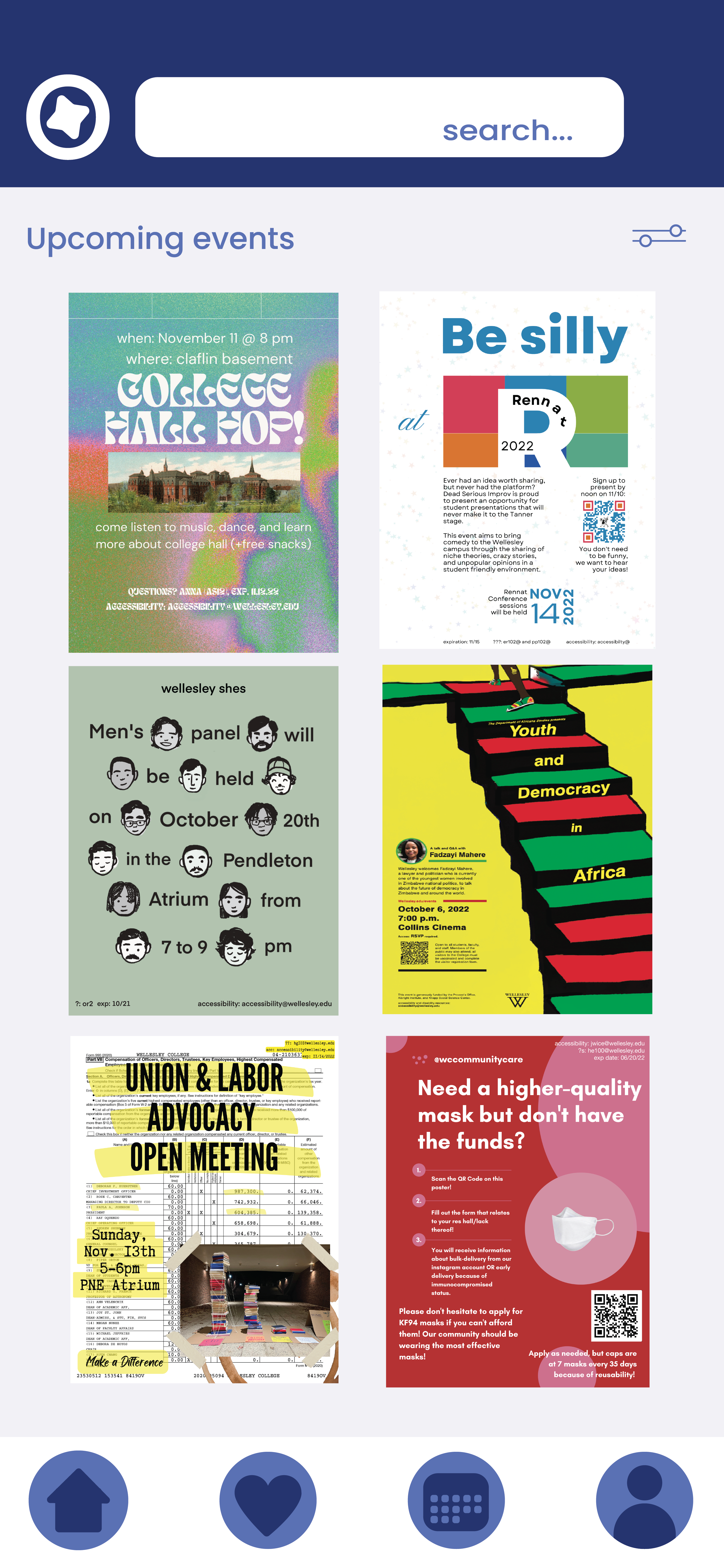
Based on the feedback from the in-class presentation, we decided decided to pursue the ‘spam board’ approach for our design. From the student perspective, the primary feed will look about the same as the original proposed design- a vertically scrollable two-wide grid of rectangular flyers. (This feed will be sortable by recency and by upcoming, and filterable by org/event type.)
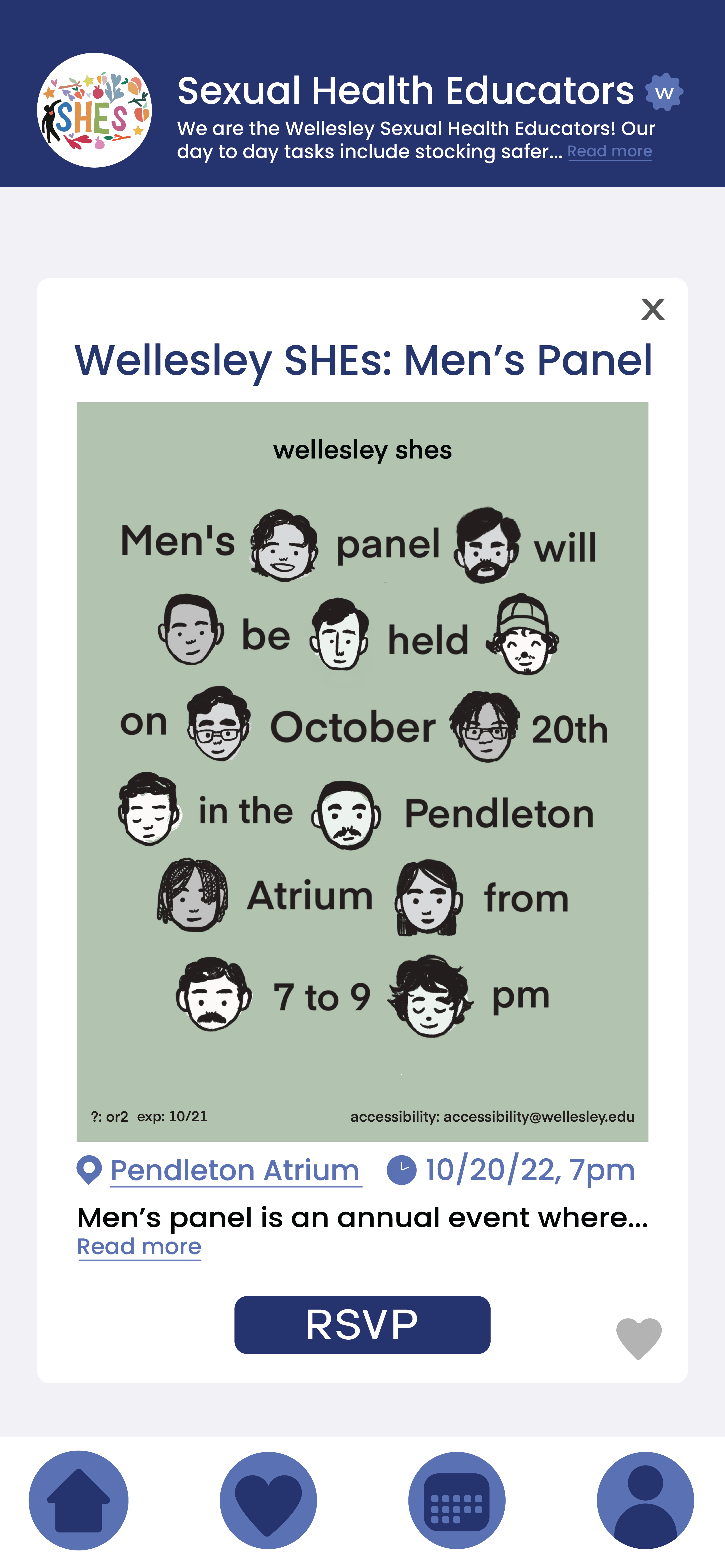
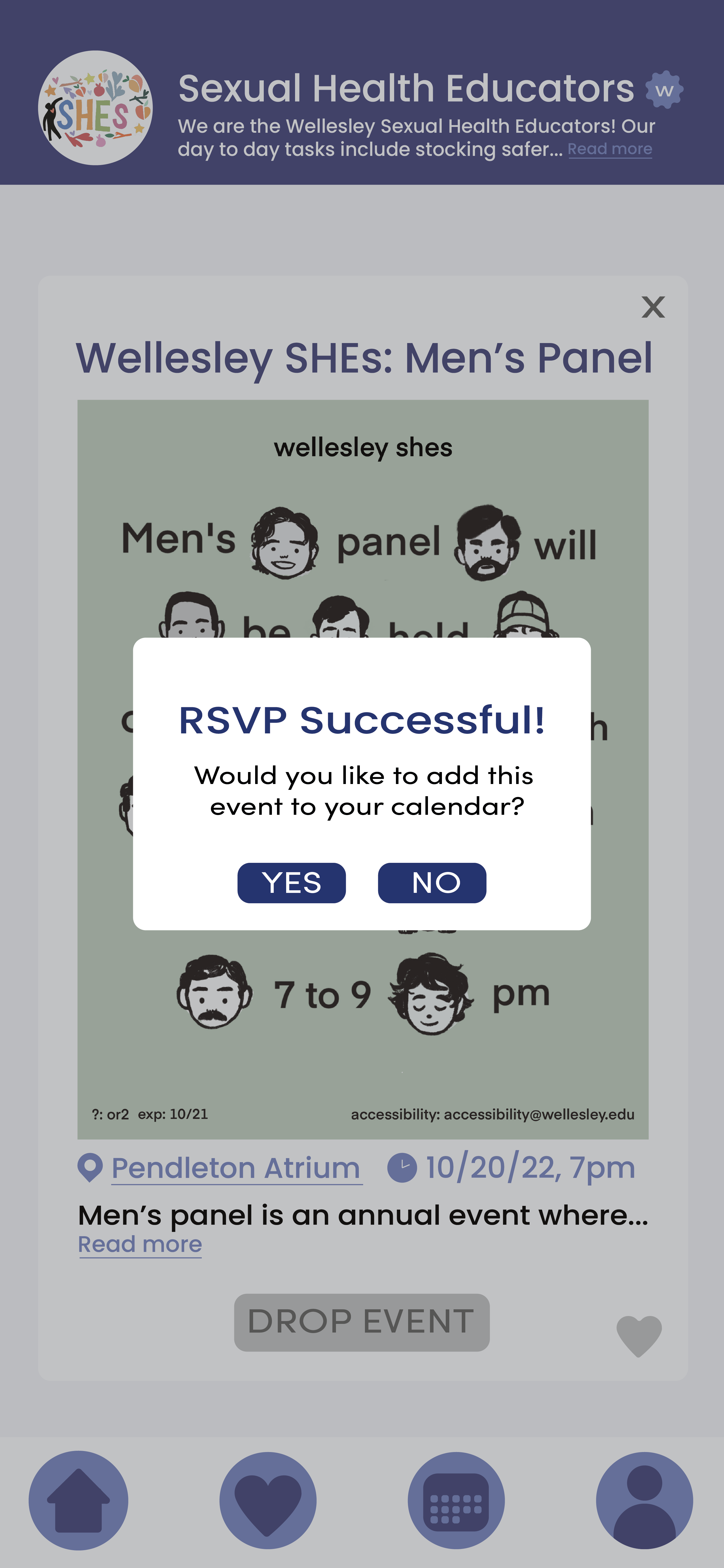
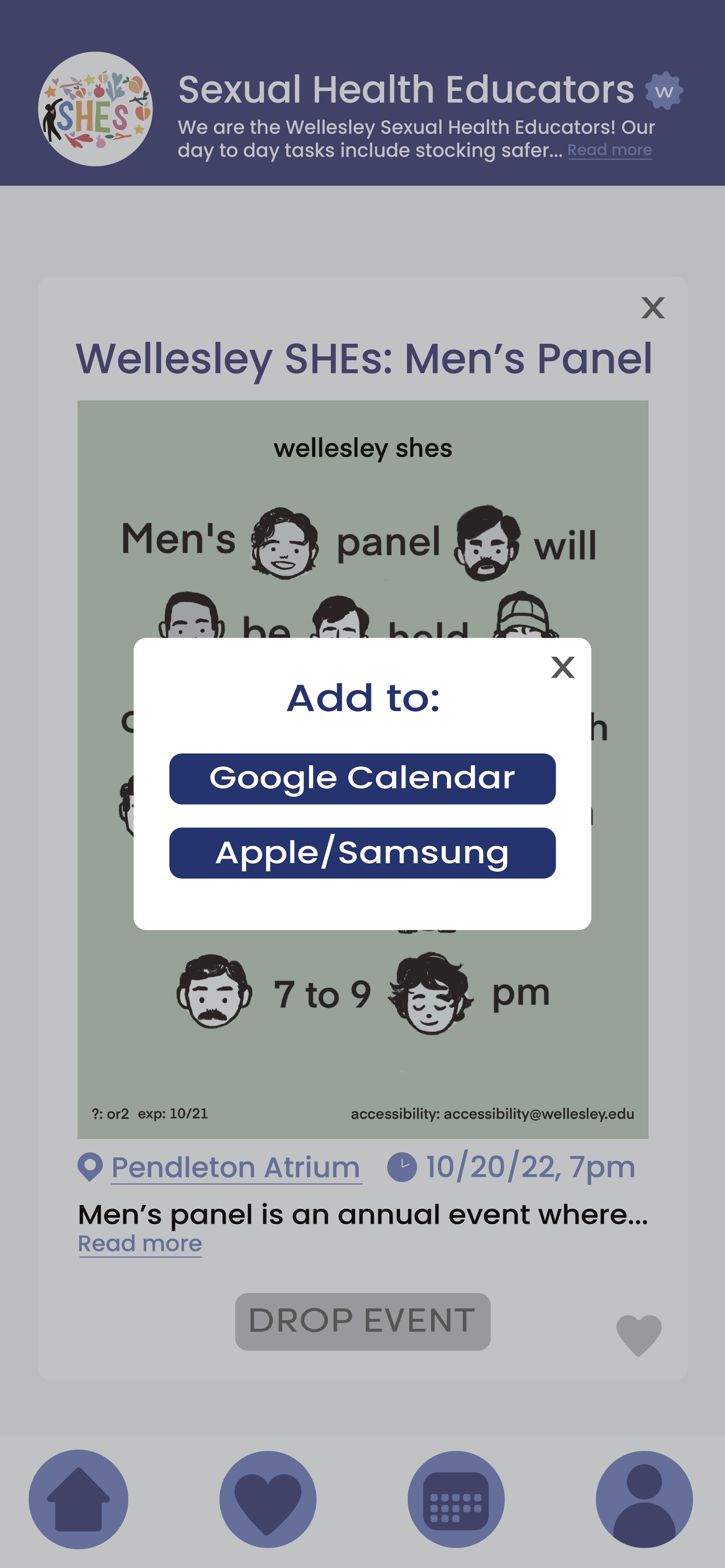
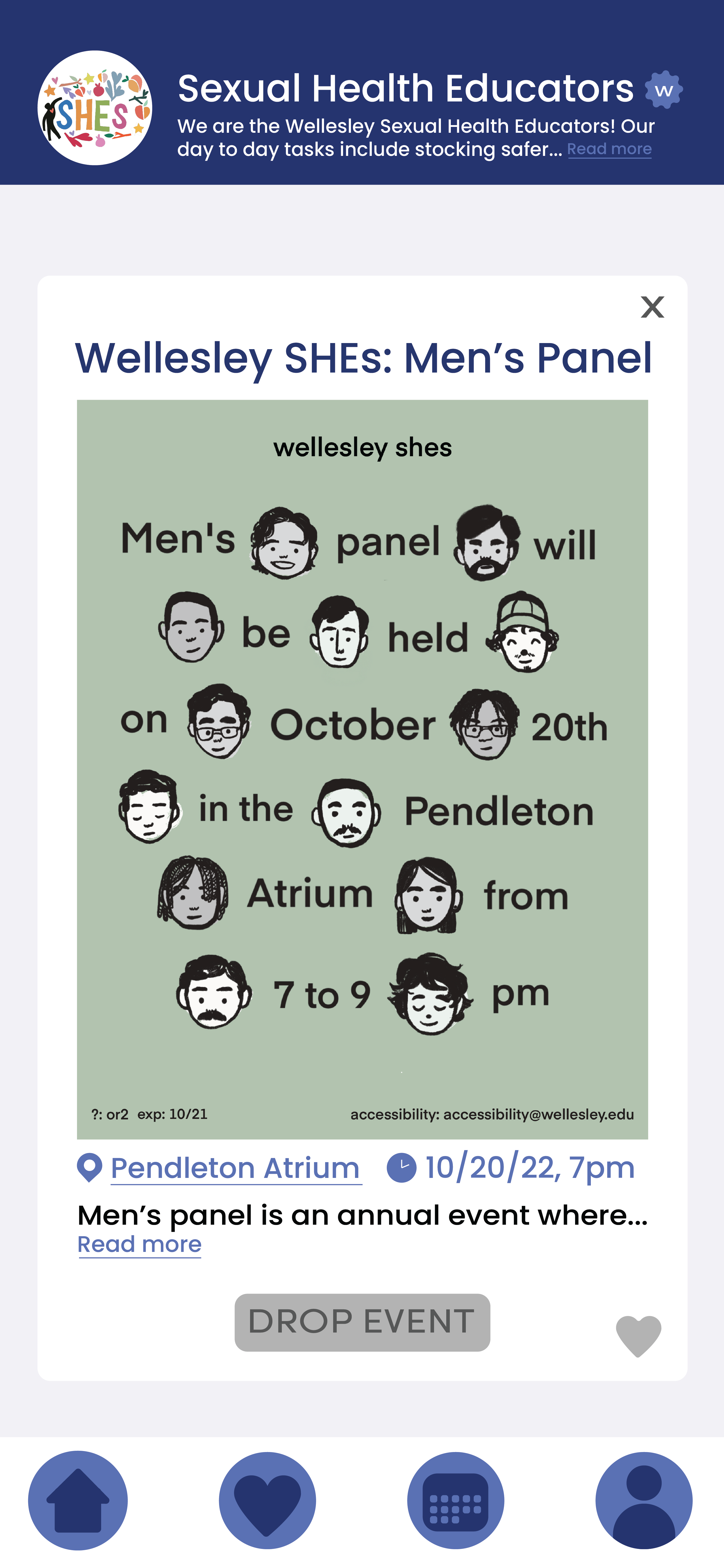
Clicking on a flyer opens a close-up of the spam, with the name of the organization (and their profile photo) at the top and the text description of the spam underneath the image. The bottom has an RSVP button, through which events will be added to a new feature we added: the in-app calendar. Events are still able to be exported to external calendars. Another feature we are adding is the ability to “like” an event, and there will be a secondary feed displaying the spam of liked events in the same manner as the main feed. Different screens will be switched between using a navigation bar at the bottom of the screen with several icons across it.
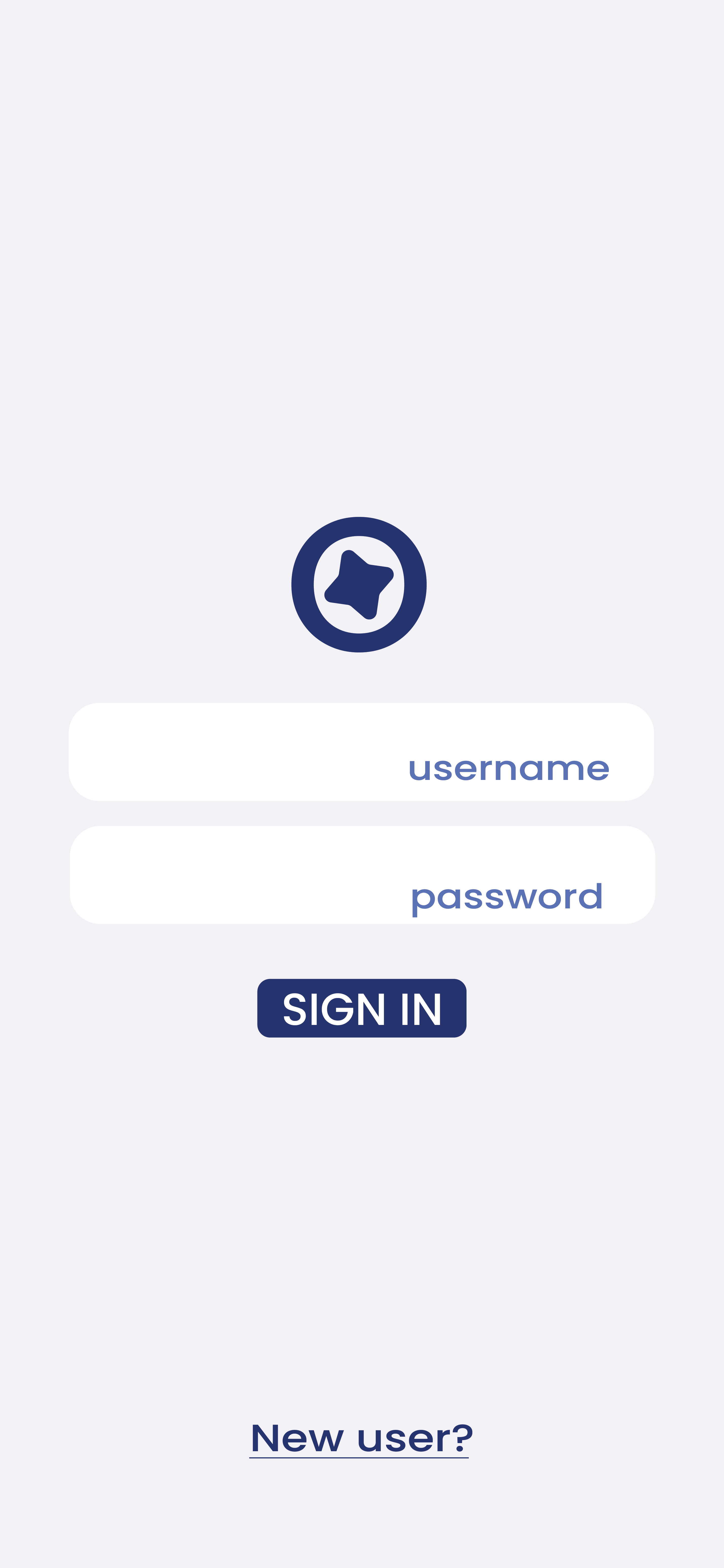
The org POV design is very close to that proposed in Design #2, with the “Make New Event” screen consisting of a blank space for typing the text description, and selection buttons for the required "event time" and "event location" attributes. We also incorporated a feature from Design #1: the button for attaching an image.
First InVision Prototype
Design Rationale:
We designed ORGanized as a tool for Wellesley students to find org events. We wanted to ORGanized to feel familiar and welcoming to Wellelsey students. To foster familiarity, we selected #26356E (“Wellesley blue”) as our banner and button colors. All other colors utilized in this design were compatible with this color. We also had a lighter blue color (#5B71B3) for our accents. Maintaining color balance was particularly important in our design process. Our platform must be compatible with the multitude of different spam designs and bright colors that campus orgs produce. We selected a neutral background color (#F0EEF3) to contrast a wide variety of spam. Readability was central to our typography and font color choices. We chose Poppins Medium, a clean and simple sans serif font, to meet this guideline and complete the modern, minimalist impression. Implementing a “spam bulletin board” metaphor, we designed a 2x3 layout for the posted spam. Initial user interviewees reported using spam boards frequently to keep up with current events. The metaphor will aid our products' learnability.
Our logo is reminiscent of a compass, symbolizing the direction that we will provide for Wellesley students looking for org events. The letters “ORG” in “ORGANIZED” are in darker blue to emphasize that our app deals with orgs. We also include a light blue “W” badge next to constituted orgs, serving a similar function as the blue check marks for verified accounts on Twitter (pre-takeover, of course).
For P4, we initially implemented only the function to RSVP events (shown to the right).
Heuristic Design Evaluation
Overall, users continued to like our spam board design, and agreed that our design choices let the colorful spam shine. One major area of concern was on error checking; users wanted ways to undo actions like RSVP, go back to previous pages, and so on. Users were also confused by buttons and icons leading to functions we had not yet implemented, such as liking an event and the in-app event calendar. Users especially wanted clarification on the calendar functions and how the in-app calendar would be implemented. We received feedback about the style of our icons and clarified them, for example, by swapping out our filter icon with a more recognizable one. Finally, while we had neat transitions between pages, they were distracting and detracted from the cohesiveness of the app, and we removed those.