EvaluationPrototype
Starting from low-fildelity prototypes, to high-fidelity prototypes, we conducted several rounds of user testing. Below, we have outlined our findings.
Wireframe
design 1
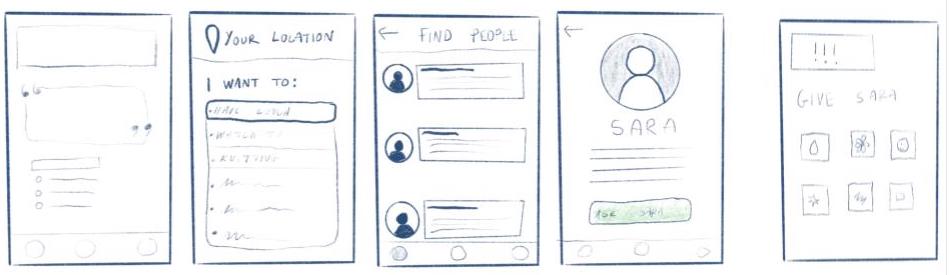
design 2
Design Direction: We decided to merge our designs 1 and 2 based on our feedback; many students pointed out the simplicity and usefulness of Design 1, but were also drawn to the plant metaphor aspect that we featured in our home page in design 2. So, we wanted to combine the designs in order to present the best aspects from both in one design. Our new homepage contains elements of Design 1 but also includes the plant from Design 2. In our home page, we got rid of elements such as the random quote section and “Welcome [user]” prompt at the top of the screen, separated our two paths into two different clickable buttons, and created efficient and smooth pathways.
Considerations: We realized we had to account for the people already doing activities so we added another button that led to a drop down menu in which users can pick an activity and see who is online and available and also interested in doing the same activity.
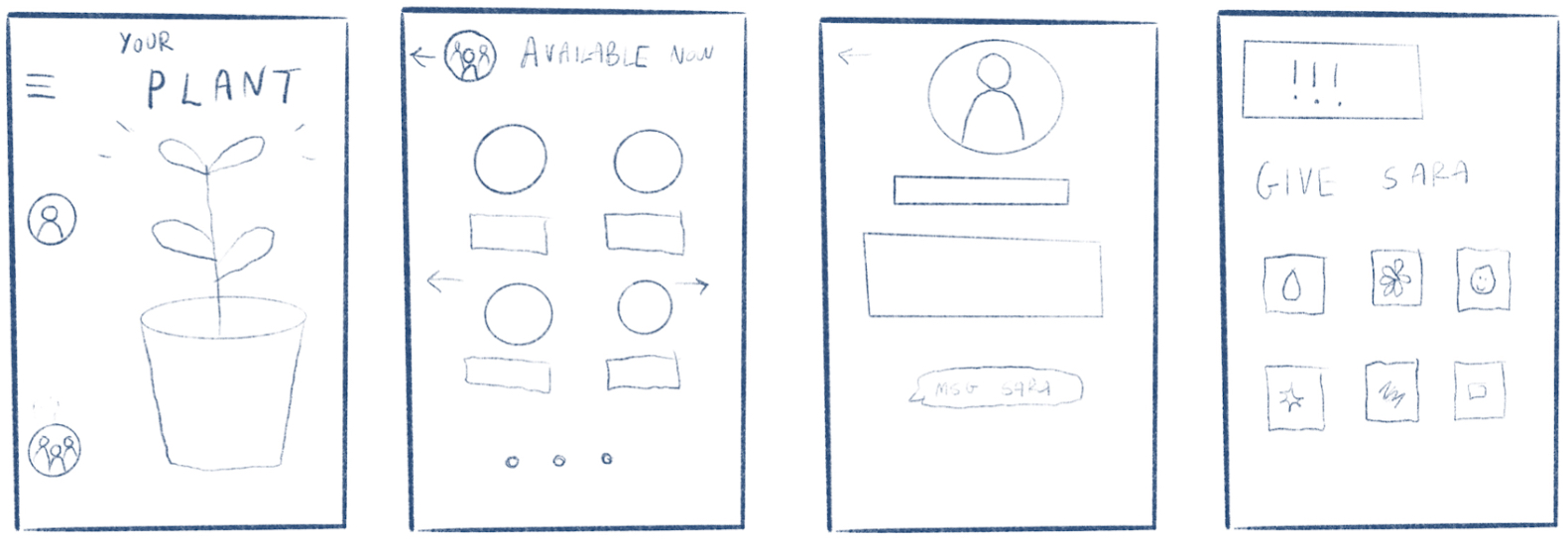
Low-fidelity Prototype
After User Testing:
Subjects enjoyed the simplicity of the design, but there were confusions around how the activity matching aspect worked; for example, one subject submitted an activity and then wanted to check the available activities right after, assuming that the two home screen buttons were both meant to be clicked in order. After sending out an activity, all subjects seemed like they were waiting for additional steps to happen and were confused about how they’d get connected to someone. Additionally, the “add a description” and “add a photo” features were mistaken for required elements for a post, although we initially designed them as fun add-ons should the user want to use them. This posed a problem to users because each subject reacted differently to that page - one got excited and said she would upload a funny selfie, while another flat out said she didn’t want to put an image because it would be unnecessary.
Prototype Adjustments: From our user interviews, there were a few common issues throughout. For instance, we need to add ‘back’ buttons on the “I have an activity” path. Currently, there are no ways for the user to exit from this once they click on it, posing an important usability issue. Additionally, all users tested suggested a clearer confirmation page for when they sent out an activity that they created. It is currently unclear what happens when they send out an activity and what the next steps they should take are. This should be outlined in the next prototype. The users also expressed confusion at the list of people after clicking the activities. It was unclear whether this was a group activity, or a list of individuals. This needs to be clarified, and perhaps we could think about creating a group activity function as well. Additionally, users expressed that they would find the app more meaningful if they were able to send out activities earlier so that they could pre-plan their day. We could therefore add a function in which users can specify a bracket of time for the activity instead of solely relying on spontaneous connections. Lastly, the users commonly expressed that the photo function when creating an activity should be optional. The prototype should be adjusted to specify which fields are optional vs required for the user to fill in.
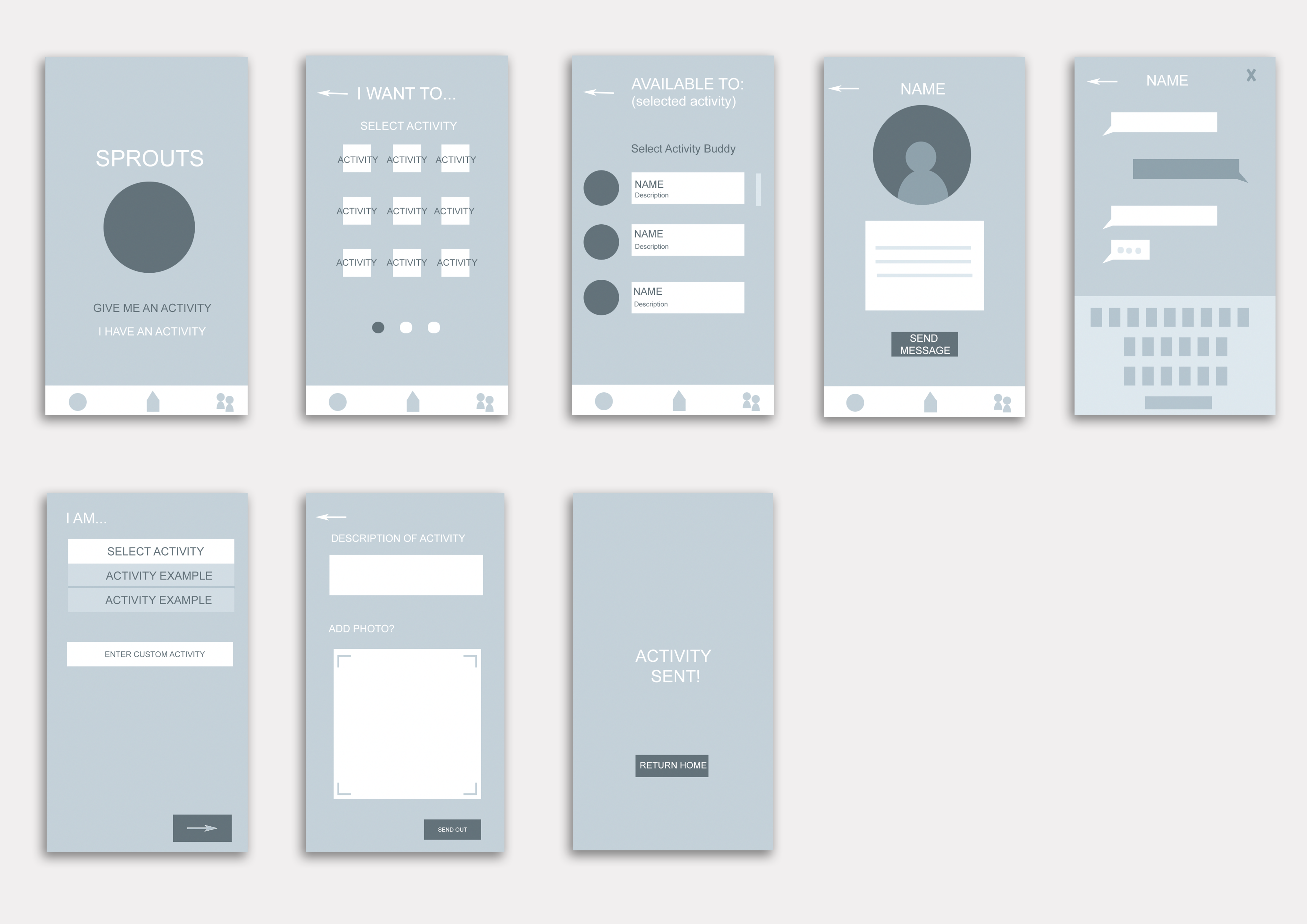
High-Fidelity Prototype
After User Testing: Our prototype was far more successful compared to our last round of user testing at meeting the usability criteria we had set. One of the main lessons taken from this round is the power of simplicity; compared to our last prototype, this one simplified the activity adding/joining process down to a more user-friendly interface. The homepage immediately presents all available activities and the ‘add an activity’ feature is more clearly indicated with a ‘+’ button. We saw that the minimal design eased user confusion much more through this but also contributed to more confusion at times; for example, several users approached the home screen unsure of what it expected from them. To some, it was not immediately apparent that the images on the homepage, representing current activities, could even be clicked on. So, we think that adding more details about each activity (time taking place, time posted, user who posted it, etc.) on the images themselves will help communicate to the user that these items are clickable and should be interacted with.
So, remaining usability issues that remain are to clear up the symbols in order to better communicate their functionality. For example, getting rid of the clock icon on the home screen and adding additional information onto the pictures. And, changing the chat function icon to something like a speech bubble would improve the learnability of our interface since it will be more recognizable to the user.
Through this round of user testing, we also realized the different interpretations our app could be taken in: one user noted that they could see this app being used as a way of communication between Wellesley students about more everyday things like lost and found or free and for sale. And, some think it would be a valuable way just to see what’s happening around campus on a consolidated platform.