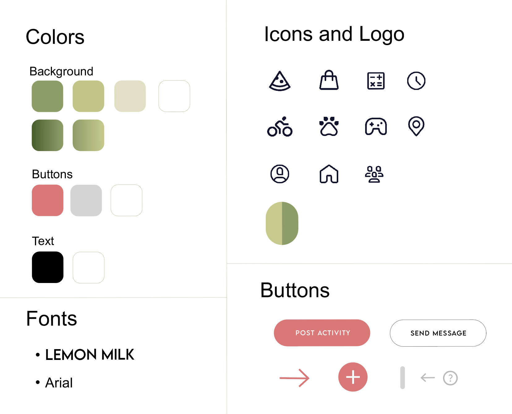
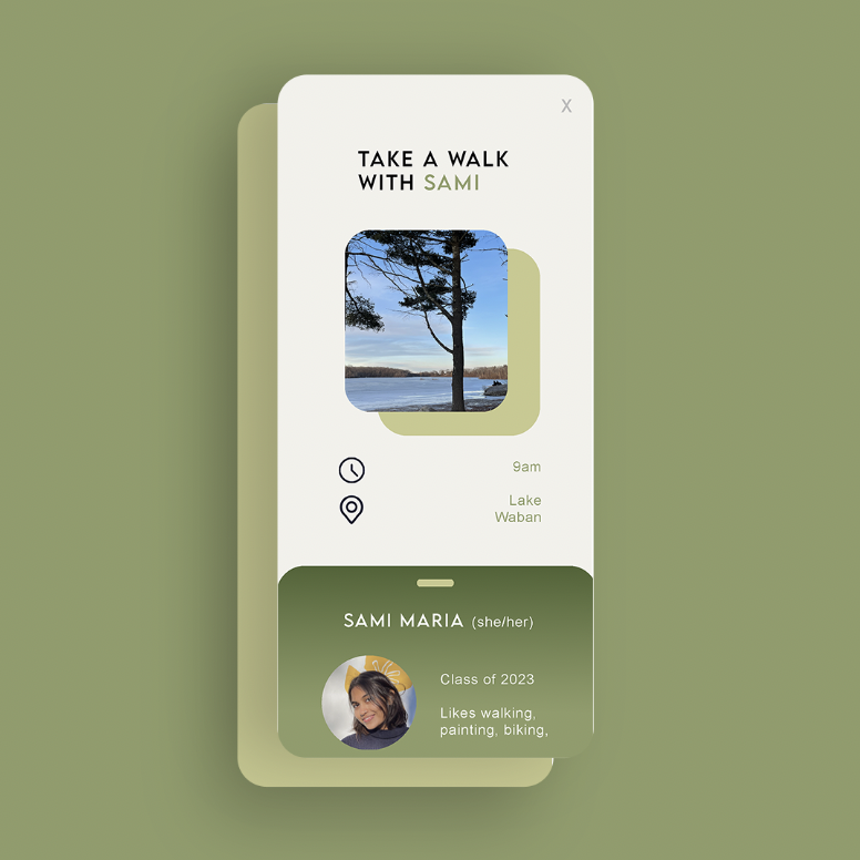
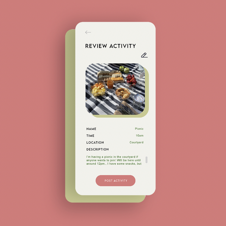
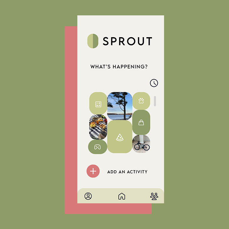
We wanted the fonts to be readable and relatively simple. We didn’t want to use too formal of a font so we chose to keep it sans serif. For the color scheme, we wanted stick to our plant theme and have the dominant colour be green. From that, we found a colour palette online that included some other accent colours to create an aesthetic interface. We decided to keep the homepage pretty simple and straightforward using photos that people post with their activity and intuitive icons that represented the event. In order to account for people’s sense of recognition, we created a direct messaging page that mimics that of Instagram. Consistent with other social connecting applications that people are already familiar with. Kept a menu button on the bottom of the pages in order to allow users to easily access the different functions that the app can perform.
Ideation Project
Rationale of the design choices we made for our project.
design inspiration
design 1