Final Prototype
Our final prototype incorporates the feedback we received from our heuristic evaluation as well as additions to functionality that allows the user to test all the core user interactions of the app.

Takeaways from the Heuristic Design Evaluation
With our previous InVision prototype, we had three testers perform a Heuristic Design Evaluation based on Neilsen's Ten Usability Heuristics. The Usability Heuristics include visibility of system status, match between system and the real world, user control and freedom, consistency and standards, error prevention, recognition rather than recall, flexibility and efficiency of use, aesthetic and minimalist design, help users recognize, diagnose, and recover from errors, and help and documentation.
From our testing results, we decided to focus on revising visibility of system status, error prevention, error recovery, and help and documentation for our final prototype. Our main takeaway from the evaluations was being able to get the perspective of a first time system user and thus implement additional screens that would best enable learnability.
Implemented Changes & Final Modifications
Features
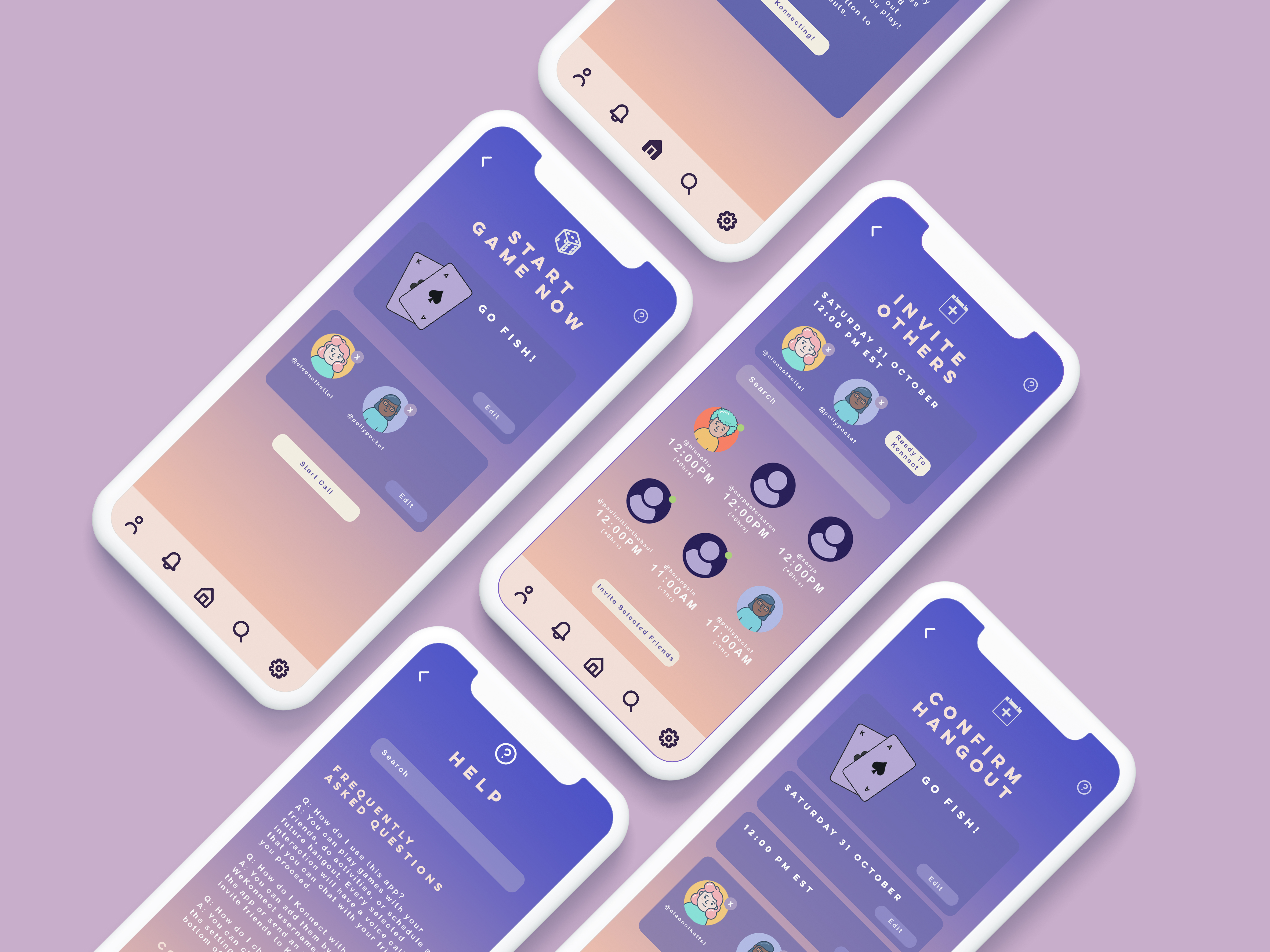
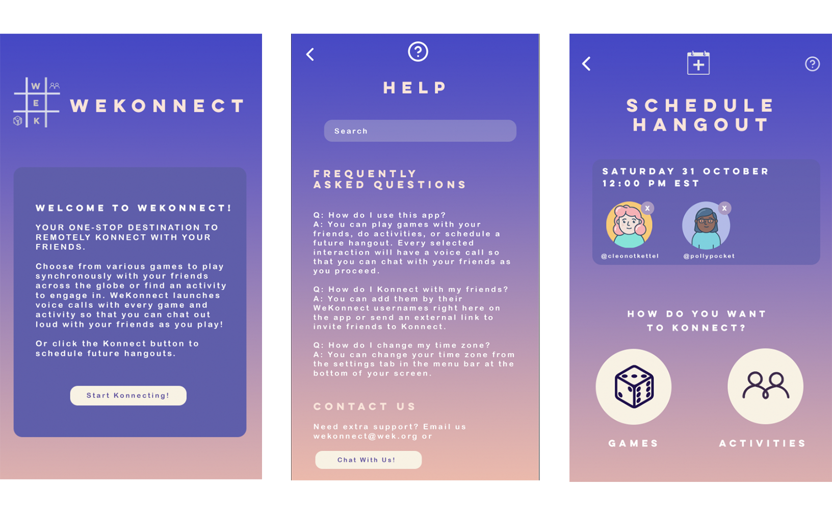
As pictured above, we added a help icon on the top right corner of every screen that would link to an FAQs section and also give users an option to contact the WeKonnect team directly. We also added confirmation screens so as to reduce the potential of user error. Our final prototype better allows for users to confirm that they want to take certain selected actions and gives users plenty of room to recognize and correct/edit possible errors. We also included documentation for games and activities so that every game and activity comes with an introductory screen that gives the user a brief overview of what it is and how many users may participate in it at a time. Furthermore, we realized that not all users come in to the app with the same level of expertise so we added a short introduction to the app for new users. We also improved our schedule hangout feature to create a more seamless user experience.
Design Decisions
In terms of design decisions, we received mostly positive responses to our color scheme. Although our app is not necessarily minimalistic, it met our design goal to create an interface that would be soothing to blue-light-afflicted audiences. For this final prototype, the main design changes we made were to better consistency. We ensured that all the subheadlines were the same cream color and the text colors all corresponded to their content. We also double checked the coloring of every button on each screen so that internal consistency was upheld to the highest possible degree.


Future Iterations
For future iterations, we would want to add a feature that allows users to send reminders for their friends to respond to a hangout invite if it has been over 24 hours. We would also allow for sending reminders a user-designated time before scheduled hangouts. To further promote learnability, we will add an icon following the introduction screen to give new users the option to follow a full walkthrough of the app. The onboarding experience would be expanded in general to be more expansive and there would be options in settings to reaccess these. We'd also consider fine tuning the call feature so as to allow users the flexibility to switch between different games and activities while on the call.