
InVision Prototype
Following our Balsamiq prototype, we created a high fidelity interactive prototype that was medium fidelity in breadth. Through this prototype, we explored the graphic design for our interface and layed out controls as we want them to appear in our final implementation. We made very careful and thoughtful choices choices about colors, fonts, alignment, icons, and white space to promote the usability of our interface.
Part I: Constructing a High Fidelity Prototype (Invision)
This high fidelity prototype shows how users can use this mobile app to schedule a hangout with two of their friends at 12:00 pm on October 31,2020.
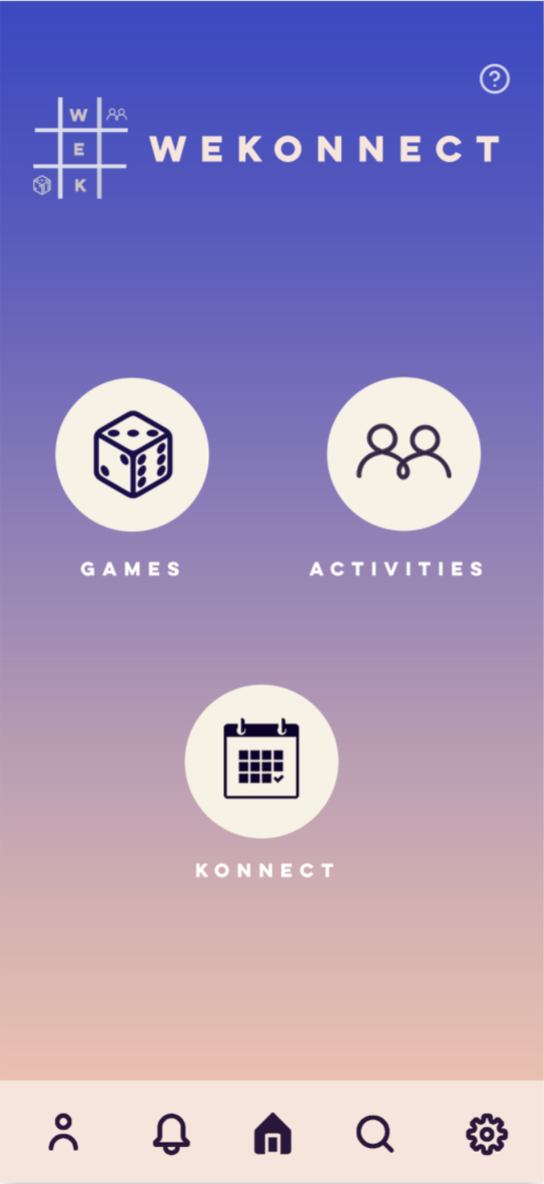
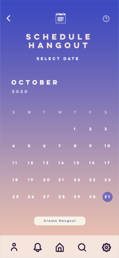
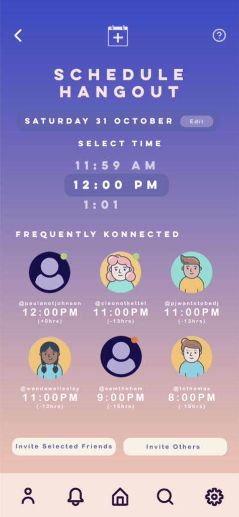
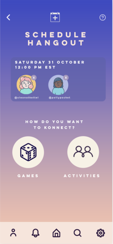
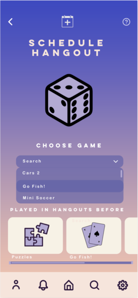
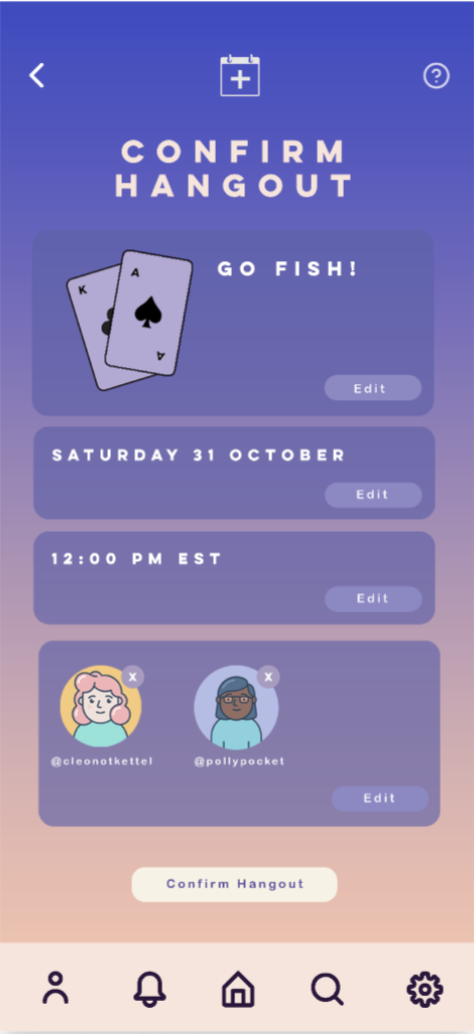
We made crucial decisions about the typography, aesthetics, layout, navigation, and overall functionality.
Part II: Design Rationale for Prototype
The design was also constructed keeping in mind that many students and young adults have tight schedules and may want to plan ahead for when they may want to virtually hangout with friends. The interface is designed to allow users to play with existing users that they are friends with on the app, or invite other individuals who do not have currently have WeKonnect accounts, by simply sending them a link through different social media platforms - making the app accessible for a larger number of individuals as it does not require one to have an account to play with a friend, if invited.
Colors
We chose a bluish-pink gradient for the background as it brings a fun and modern look to our app. Our initial colors seemed too relaxed to users in earlier testing, but this gradient seems to be both vibrant enough to feel exciting but also plain enough to allow users to focus on the different features within the app. The gradient also makes our application memorable to users, helping us add a spark and intrigue user interest. The white buttons in our design contrast well against the bluish-pink background, rendering it easier for the user to locate them and complete their respective task. The dark purple icons on the inside of these buttons contrast the white circle they are placed in, making it clear for the user to be able to discern the purpose of each button. On our home screen, we also use a light purple for the game title to distinguish it from the headings on other screens as well as the other creamish white text on the home screen itself.
Typography
For headings and subheadings, we use the all-caps, sans serif family font, Lulo Clean. This clean typeface is a great fit for headings since it is all-caps, and very easy to read due to the spacing of the letters. For other labels and buttons that do not feature capital letters, we decided to use Arial Rounded Bold as the typeface, as the rounded ends of the strokes impart a more informal look than the normal Arial typeface – which better matches the mood of the rest of the application. The bolded font also grabs user attention to the different features it is meant to highlight.
Layout
Overall, we focused on having a minimalistic design that does not contain noise that unncessarily distracts users. Our application is designed to be simple and intuitive to use, with the help of easily recognizable metaphors and signifiers throughout the interface. Each screen -asides from the home page which instead features the app name- of our application has an icon on the top, which ensures that the user is on their desired screen and effectively able to navigate through the interface. The navigation bar is highlighted at the bottom through its creamish white background and corresponding dark purple icons – a contrasting color scheme that is kept consistent throughout the application. This bar offers shortcuts to the screens that users are most likely to use. Lastly, on the Schedule Hangout screen, we use dark purple text for the Invite buttons at the bottom, to maintain internal consistency with the rest of the app that uses dark purple text and icons to indicate buttons that the user can press to carry out an action. Internal and external consistency in design were extremely crucial as we aimed to promote learnability and memorability while minimizing user errors.