
Ideation
Based on user interviews, we created personas and user scenarios which then helped us brainstorm some different design ideas for our app prototype.
Part I: Usage Scenarios
Analyzing the personas we created and their needs, we came up with 3 user scenrios based on the functionality of our application:

Wanda (Tired Junior)
Wanda downloaded the WeKonnect app on a Friday afternoon after receiving a Facebook event invite to an organization bonding’s WeKonnect game night. She’s exhausted from a week of Zoom classes and isn’t in the mood to meet and play games with new people, but she got the app anyways because she was curious about WeKonnect. Also, she recently read an article in the New Yorker about the advantages of a phone call over a video call and is interested in WeKonnect’s voice call feature. She makes a new account and chooses one of the available app icons for her profile picture. She gravitates immediately to the Games tab. While browsing through the Games tab, Go Fish! Catches her eye. She texts her group chat about WEKonnect and finds out three of her six friends in the chat are already regular users of the app. They text her their usernames. Navigating back to the WeKonnect app, the app automatically logs her in as she didn’t log out on her last use. She goes back to the Games tab and searches for Go Fish! She clicks on the game icon and then adds her friends using their username. Her friends already had the app open in anticipation of her invite so the voice call between the four of them starts immediately. They end up playing and chatting for an hour. When the game is over, Wanda is ready for dinner and feels like she’s happily met her social and fun quota for the day.

Rebecca (Excited First-Year)
Rebecca just finished writing an essay and working on a group project via Zoom. She has a few hours before she has to attend two classes and a lab back-to-back again on Zoom at night since she’s in Tokyo. She needs to cook her dinner but she wants it to be a relaxing social time. She doesn’t want to watch tv in her free time since her day is packed with her being on screens. She remembers that her game night app, WeKonnect, also has a feature of offline activities. She selects the activity tab and browses through them until she comes across cooking. She selects this option and invites her friend, Wanda, in Boston to join her. Rebecca and Wanda get on an audio call and select recipes for each other to follow for dinner and breakfast, respectively. Rebecca and Wanda cook their meals while speaking to one another and enjoy sharing their adventures in the kitchen. After connecting with her friend and not using another screen, Rebecca feels refreshed and is ready for a long night of Zoom with her dinner!
Rebecca (Excited First-Year)
Rebecca is excited to have gotten selected for the community events chair position for WOrg this fall. The first event she has to plan is a bonding event for the executive board for the org. However, Rebecca finds that it is difficult for people to bond virtually as it is hard to open up so quickly to new people without anything simulating to do together. Rebecca is looking for a platform that allows her to schedule a fun icebreaker game for the group to connect without physically leaving their homes. She finds WeKonnect and uses it to send a calendar invite to her org members for a specific time based on their availability, ensuring that they are available for that block of time.
Part II: Design Directions
To begin, we made sketches to brainstorm 3 different possibilities for our app’s interface design.
List Based Design
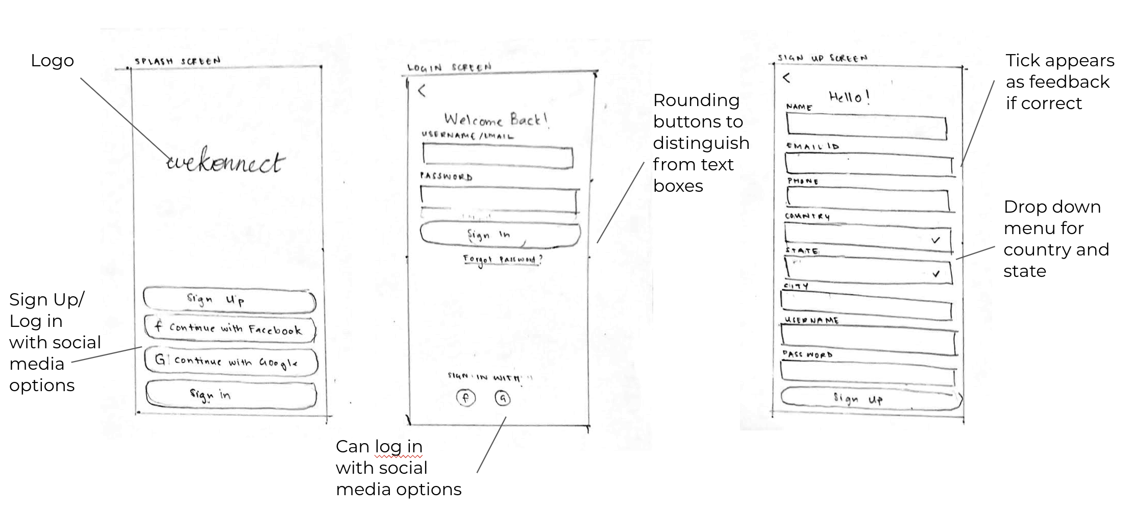
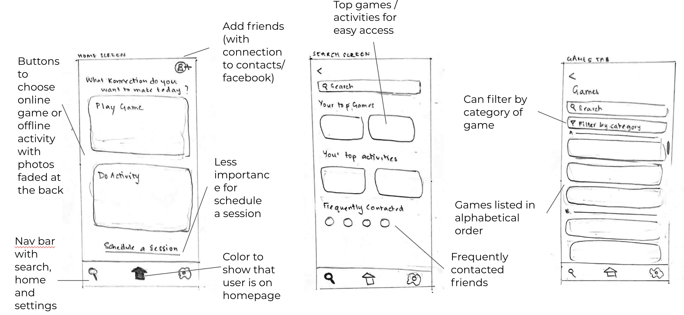
This design offers the user to sign in through different platforms, such as Facebook and Gmail. Games are listed in alphabetical order and the user is only able to see the game image once they select a game. The design also allows users to easily access their top games and activities.
Icon Based Design
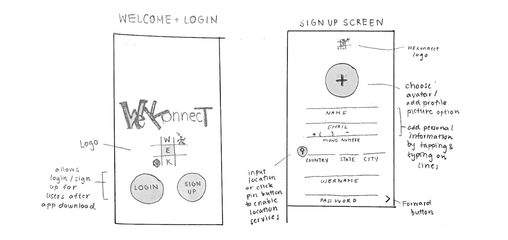
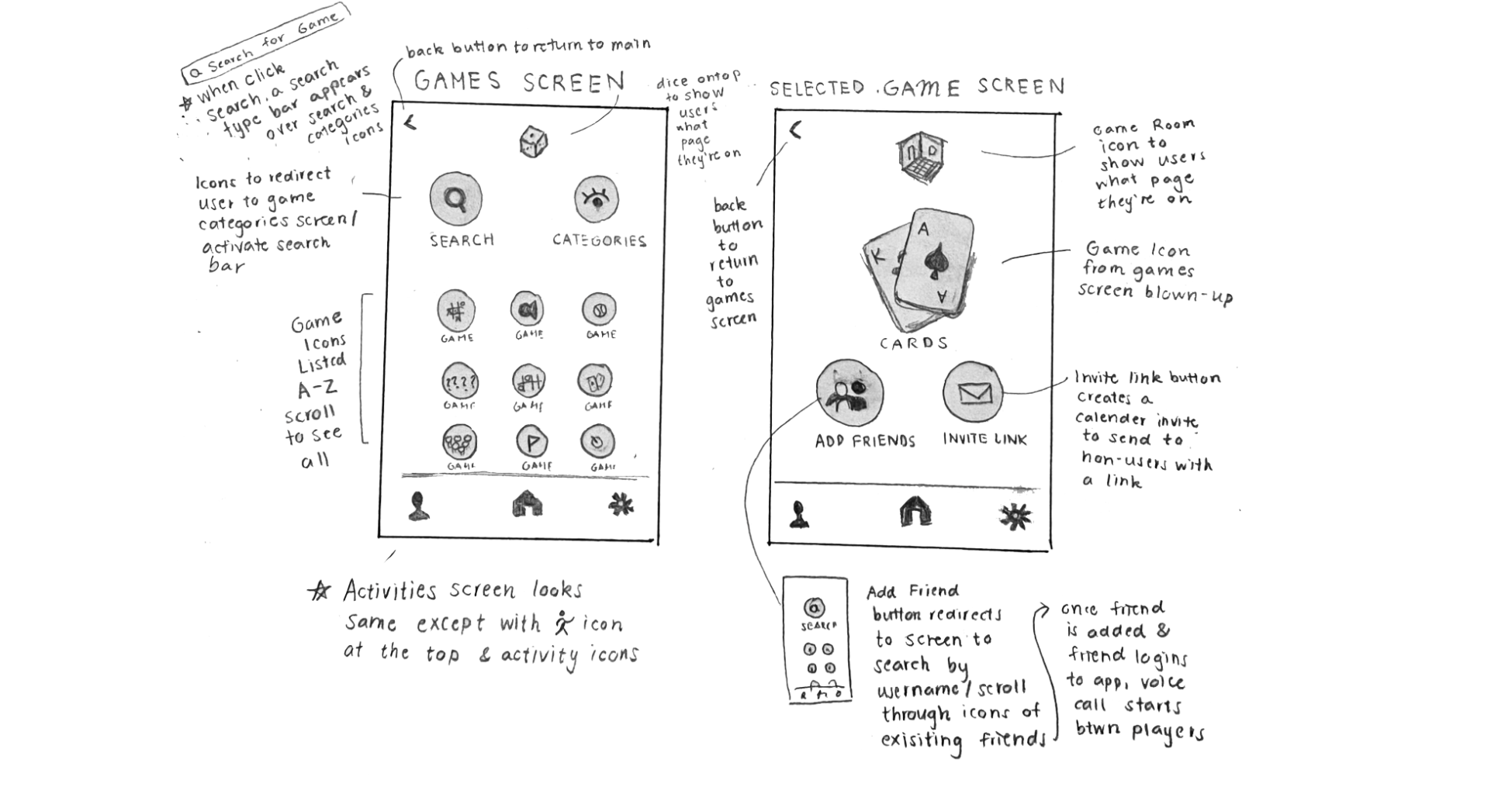
This design uses icons to help the user identify different games and activities, as well as different menu options. It also allows users to see other users' timezone, making it convenient to find a common time to play in real time, or even schedule a future hangout room.
Image Based Design
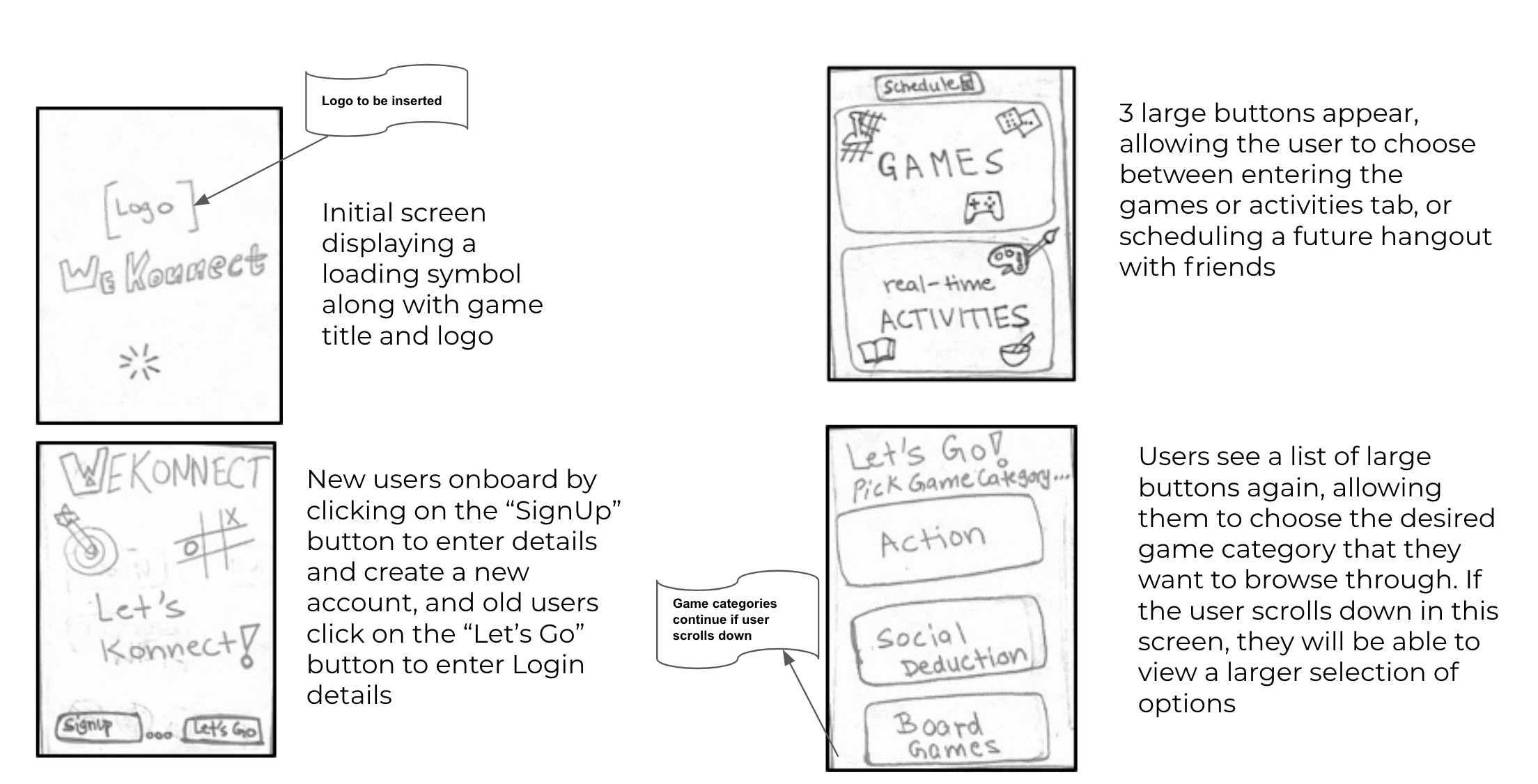
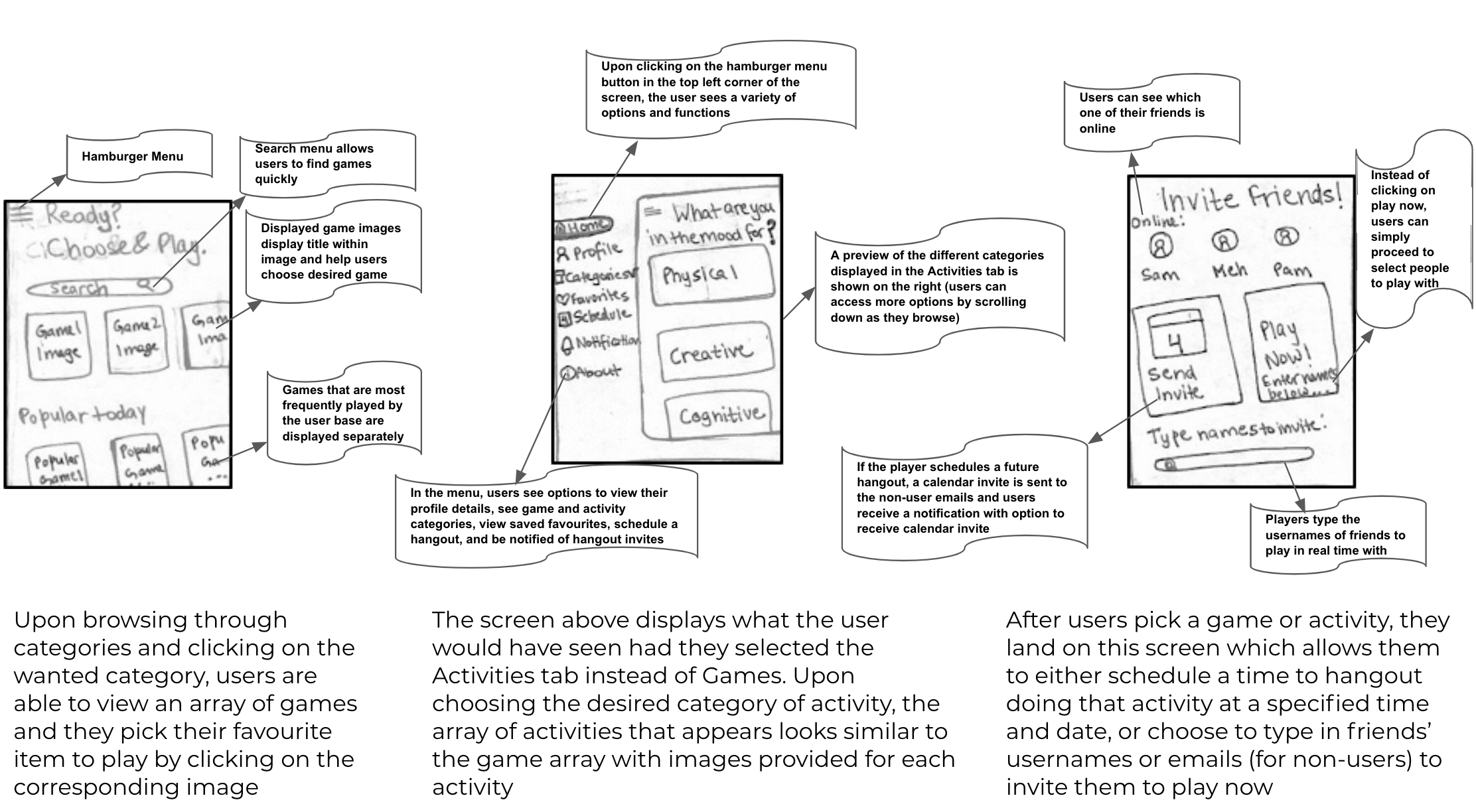
This design employs large images to display game and activity items, as well as other buttons and menu options. The interface is simple to explore and learn, but does not offer the option to log into the application without setting up a profile.
Part III: Peer Feedback
Upon sharing our design sketches with classmates, these were our major takeaways:
Initial Impressions
"The design is very appropriate and much needed for the current context, not just for students but also for everyone that works!""
"I like the icon based nature of the design, it seems like it would be fun to use"
"Really like this design. It considers the user's need (accommodating for time zones) and provides an fun outlet online and/or physical"
"Really like this design. It considers the user's need (accommodating for time zones) and provides an fun outlet online and/or physical"
"My first impression of the design is that I have seen a lot of game apps that connect friends. However, I think this design is appropriate for the goal because it also has offline activities, which is a unique aspect of an app"
Design
"I feel that it will quickly become popular, because it allows for friends in different time zones to more easily connect and give them something to do together. The design is simple and easy to use as it takes after commonly used applications so it can quickly be learned"
"I think the target audience will appreciate having a lot of games in the same app"
"I think the target audience will appreciate the centralized nature of the app (I personally often don't have access to/am not familiar with a lot of the apps out there that my friends suggest) as well as the offline activity option, since that type of connection/bonding is really what we're missing in the remote environment"
"Really like this design. It considers the user's need (accommodating for time zones) and provides an fun outlet online and/or physical"
"The emphasis on engagement via activities that can be done synchronously is very exciting"
Suggestions
"I would suggest to think of ways that differentiate your games from others and how to get people excited to play"
"I would like the option to be able to see other users' profiles to engage with them"
"Include the timezone in everyone's profile, be explicit about the format of the activities, and we also didn't see any colour injected because of the nature of the sketches but I imagine it will look really fun and colourful so just keep this in mind!"
"Add an activity status to show if someone is online or not"
"Don't overuse icons or metaphors as that gives a cluttered look, and make it very clear what games and activities the app offers"