CSS continued - more about Images:
In the last lesson, we introduced CSS, or Cascading Style Sheets, and practiced using CSS to add style: background colors, text colors, font families, tables, margins, visibility, etc. to HTML documents. At this point, you should have begun experimenting with CSS stylesheets to further personalize your blog posts (see the assignment at the bottom of "Week 5-6").
This week, we're going to continue discussing CSS, but focus specifically on images. We'll talk about public domain images and copyright law, online photo editors that will help you refine or modify images for your blogposts, and look at particular CSS skills like opacity/transparency or rounded images that you can use. The questions you should be able to answer after completing this tutorial are:
Where can I find images online, and how do I know if I can use them?
What should I do if I find an image but it's the wrong size or shape? How can I make the images I use on my website more unique?
How can I stylize images for my website?
As we discuss information and tools you can use to improve your digital work, write down any ideas you have for you digital portfolio or for your blog posts... what do you want the finished products to look like? And which of the new skills we're discussing can help you code those ideas? If at the end of the tutorial you still don't know how to style your documents, try visiting blogs or websites that you like and make notes about the colors, fonts, or layouts.
A look ahead: Visit Wellesley's Library & Technology Research Guide about Media for Use in Course Projects: Media Sources or the corresponding section of the tutorial .
In this tutorial, you'll find information about:
and the following assignments interspersed throughout the material:
Public Domain Images and Copyright Law:
Where can I find images online, and how do I know if I can use them?
Photos in the public domain are free from copyright protections - they can be used for personal or professional purposes without seeking permission, paying a fee, or break the law. According to the Public Domain Sherpa website, a website dedicated towards informing web users about the public domain, there are five reasons a photo would be considered to be part of the public domain:
- If "the photo was created by the U.S. government."
- If "the photo lacks a copyright notice."
- If "the photo's copyright has expired."
- If "the photo is not eligible for copyright protection."
- If "the photo has been dedicated to the pulic domain."
For more information about any of these classifications, visit the Public Domain Sherpa page linked above. Additionally, you can visit this Public Domain Sherpa page for a list of good resources for finding images in the public domain - when you're collecting photos for your websites, these resources are a great place to start.
This Public Domain Images website is also a great resource for learning more about public domain images, as well as copyright laws and Creative Commons licensed images. Images licensed under the Creative Commons are copyrighted but their owners, but are still made available by those owners to the public for "personal, educational or non-profit non-commercial purposes". The caveat with these images is that, depending on the type of license, the owners may need to be acknowledged (attributed); by contrast, public domain images do not need to be attributed to anybody.
This website also lists several more sources for public domain images:
- "Photographs of Artistic Works"
- "Historical Images"
- "Images from Government Photo Archives"
- "Search Engines"
Again, visit the website to read more about the public domain, or about these sources of public domain images. Since March 1, 1989, the Copyright Act has not required owners or creators to put the (C) copyright symbol on the photo. If an image is neither indicated to be in the public domain or copyrighted, then, it is safer to assume that the image is copyrighted and to contact the owner/creator to ask permission for use. Read more about the Copyright Act and fair use laws here.
So, can I use the image below?
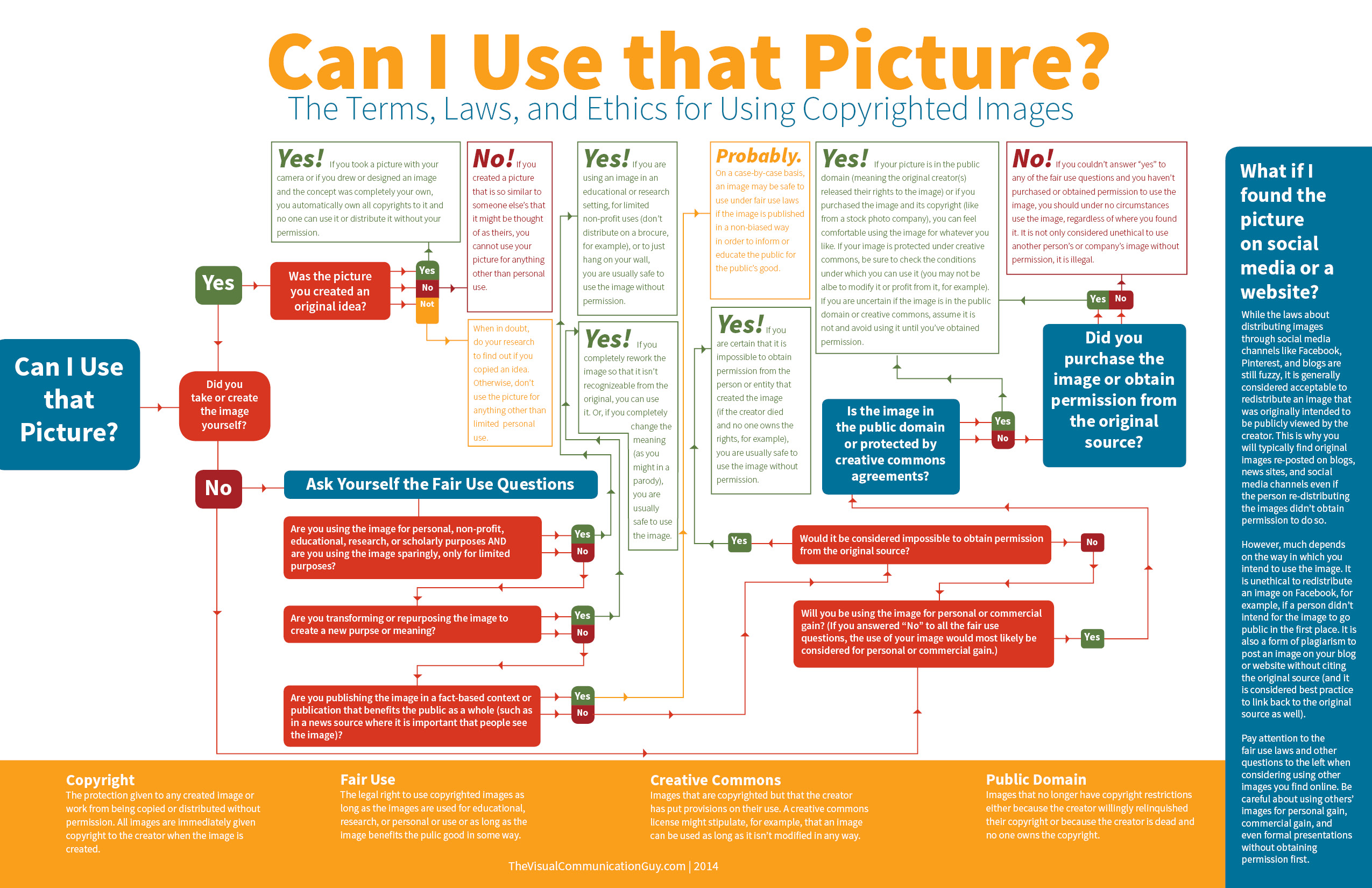
Let's make our way through the diagram to check whether or not this is an appropriate usage of somebody else's graphic...
- "Can I Use that Picture?"
- "Did you take or create the image yourself?"... NO
- "Ask Yourself the Fair Use Questions"...
- "Are you using the image for personal, non-profit, educational, research, or scholarly purposed AND are you using the image sparingly, only for limited purpose?"... YES! The image is being used solely for educational purposes, so I can use the image!
Wellesley's Library & Technology Research Guide about Media for Use in Course Projects: Media Sources
Among the many research guides available to students at Wellesley is a guide for Media for Use in Course Projects: Media Sources. This resource offers links to background information about finding non-copyright images for presentations, as well as many to digital image collections and Creative Commons collections that you can use to find images for your blog posts and portfolio. I strongly recommend browsing these resources; in particular, the guide for finding Art and Architecture images. This resource provides links to reservoirs of art like ARTstor and Oxford Art Online - images found on these webpages could be used as background images in your blogs.
Visit Wellesley's Library & Technology Research Guide about Media for Use in Course Projects: Media Sources.
Online Photo Editors:
Or...What should I do if I find an image but it's the wrong size or shape?
How can I make the images I use on my website more unique?
There are several online photo editors that are free and easy to use. These editing programs allow you to upload images directly from your computer, edit them by cropping the image, making basic adjustments to the photo (contrast, brightness, etc.), applying themes or textures, and adding text or stickers. Using these programs not only lets you adjust the size or shape of photos, they also let you change images to a degree that they are either unrecognizable or the meaning has been completely changed from the original version. Both of these changes would make the images okay to use for public consumption - see the Fair Use Questions in the chart above.
This list of "The 9 best browser-based photo editors available today" offers several options for photo editing - three that I would recommend you use are Pixlr and PicMonkey. Each editor has different features that are best suited to different types of editing.
PICKING A PHOTO EDITOR:
Pixlr:
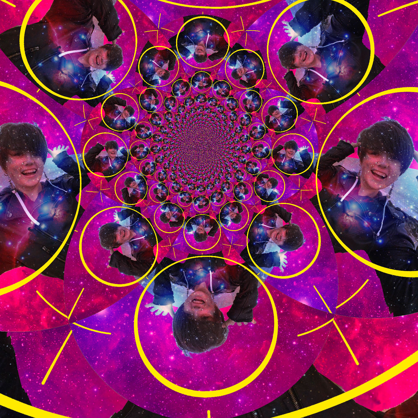
Pixlr is a great online photo editor because it closely resembles Adobe Photoshop and contains many of the same tools. Using Pixlr, you'll be able to create, edit, and combine layers to create more complex and interesting graphics. You can also add text, make adjustments to the image (brightness, saturation, contrast, etc.), and draw/paint. This editor is a great choice for creating unique background for your blogposts and portfolio. Watch the tutorial below to see how to transform the image on the left into the image on the right in Pixlr!

To further explore the various tools you can use in Pixlr, check out this link to the WikiHow Pixlr Online Image Editor tutorial.
Click play below to watch the video.
Four more images edited using Pixlr are displayed below. These images primarily use the Kaleidoscope Filter, Image Adjustments from the drop-down menu bar, and various Opacity/Blending Mode adjustments to combine layers. Text of various fonts has been added on top of the images, as well as shapes of various colors to provide background for the text:


PicMonkey:
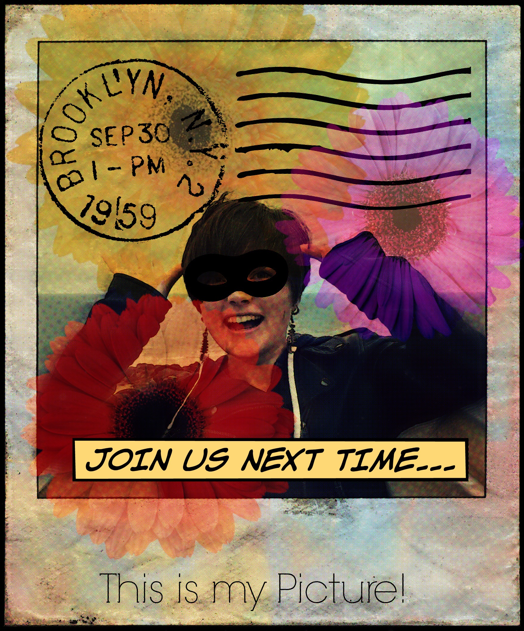
While Pixlr is a useful photo editor if you want to combine multiple images, PicMonkey is a great choice for editing photos if you are working primarily with a single picture. It has a number of preloaded stickers, borders, textures, and themes to choose from that you can use to create unique and fun images. They editor also allows you to make basic photo edits, apply various photo effects as you might in apps like Instagram, and add text. This editor is a create choice for creating narrative graphics or customizing images that can be interspersed with text on your websites. Watch the tutorial below to see how to transform the image on the left into the image on the right in PicMonkey!
Click play below to watch the video.
Assignment: Find, Edit, and Share an Image
Find an image that is okay to use for a personal/educational purpose (like your digital portfolio!), then save it to your "images" folder in your "writ135" folder. Again, make sure you record both the image URL and the URL of the website it is posted on. It may be a good idea to begin cultivating a photo citation HTML webpage (see "Photo Citations" for an example) that will contain all images and citation information you collect. In the next portion of this week's tutorial, you'll explore different ways to create and style photo galleries that could be used for this part of your website.
Once you've saved the photo, make a duplicate and rename the new version. This second version of your chosen image will be the copy that you edit. Pick one of the two photo editors listed above (or choose another from the linked list) and open your photo, then create an interesting graphic using the picture and the editor's tools. You may choose to find and combine more than one image to create your final product: an interesting and unique graphic. This graphic could be of use for your digital portfolio, or it could just serve as good practice for future photo editing.
When you've finished editing, add both photos, original and edited, to a new HTML document using <img> elements. Add some text that describes the different tools and effects you applied as you worked. Save this new HTML document to your "writ135" folder, then link the new page to your digital portfolio. There is no need to add CSS to this webpage, although you absolutely can if you want extra practice. You can use this HTML template to create the new webpage. Copy and paste the code from the link into a new document in Brackets to get started.
Resolution and PPI:
Two important concepts for digital photo editing and web design are resolution and PPI (Pixels per Inch). The definitions, borrowed from this article, are:
- Resolution: Resolution is the measure of pixels in the display, usually expressed in measurements of width x height. For example a monitor that is 1920 x 1080 is 1920 pixels across and 1080 pixels down.
- PPI: Pixels per inch. Most commonly used to describe the pixel density of a screen (computer monitor, smart phone, etc…) but can also refer to the pixel density of a digital image.
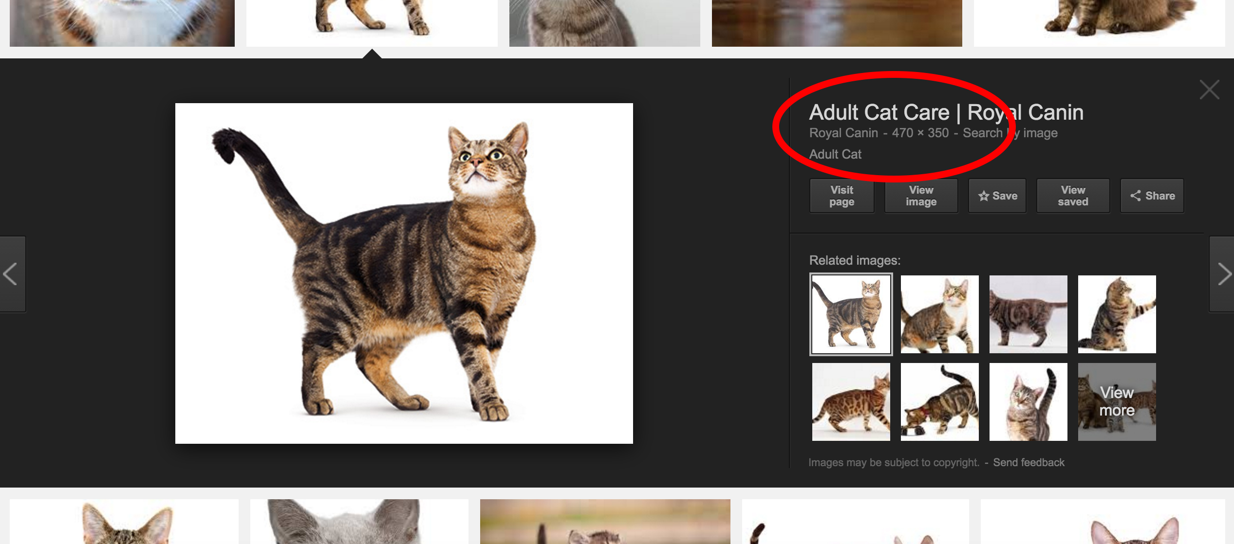
When you are searching for images to add to your website or editing images that you've found, it's important to take into account their resolutions. If you're searching in Google Images, an image's resolution will always be displayed when you click on a photo (see below). You can also search for similar images of different sizes by clicking on the resolution displayed (circled in red).
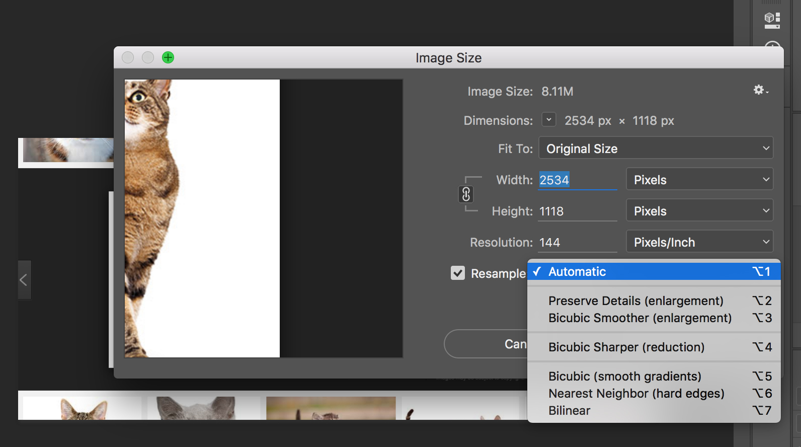
Although you can always make an image smaller in online photo editors or in Photoshop, you may lose image quality when you make the image bigger. There are a couple of ways to avoid a loss of image quality; in Photoshop, you can adjust the resampling method (which determines how pixels are added or deleted from your image) from Automatic to Bicubic Smoother (enlargement), then use the drop down menus for width and height to switch from pixels to percent. If you then scale your image up by 5-10%, you can slowly enlarge the image without losing pixel quality. For more information about resolution, resampling tricks, and pixel quality, check out this Layers Magazine article. This Adobe article also discusses image size and resolution in more detail.
For the purposes of this class, it will always be a better idea to start with large images, particularly any image you want to use as the background for an HTML page, and use CSS to scale them down to the appropriate size. Remember, you can always adjust the width or height style attributes of the image either by pixels or by percent. An image that is initially 1000px+ can easily be rescaled to fill only half of your screen (style="width:50%;").
If you choose smaller images from online databases and try to make them larger using CSS than they are initially, the image will look blocky or fuzzy in your webpage because the resolution was too low. For more information, take a peek at this Vsellis article about Resolution (also linked above).
CSS and Images:
In the previous weekly lesson, you read over several different CSS techniques involving images; this week, we're going to look more specifically on several uses for images on websites including rounding the corners of an image or cropping the image into a circle, adding a border to the image, making images scalable with the screen, adjusting the opacity/transparency of an image, adding CSS to an image specifically when it is being hovered over, creating an image gallery, and using images as backgrounds. Each of the following links will direct you to a relevant topic in either the "CSS Tutorial" or the "CSS3" sections of the W3Schools CSS Tutorial. Read each introduction to the topic, then navigate to the link to read the information and practice each skill in the "Try It Yourself" boxes.
The "CSS3 Images" topic shows you how to use the 'border-radius' attribute to either round the corners of a rectangular image or make a rectangular/square image into an oval/circle. You can set the value of 'border-radius using either a number of pixels or a percentage; if you set the value to a 50% (ex: border-radius: 50%;) you'll get an oval or circle. Click here to read more about rounded corners. You'll also learn about the 'border' attribute, see the :hover selector in use (which will apply specific styling to an image when the cursor is over it), see how to make an image scalable by setting the 'width' attribute to a percentage (a value of 100% will cover the full width of the screen with an image no matter how the screen's size has been adjusted), practice using the attribute/value pair of margin: auto; to center an image on the screen, how to position text on an image, how to create the illusion of depth by adding a shadow behind images with the 'box-shadow' attribute, and how to use the 'filter' attribute to add visual effects to an image.
The "CSS Opacity" topic discusses how opacity/transparency effects can be applied to either images or elements colored with the 'background-color' attribute. Using the 'opacity' attribute with a decimal value between 0.0 (totally transparent) and 1.0 (totally solid), the appearance of both images and blocks of color can be altered. This attribute is often used in conjunction with the :hover selector so that the transparency of an image reflects whether or not the cursor is above it. To see examples of the :hover selector in action, visit either the "Weekly Work" section of the Home page, where it is used with the 'opacity' attribute, or the "Photo Citations" page, where it is used to replace photos with block colors.

This example uses the :hover selector to adjust the image's opacity. Look below for the CSS!
Here are the HTML and CSS that correspond to the example above:
    HTML:
        <div class="photolink">
            <img src="../images/serenity.jpg" alt="An artistic picture of the spaceship Serenity from Firefly" style="max-height:350px;">
            <div class="centertext">
                <p class="idtag">This example uses the :hover selector to adjust the image's opacity. Look below for the CSS!</p>
            </div>
        </div>

    CSS:
        .photolink {
            position: relative;
            display: inline-block;
            margin:7px;
            padding:3px;
        }
        .centertext {
            position: absolute;
            top: 50%;
            left: 50%;
            transform: translate(-50%, -50%);
            opacity: 0;
            visibility: hidden;
        }
        .photolink:hover img {
            opacity: 0.25;
        }

        .photolink:hover .centertext {
            opacity: 1;
            visibility: visible;
        }
Another way to adjust the transparency of a block of color is to assign a background-color using its RGBA value, where A is the decimal opacity, instead of its RGB value. For example:
This has background-color: rgb(92, 200, 67);.
This has background-color: rgba(92, 200, 67, 0.5);
The second bar of color is more transparent because the fourth value in parentheses, the A value, adjusted it's opacity.
The "CSS Image Gallery" topic offers several examples of how to create image galleries using a variety of <div> elements. By creating a variety of <div> classes, then defining attributes like 'margin', 'padding', 'width', 'height', and 'border', you'll be able to create galleries of images that can include descriptions below the photos and involve :hover specific styling.
The "CSS3 Backgrounds" topic will introduce several ways that you can customize a background compiled of one or more images using the 'background-clip', 'background-image', 'background-origin', and 'background-size' attributes. It also introduces a way to set all the background attributes in a single, 'background' attribute. You can practice using these attributes in five included exercises one the tutorial topic, or look back at your blog posts and experiment with combinations of background images.
For more ways to add styling to your website (or to images on your website), you can look through the remaining indexed topics in the "CSS3" section of the W3Schools CSS tutorial by scrolling down the left-hand navigation pane past the "CSS Tutorial" topics.
Assignment: Enhance the CSS for your Blogs and your Portfolio
Look back at your blog posts and consider using the new skills you've studied this week to further personalize them. This is an optional component of the assignment. You could make changes like editing background photos, adding images with styling, or using photos with :hover selector styling as links to navigate back to your portfolio.
The second (and required) component of this week's assignment is to add images as either backgrounds, links, or for citation purposes to your digital portfolio. Some ideas include creating a photo citation gallery as described in the last assignment; customizing a background image; combining multiple images to create a unique background; or applying different background images, colors, and borders to various <div> elements on your portfolio. For this final idea, you'll need to add <div> elements by dividing the content of your website into distinct sections - remember, you can think of <div> elements like building blocks that can be arranged on the screen (revisit this W3Schools HTML "Layout" reference for ideas and further information).
When you finish updating your blog posts and portfolio, upload your "writ135" folder to your server account using Cyberduck. Because a "writ135" folder already exists, you can either delete the old folder and upload the entirely of your updated "writ135" folder, or open the folder, delete its contents, then add all the new/updated documents to the server. As always, send me an email when all new content has been uploaded.
Congratulations! You're done!