Color Theory, Typography, and Layout:
In this week's tutorials, we will talk about the necessary style principles to keep in mind as you design for the web. Color, typography, and layout are all essential components of your website. When you read about Color Theory, you'll learn about how to quantify color in terms of hue, chroma, and value; how to use the color wheel to create harmonious color schemes; how to pick colors to convey a particular mood or emotion; and how to balance the colors of every element of your website to maintain you scheme. In the Typography section, you'll find resources to help you choose fonts well-suited for your websites, learn about the history of typography, explore the fonts available to you on the Google Fonts website, and build your own typographic hierarchies. In the Layout Section, you'll review HTML layout elements and <div> elements; learn about Bootstrap, a framework for bulding complex column or grid systems on your webpages; and explore pre-designed website templates/themes available to you through W3Schools.
Color Theory:
A great way to start developing the color scheme for your digital portfolio or blog posts is to choose a base color - this color will be the linchpin around which all other color decisions you make will hinge. Check out the Smashing Magazine's article, "A Simple Web Developer's Guide to Color" to learn more about base colors. The website is a good first resource for understanding color theory because it focuses less on the nuts and bolts of the Theory, and more on general design principles. When picking your base color, the article has several recommendations including starting from a logo (or a background image you already collected), thinking about the target audience, avoiding stereotypical colors, and playing a word game. Once you have chosen a base color, you'll be guided through choosing an accent for the original color (using the Color Wheel) and adding a small number of neutral grays that support the color scheme.
The Smashing Magazine article recommmends this website, a color picking tool called Paletton, for use while you set your color scheme. Paletton allows you to pick a base color and choose from a variety of traditional color theory patterns (monochromatic, split complimentary, tetradic, and adjacent). As you make adjustments to your color choice on the left side of the screen, you'll see a palette recommended on the right. You can always click on the colors included in your table to get values that you can use with CSS. Here's an example of a split complimentary palette generated with the website:

Two more good resources for choosing colors for webdesign are the Vandelay Design "Ultimate Guide to Color Theory for Designers" and the Tiger Color "Color Harmonies" reference page. These two articles look more closely at the mathematics of color, the color wheel, and traditionally harmonic color combinations.
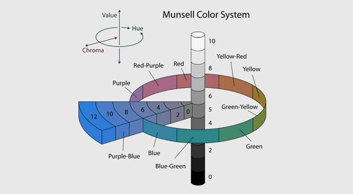
Read through the "Ultimate Guide to Color Theory for Designers" to investigate HSV Basics and Harmonic Patterns, among other topics. HSV stands for the Hue, Saturation, and Value Scale. By definition, these refer to:
- Hue: The actual color visible, independent of saturation or value, which correspond to the colors on the color wheel.
- Saturation: The vibrancy or intensity of a color with reference to how different it is from white; saturations of colors fluctuate from white/pastel to rich, bright colors.
- Value: The lightness or darkness of a color, or the color's shade; value can be compared by converting an image to black and white and noting how color's that once appeared different (navy blue and a deep red, for example) now look the same.
Together, these three components of color can be graphed to represent the full color system. One way of visualizing these relationships is the Munsell Color System shown below:
The Vandelay Design website also introduces several color schemes including Complimentary Colors, Analagous Colors, Triadic Colors, Split Complimentary Colors, and Tetradic Colors. Some of these will be familar from Paletton. Read through the article and explore the different color schemes, then navigate to Tiger Color's "Color Harmonies" article to further explore the schemes. Do any of the color schemes you have used in your work so far match these design principles?
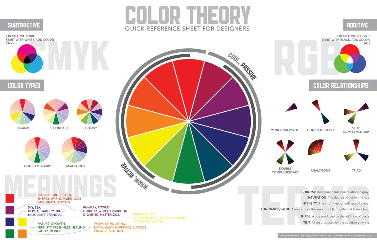
This color theory reference sheet serves as a quick, go to guide on choosing color. Study in particular the COLOR TYPES, COLOR RELATIONSHIPS, AND VOCABULARY (bottom right) introudced. The color meanings are more subjective, but may be useful to you as starting points for interpreting the mood of a color:
"The 10 Commandments of Color Theory" is another useful reference sheet to keep open on your computer while you design for the web. It summarizes many of the principles we've discussed or read about so far, including small examples of each rule below. These two reference sheets together summarize the basics of Color Theory:

Click to enlarge.
Another website you should red is The Daily Egg's article,"14 Examples of The Persuasive Power of Color in Web Design". This article includes information about the ways in which color choice can affect text links, navigation, buttons, headings, and list items on websites. It also discusses color accessibility, how choosing particular colors together (for example, colors that all have similar values) will negatively impact users who are color blind, and monochromatic or grayscale web design.
An online resource for Color Theory that I was introduced to more recently is a blog post hosted by SEAT UP. This webpage discusses how color can evoke different emotions, especially in the context of selecting a color of paint for rooms in a home, and also provides a great summary of warm vs. cool colors. There are several more links on the blogpost to other interesting resources for understanding color - some of my favorites are this Harrington Design College article about "The Psychological Impact of Paint Colors" and this Denver Art Museum activity about using cool colors to paint snow, like Theodore Waddell did in his 1994 painting, Motherwell's Angus.
Assignment: Create Three Possible Color Schemes
Using the Color Wheel above and either Paletton or pencil/colored pencils, create three possible color schemes for either a blog post or your portfolio. If you don't know where to begin, try selecting a base color based on the mood of your writing or from a graphic/image you want to include on the page. Each of your three color schemes should represent a different color pattern described above. Your options include: Complimentary Colors, Analagous Colors, Triadic Colors, Split Complimentary Colors, and Tetradic Colors.
In an email, send me a picture or pictures of your finished three color schemes.
BONUS: Think about your favorite season, your favorite place, your favorite sports team, etc. Can you identify an underlying color scheme? Train yourself to see color relationships. Look for naturally occuring color schemes when you walk between classes, or purposeful usage of color theory in interitor spaces and advertisements. For example, my favorite season is Fall, and my favorite part of Fall is when the only leaves left on trees are bright red or yellow and sky is bright blue. Red, yellow, and blue make up a primary triadic color scheme.
Typography
Just like color, typography is a tool that you will use as your develop your websites to convey meaning to viewers. As writer Keith Bryant in an article, "The Principles of Typography: Back to Basics", on the Speckyboy Design Website notes: "We use [typography] to shape content, give language a physical body and enable the flow of understanding". The article linked above provides a brief introduction to typography before exploring the different classifications of typefaces. These classfications are: alignment and proximity, measure, leading, and weight.
The How Design article, "Gestalt Theory in Typography and Design Principles" expands upon these classifications by further discussing proxmity and introducing similarity, continuity, closure, and figure/ground. For each design concept, the article offers visual reprsentations (both text and images) that demonstrate their significance
The classifications and design concepts introduced and above are, for the most part, summarized and expanded upon to create "The 10 Commandments of Typography" in the reference sheet below. Below each rule are several small images that illustrate different possibilities of font-family, font combinations, font-weights, and more that will help inform your choices:

Click to enlarge.
There are five generic font-families, including:
- Serif
- Sans-serif
- Monospace
- Cursive
- Fantasy
Within these generic-families, there are specific font-familise like Times New Roman, Arial, Helvetica, Courier, and more. Revisit this W3Schools topic about "CSS Font" to read more about font-families. If you're curious about Serif vs. San-serif for responsive web design purposes, read more at this Fonts.com link here.
Fonts.com has a number of great resources for learning about Fontology. Two particularly good pages to start on are the Module "Type Families" in the Typographic Foundation tutorial and the Practical Typography Module "Web Typography". The "Type Families" module not only contains historical information about type families, it also outlines the histories of individual letters, numbers, and punctuation. The "Web Typography" module, by contrast, has less to do with history and more with making decisions while developing websites; the page will help you navigate to three great tutorials called "Eight Tips for Type on the Web", "Choosing Text Typefaces for the Web", and "Typographic Emphasis in Digital Media".
I recommend that you read through all three of these articles - each is fairly short - to cement the concepts and classifications of fonts introudced in the articles and reference sheet above.
Assignment: Define Two Typographic Hierarchies
For this assignment, you will define two Typographic Hierarchies, or organizational system for assigning different fonts to different portions of your website. Using "The 10 Commandments of Typography" as a reference, choose two (or possibly three) fonts for each hierarchy. Keep the generic-family, contrast, mood, weight, etc. of the fonts in mind as you build your hierarchy.
An example hierarchy (used on this website), uses the 'Poppins', 'Quicksand', and 'Arial' sans-serif fonts. 'Poppins' is at the top of the hierarchy - it is used for all headings. 'Quicksand' is next on the hierarchy, it is used for a paragraph content. 'Arial' ranks below the other fonts; it is only used for lists, both ordered and unordered. Together, these three fonts look like this:
Poppins
Quicksand
Arial
Visit Google Fonts to browse a variety of options for you websites. Remember, to add the fonts to your document you'll need to get a <link> from the website. Click the red circle with a plus sign in the top right had corner of each font square, then, when you've selected all the fonts you'd like, click on the black bar at the bottom and copy the <link> that appears. Once the CSS link has been added, you'll be able to use the fonts by setting them as the values of 'font-family' attributes in your CSS documents.
You can copy the HTML and CSS code from these two template documents. Save these two new documents to your "writ135" folder, then link the new HTML page to your digital portfolio.
Layout:
While studying HTML and CSS, you likely worked through the "HTML Layout" topic that introduces how distinct elements (named or <div>) can be used to organize webpages. By dividing different types of content - the header, sections of conent, an article, the navigation pane, or a footer - or by creating unique <div> classes - for stylized photos, image galleries, or columns of text - you can give your digital portfolio a unique and user friendly appearance.
Although you can define the layout of your website using the CSS you've already learned, a number of great resources exist online that provide stylesheets and HTML templates to help you along. One of these resources is Bootstrap, an infrastructure available online that you can use to create complicated grid or column layouts on your webpages. Visit the Bootstrap CSS website to learn more about how Bootstrap works and see examples of it in use. Once you've familiarized yourself with Bootstrap, check out this W3Schools Bootstrap introduction. From the W3Schools page, you'll be able to see and modify a first Boostrap example or begin working through a longer Bootstrap tutorial. If creating a column layout for either a blog post or for you digital portfolio (to create, for example, a column for blog posts and a column for writing assignments), this tutorial is a great place to start. Read more about Boostrap from the "BS Get Started" topic and learn how to create basic grids with columns of different sizes from the "BS Grid Basic" topic.
To see an example of a blog post using Bootstrap, visit the link below. The CSS is also attached. Here, Bootstrap was used to create three columns of text to simulate a newspaper layout:
| Description: | Blog Post: | CSS Template: |
|---|---|---|
| "Newspaper"/Bootstrap Layout, Example 1 | Blog Sample, Never Let Me Go | See the CSS |
Another way to begin building a website with a predefined structure is to use a template found online. W3Schools provides several templates on their "W3.CSS Templates" website. Scroll through the page and explore the different templates available. For each template, you can launch a Demo to see how the website will look or click "Try It Yourself" to see all of the code. From the "Try It Yourself" webpages, you'll be able to copy the code directly into brackets. Take note of the stylesheets you're importing as <link> elements. If you encounter a class, id, or element tag in your code and you don't understand how it is being styled (or if you want to change its styling), open the website CSS links and use Ctrl-F to search for the elements by name.
Even if you start from a template, you will be able (and should) customize different elements of your website. Treat the code you copy into the document as a starting point and add to it or expanding it as you work. I used the Parallax Template as a starting point for this class website - do you see the similarites? Can you identify changes that have been made?
Assignment: Use Bootstrap or a W3Schools Template to Build a Webpage
Explore the different template options, both Bootstrap and W3Schools samples, and consider which might be a good fit for your digitial portfolio. When you've chosen a template, try creating a second, sample digital portfolio in Brackets. Substitute images and text into the template you choose, add columns and grids using Bootstrap, and add links to each of your blog posts and assignments to this new version of your portfolio. If you like the final product, add styling from your original digital portfolio, and resave this new portfolio as "index.html". You may want to save the original document to a differnet name ("outdated_index.html", for example) so you don't lose your original work. If you don't like the template you chose, consider using another (or a different structure of columns/grids) for you digital portfolio.
When you finish, upload your "writ135" folder to your server account using Cyberduck. Because a "writ135" folder already exists, you can either delete the old folder and upload the entirely of your updated "writ135" folder, or open the folder, delete its contents, then add all the new/updated docuemnts to the server. As always, send me an email when all new content has been uploaded. If you chose not to keep any of the work you did on this second digital portfolio, add a link to the document to your portfolio and make a note in your email.
Congratulations! You're done!